


Visualisation is the graphical display of information. Learning and cognition is enhanced by visualisation. While all of us are not born artists, scientific graphics visualisation merely requires the knowledge of code to visualise ideas and concepts.
The number of people doing research in our country is increasing daily. One of the challenges often faced by researchers is on how to best convey their findings to the research community and the general public. Well, there are no easy ways to express complicated scientific ideas in simple terms. The famous English idiom,‘A picture is worth a thousand words’, gives us a hint. Images convey ideas in a simple but elegant manner. However, scientific visualisation is not limited to researchers alone—professionals working in diverse areas like IT, banking, automobiles and the healthcare sector also need good visualisation tools.
In this three-part series on scientific graphics visualisation, we will discuss three powerful tools used for this purpose. The tools are Matplotlib, PGF/TikZ and PSTricks. Though none of these tools can replace the other two completely, mastering even a single one of them will help researchers and professionals a lot. This series will help the reader skim through the basics of these three tools very quickly and then decide whether to master one, two or all three. All these tools are free and open source software. The additional advantage is that all three of them blend in perfectly with LaTeX, the best scientific document preparation tool.
Matplotlib
Matplotlib is a plotting library for the Python programming language licensed under the Python Software Foundation License (PSF License), a free software license, compatible with the GNU General Public License. Using Matplotlib, you can generate plots, histograms, bar charts, scatter plots, etc, with the help of just a few lines of code. Matplotlib works in tandem with NumPy, a mathematical library for Python. It works as a multi-platform data visualisation library built on NumPy arrays and is designed to work within the Scipy stack. It is supported by Python 2, Python 3 and IPython. In fact, Matplotlib was first developed as a patch for IPython, for enabling interactive MATLAB-style plotting from the IPython shell.
Currently, I am using Fedora 24 and on searching, I found out that Python 3 is installed in my system, by default. But unlike Python 2 and IPython, the Matplotlib and NumPy packages were not part of my Python 3 installation; so I had to install them manually. Once the installation is successful, when the commands python, python3 and ipython are executed in a terminal, you will be taken to the shells of Python 2, Python 3 and IPython, respectively. To use Matplotlib you need to import this package first with the command:
import matplotlib
The early development of Matplotlib was done by John D. Hunter and the first public version, Matplotlib version 0.1, was released in 2003. The latest stable release of Matplotlib is version 2.2.0, which was released on March 6, 2018. Figure 1 shows the logo of Matplotlib.
After importing Matplotlib, if you execute the command ‘matplotlib._ _version_ _’ in the shell, you will be able to find out the version of Matplotlib running on your system. It is not always the case that Python 2 and Python 3 are using the same version of Matplotlib. In my system, Python 2 and IPython use version 1.5.2, whereas Python 3 uses version 2.2.0. Though I have checked the availability of Matplotlib in Python 2, Python 3 and IPython, all the Python programs in this article are tested only with Python 2, so that minor differences between various versions of Matplotlib will not hinder the progress of our discussion. As mentioned earlier, Matplotlib can be used in different contexts—the important ones are within a script, inside a shell, and inside the IPython notebook called Jupyter. An IPython notebook is a browser based interactive data analysis tool that can combine narrative, code, graphics, HTML elements and other multimedia components into a single executable document.
Modules in Matplotlib
Pyplot is a module in Matplotlib. It is a collection of command style functions that make Matplotlib work like MATLAB. The functions in Pyplot make some changes to a figure. For example, Pyplot can create a figure and allocate a plotting area for that figure, and then plot a number of lines in the plotting area of the figure.
Another such module provided by Matplotlib is called Pylab. It is a module that bulk imports both mathplotlib.pyplot and NumPy, the Python mathematical package, for easier use. Though it is more convenient to use Pylab, due to this bulk import, its usage is slightly discouraged nowadays. The general rule of thumb proposed by the standard Matplotlib documentation is as follows: Select Pyplot for non-interactive plotting and the Pylab interface for interactive calculations and plotting, as it minimises typing. To simplify matters, our discussion is based solely on Pyplot and we can import NumPy separately, if and when required.
Simple line plots in Matplotlib
Let us now look at a simple example involving Matplotlib. The code below shows the Python program plot1.py. This, and all the other Python programs discussed in this article, can be downloaded from https://www.opensourceforu.com/article_source_code/april18/matplot.zip.
import matplotlib.pyplot as pt

import numpy as np

a = np.linspace(-10,10,1000)

pt.plot(a,np.sin(a))

pt.plot(a,np.cos(a))

pt.plot(a,np.tan(a))

pt.show( )
Before executing the program, let us try to understand it in detail. With the first two lines of code, we have imported the packages matplotlib.pyplot and numpy. The line of code:
a = np.linspace(-10,10,1000)
…creates a linearly spaced vector ‘a’ such that it contains 1000 numbers from -10 to 10, with the same common difference between every adjacent pair of numbers. The next three lines of code use the plot( ) function of Pyplot to plot sine, cosine and tangent functions using the vector ‘a’ already generated. The function plot( ) plots ‘y’ versus ‘x’ as lines. In one of the examples that will be discussed later, we will use markers instead of lines to plot, with the plot( ) function. The functions sin( ), cos( ) and tan( ) are provided by the package NumPy. The last line of code:
pt.show( )
…displays the figure on the screen. You can execute the program plot1.py in Python 2 with the command:
python plot1.py
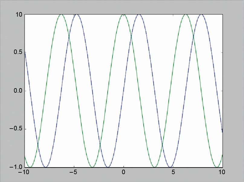
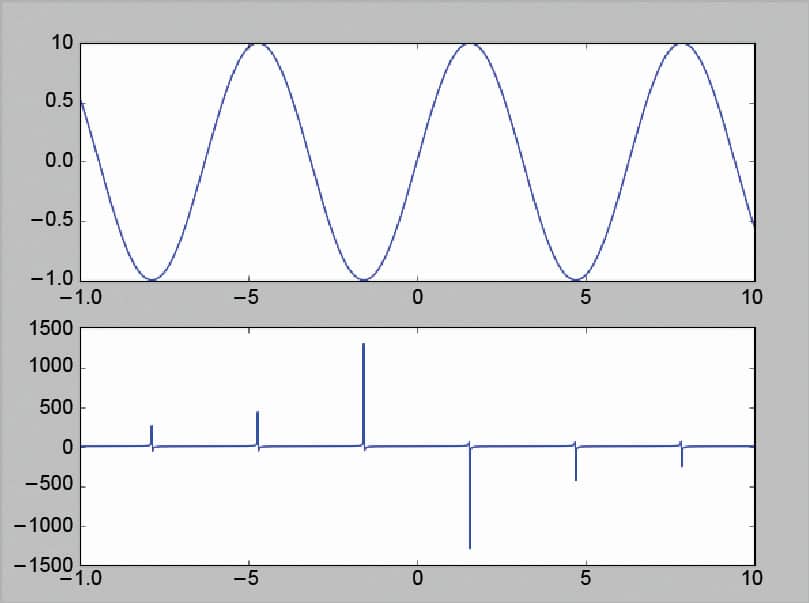
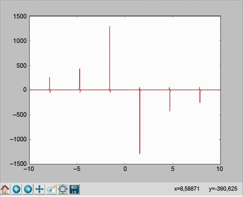
Figure 2 shows the graphics output produced by Matplotlib and Python 2. The same result can also be obtained if you execute every line of code in the shell of Python 2.
Well, it is a bit surprising that the familiar sine and cosine waves are missing in the figure produced. Only the tangent function and two overlapping straight lines are visible in the image. Did we do something wrong? Absolutely not! Then why have we got this particular output? Both sine and cosine functions take values from -1 to 1, whereas the tangent function takes values between -∞ and +∞. So the sine wave and cosine wave look like straight lines due to the large interval in the y-axis. If you look at the bottom of the image, you will see the option to zoom it. If you press the button and zoom along the y-axis, you will see the normal sine and cosine waves instead of straight lines. Better still, just comment out the line of code:
pt.plot(a,np.tan(a))
…as:
#pt.plot(a,np.tan(a))
…to obtain the program plot2.py. On execution of this program, you will get the output shown in Figure 3, in which only sine and cosine functions are plotted.
Sub-plots in Matplotlib
In the previous programs, multiple functions were plotted in a single image, but now we will try to place the plots of different functions into different sub-plots of the same image. Consider the program plot3.py given below to perform this task:
import matplotlib.pyplot as pt

import numpy as np

a = np.linspace(-10,10,1000)

pt.subplot(2,1,1)

pt.plot(a,np.sin(a))

pt.subplot(2,1,2)

pt.plot(a,np.tan(a))

pt.show( )
There are only two lines of code that have been newly introduced in plot3.py. The line of code:
pt.subplot(2,1,1)
…shows that the plot has two rows, one column and the sub-plot should be placed in the first panel. The line of code:
pt.subplot(2,1,2)
…indicates that the sub-plot should be placed in the second panel of the plot with two rows and one column. The two functions plotted by the program are the trigonometric functions sine and tangent. On executing the program, plot3.py will produce the image shown in Figure 4, as the output.
Line styles and colours in Matplotlib
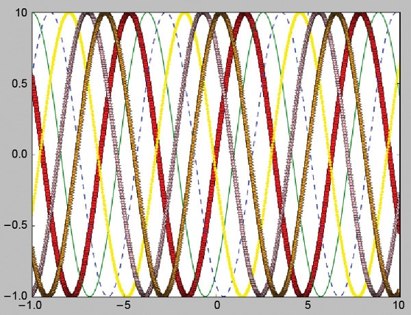
So far, we have only drawn lines in a single style without setting specific colours to specific lines in Matplotlib. But do not think that this is the limit of Matplotlib, which actually can do a lot of tasks with simple commands. In this section, we will look at how Matplotlib can use different styles and colours while drawing images. Consider the program plot4.py that uses different styles and colours while drawing the sine function, which we are already quite familiar with:
import matplotlib.pyplot as pt

import numpy as np

a = np.linspace(-10,10,1000)

pt.plot(a,np.sin(a-0),’o’,color=’red’)

pt.plot(a,np.sin(a-1),’-’,color=’green’)

pt.plot(a,np.sin(a-2),’--’,color=’blue’)

pt.plot(a,np.sin(a-3),’.’,color=’yellow’)

pt.plot(a,np.sin(a-4),’v’,color=’pink’)

pt.plot(a,np.sin(a-5),’>’,color=’orange’)

pt.show( )
This program prints six sine waves such that each is one point apart from the nearby sine waves. The only line of code that requires an explanation is:
pt.plot(a,np.sin(a-0),’o’,color=’red’)
This line plots a sine wave at a position a-0 with the marker ‘o’ in red colour. The remaining five lines also plot sine waves with different markers and different colours. There are other markers also available for use in Matplotlib like ^, <, +, etc. On executing the program, the output is the image shown in Figure 5.
Saving Matplotlib figures
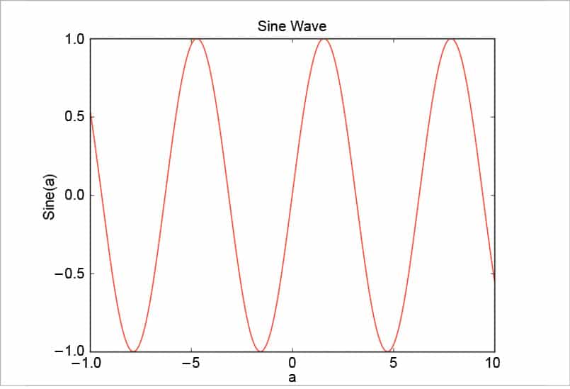
Now consider the program plot5.py shown below. It will save the figure generated by Matplotlib into a specific output format. The output formats supported by Matplotlib include eps, jpeg, jpg, pdf, pgf, png, ps, raw, rgba, svg, tif, tiff, etc. If you observe this list carefully, you will see that the output formats of Matplotlib include both raster graphics and vector graphics formats. Do remember that vector graphics clearly outperform raster graphics as far as image quality is considered, especially when enlarged to large sizes. Apart from Matplotlib, PGF/TikZ and PSTricks can also be used to create vector graphics. So, mastering any one of these tools will help you create good quality images, which is almost always a necessity while publishing journals and magazines. The program plot5.py also illustrates certain other necessary features of Matplotlib like setting plot labels and the plot title.
import matplotlib.pyplot as pt

import numpy as np

a = np.linspace(-10,10,1000)

fig = pt.figure()

pt.title(“Sine Wave”)

pt.xlabel(“a”)

pt.ylabel(“Sine(a)”)

pt.plot(a,np.sin(a),color=’red’)

fig.savefig(‘Image.png’)
The line of code:
fig = pt.figure( )
…creates a new figure. The line of code:
fig.savefig(‘Image.png’)
…saves the plot as Image.png. The line of code:
pt.title(“Sine Wave”)
…sets the title of the image as Sine Wave. The lines:
pt.xlabel(“a”)
…and:
pt.ylabel(“Sine(a)”)
…set labels on the x-axis and y-axis. On executing the program, plot5.py will not display any image on the screen, but will generate a file named Image.png on the same directory in which the program plot5.py is stored and executed. Figure 6 shows the image Image.png.
Histograms and scatter plots in Matplotlib
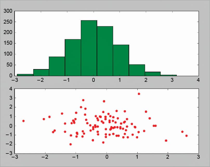
Consider the program plot6.py shown below, which will draw a histogram and a scatter plot using Matplotlib:
import matplotlib.pyplot as pt

import numpy as np

a = np.random.randn(1000)

b = np.random.randn(100)

c = np.random.randn(100)

pt.subplot(2,1,1)

pt.hist(a,color=’green’)

pt.subplot(2,1,2)

pt.scatter(b,c,marker=’o’,color=’red’)

pt.show( )
The line of code:
a = np.random.randn(1000)
…generates 1000 random numbers and stores them in the variable ‘a’. Similarly, the next two lines of code generate 100 random numbers each, and store them in the variables ‘b’ and ‘c’. This program also uses two sub-plots which we have seen earlier. The line of code:
pt.hist(a,color=’green’)
…plots a green histogram using the numbers in variable ‘a’. The line of code:
pt.scatter(b,c,marker=’o’,color=’red’)
…plots a scatter plot with the numbers stored in variables ‘b’ and ‘c’. On executing the program, plot6.py will give the image shown in Figure 7 as the output.
Though a number of important topics like 3D plotting using Matplotlib, Matplotlib tool kits, etc, have been left out, I am sure this introduction will motivate researchers and professionals into accepting Matplotlib as a powerful tool for scientific visualisation. Earlier, when we discussed the different output formats of Matplotlib, we came across a format called pgf. This is the format by which Matplotlib provides PGF/TikZ code to LaTeX. So, in the next article in this series on scientific graphics visualisation, we will discuss PGF/TikZ, yet another powerful graphics visualisation tool.


