


This tutorial will help you create a barcode generator app using App Inventor 2. It will be beneficial for readers joining now to refer to earlier issues to gain mastery over App Inventor 2.
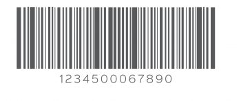
Barcodes are quite commonplace in daily life. Because of things going digital nowadays, you see the check-out counter staff in shopping complexes and malls scanning the barcode pasted on the product rather than manually entering the data about a particular item. A barcode is an image that has bars of varying thickness and spaces, and retains information within that pattern. Different barcode images will have different information written into them. We have handheld barcode readers or smartphones that decode the information written in a barcode. A barcode can have information in any form like, names, numbers, addresses, the price, quantity, etc. The more the information in a barcode, the more dense will be the arrangement of bars in the image.
In this article, we will make a barcode generator application using App Inventor 2. By now, readers will have gained sufficient experience and hands-on practice with this tool. If this is the first time you are reading an article in this series, you can very well learn from this point itself, without any prior programming or specialised knowledge. Apps developed with App Inventor can be uploaded to Google Play.
We can proudly say that we have mastered App Inventor in terms of the components that are available for use in the palette. And playing with the designer and block editor is a lot of fun.
Theme of the application
The theme is pretty simple and you probably have already got the idea from previous articles. We will make an Android application which will convert any written text to the barcode. The barcode generated can be saved to the SD or can be shared with other users via sharing components.
GUI requirement
For every application we have a graphical user interface or GUI, which helps the user to interact with the on-screen components. How each component responds to user actions is defined in the block editor section.
GUI requirements for Screen 1
1. Label: Labels are static text components that are used to display some headings or markings on the screen.
2. Button: A button will let you trigger the event and is a very essential component.
3. Horizontal Arrangement: This is a special component that keeps all the child components horizontally aligned within themselves.
4. Notifier: This is used to display some instructions or give controls over your existing components. You will be able to explore its functionality in more detail as we implement it in our game.
5. Canvas: This is the component for drawing and animation. You can place various animation objects over Canvas to control them via user actions. We will look at more details as we work with the application.
6. Text Box: This is the component to take user inputs. Whatever text the user writes in the text box will be treated as input and can be used further. We will see more of it within the application itself.
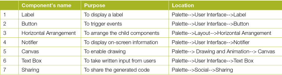
We will require the components listed in the table above for this application. We will drag them on to the designer from the left hand side palette.
1. Drag and drop the components mentioned in the table above, to the viewer.
2. Visible components can be seen by you while the non-visible components will be located beneath the viewer under the tag ‘Non-visible’.
3. We have placed a label to fill in the name of the application.
4. All buttons need to be put within the Horizontal Arrangement to keep them aligned horizontally.
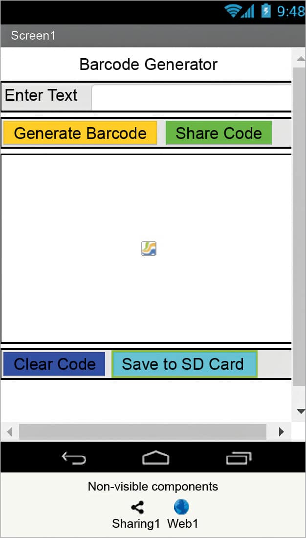
5. If you have dragged and placed everything, the layout will look something like what’s shown in Figure 1.
6. Make the necessary property changes, like we did when changing the text property for the label and button components.
7. Renaming the components helps to identify them in the block editor.
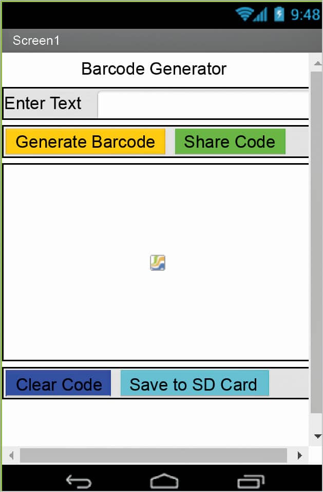
8. So this way, your graphical user interface is ready. Figure 2 shows how the application will look after installation to the device.
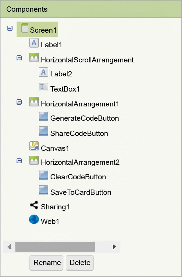
9. Figure 3 gives the hierarchy of the components that we have dragged to the designer.
If you are confused after seeing the designer and the components viewer, let me explain further. Here is the hierarchy that we have placed for our application.
1. At the top, we have the title of our application. It’s always a good practice to name your application and show it on the screen as well. We have put a label for it and have set its text property to the name of the application.
2. Below that we have a name label and textbox for users to type in their text. We will use this text to generate the barcode.
3. Next, we have two buttons aligned horizontally. One button will be used to trigger the event of generating code, while the other will trigger the sharing component to share it with others.
4. Next, we will display our generated barcode over the canvas area.
5. Next, there is a button to clear the canvas.
6. A Save button saves the generated image to the SD card.
7. There are sharing and Web components for respective functions.
Now, let’s head towards the blocks editor to define the various kinds of behaviour. We need to discuss the actual functionality that we are expecting from our application.
1. First, the user will be writing a text into the text box.
2. On clicking the ‘generate code’ button, it should call the Web API to return the generated code.
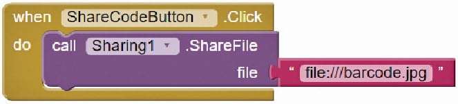
3. On clicking the ‘Share code’ button, a list should pop up with all the sharing applications being available on the device like Bluetooth, WhatsApp, Shareit, Xender, etc.
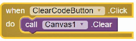
4. The Clear code button should clear the canvas image.
5. The Save to SD card button should save the image to the SD card.
So let’s move on and add these behaviours, using the block editor. I hope you remember how to switch from the designer to the block editor. There is a button available right above the Properties pane to help you do this.
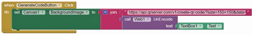
Block editor blocks: I have already prepared the blocks for you. All you need to do is drag the relevant blocks from the left side palette and drop them on the viewer. Arrange the blocks in the same way as shown in Figure 4. I will explain each one, telling you what it does and how it is called.
On clicking the ‘Generate code’ button, we are calling the Web API located at https://api.qrserver.com/v1/create-qr-code/?size=150×150&data=. By using the REST procedure of the Web component, we will receive the image from the URL source and the same will be set as an image on the canvas.
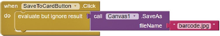
Let’s save the image to the SD card with a common name. If the file name already exists in the SD card, it will overwrite the previous file to create a new one. Using the sharing component, we will pick the file stored in the SD card.
On clicking the ‘Clear code’ button, the canvas image should be cleared.
On selecting ‘Save to SD card’, the image should be saved to the SD card with the name barcode.jpg.
Packaging and testing: To test the app, you need to get it on your phone. First, you have to download the application to your computer and then move it to your phone via Bluetooth or USB cable. I’ll tell you how to download it.
1. On the top row, click on the Build button. It will give you an option to download the APK to your computer.
2. You will be able to see the progress of the download, and after it has been successfully completed, the application will be placed in the download folder of your directory or the location you have set for it.
3. Now you need to get this APK file to your mobile phone either via Bluetooth or via USB cable. Once you have placed the APK file in your SD card, you need to install it. Follow the on-screen instructions to install it. You might get some notification or warning saying, ‘Install from un-trusted source’. Allow this from the settings and after successful installation, you will see the icon of your application in the menu of your mobile. Here, you will see the default icon, which can be changed and we will tell you how to do that as we move ahead in this course.
I hope your application is working exactly as per your requirements. Now, depending upon your usability and customisation, you can change various things like the image, sound and behaviour, as well.
Debugging the application: We have just created the prototype of the application with very basic functionality but what else might the user be interested in? Now come various use cases, which require serious attention so as not to annoy the user, and your app should be able to address these. Consider the following cases:
1. Can we think of a way to store files with unique names?
2. If we are saving multiple codes to the SD card, can we ask the user to browse a particular image and then share it?
3. Can we extend the same application to read the barcode as well?
These are some scenarios that might occur and users will be pretty happy seeing these implemented.
Think about these scenarios, and how you can integrate them into the application. Do ask me if you fail to address any of the above cases.
You have successfully built another useful Android app for yourself. Happy inventing!


