


Visualisation of large and complex data can help to understand it much better. Python’s Seaborn library is an excellent resource for data visualisation and offers a wide range of options.
We are flooded with data today, and so much information and insights can be obtained from it. However, data can always be understood better when we visualise it. Data visualisation can transform complex and big data into easily understandable representations that are also visually attractive, like charts and graphs. Visualisation is also helpful while presenting the data and its findings to stakeholders and business partners, who may not have much technical knowledge. It helps identify anomalies and outliers too.
Python is a widely used programming language in data science and data visualisation. Seaborn is one of the most popular libraries in Python that helps us visualise data easily. It is built on top of matplotlib, which is a lower-level library for visualisation. We will understand the various functionalities of Seaborn in this article.
We will be using the Google Colab notebook as the IDE here. You can run the same code in any other IDE, like VS Code or PyCharm.
Now let us get started. You can access Google Colab from http://colab.research.google.com. Click on the new notebook and open it as shown in Figure 1.
Install the library using the following command:
pip install seaborn
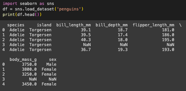
We will be using a very unusual dataset to explore this library — a dataset about penguins! Sounds interesting, right? This dataset is available in the Seaborn library itself. We’ll see how we can import and use it. There are many features in this dataset like the length and width of the penguins’ beaks, their gender, which island they belong to, etc.
import matplotlib
import scipy
import seaborn as sns
import pandas as pd
Now let us import the required libraries. These would have been installed along with Seaborn. The penguin dataset can be imported using the code given in Figure 2, and we can also see the top few rows in this figure.
Let’s start the data visualisation. The first step is to set the context and let our library know the IDE we are using, because each IDE and user interface may have different parameters and this may make the visualisations look different. These minor details are very important in data visualisation, as we are trying to make the graphs and visuals more understandable and useful.
So how do we let Seaborn know that we are using a Google Colab/Jupyter notebook? This is done using the following line.
sns.set_context(“notebook”)
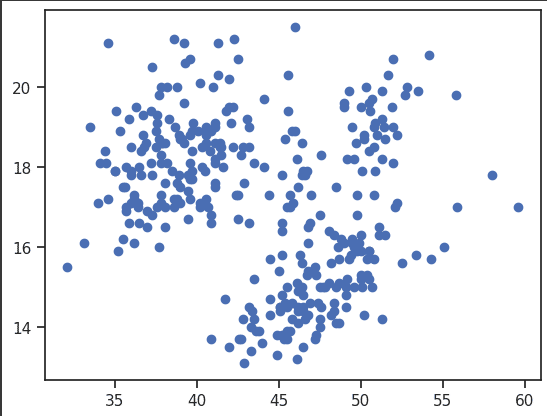
Now let us plot a graph of the width and length of the penguin beaks. For this, use the following code, which will generate a scatter plot. (A scatter plot is used to identify the patterns and the correlations between two features.) The output for the code given below is shown in Figure 3.
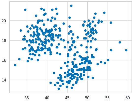
from matplotlib import pyplot as plt
import seaborn as sns
sns.set_context(“notebook”)
plt.scatter(df.bill_length_mm,df.bill_depth_mm)
plt.show()
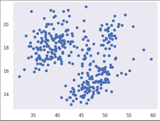
As we discussed earlier, it is important to improve the look and the aesthetic quality of our visualisations. We can do that using the set() function as shown below.
sns.set_context(“notebook”)
plt.scatter(df.bill_length_mm,df.bill_depth_mm)
sns.set()
plt.show()
This will add a grey grid in the background of the graph.
Let us now add a white grid in the background as shown below:
sns.set_context(“notebook”)
plt.scatter(df.bill_length_mm,df.bill_depth_mm)
sns.set_style(“whitegrid”)
plt.show()
If you want a dark background to see the graph better, use the following code (Figure 4).
plt.scatter(df.bill_length_mm,df.bill_depth_mm)
sns.set_context(“notebook”)
sns.set_style(“dark”)
plt.show()
Now if we want to add ticks in our graph to make it look better, we can use the following code (Figure 5):
sns.set_context(“notebook”)
plt.scatter(df.bill_length_mm,df.bill_depth_mm)
sns.set_style(“ticks”)
plt.show()
We can format the grid by using the code given below:
sns.set_context(“notebook”)
plt.scatter(df.bill_length_mm,df.bill_depth_mm)
sns.set_style(“darkgrid”, {‘grid.color’: ‘red’})
sns.despine()
plt.show()
Colouring the grid and formatting it can make the graph more understandable and insightful. Seaborn, as we have been seeing, is a very good and creative library. It has many different colour palettes that can be very helpful to make the visualisation more attractive. See the code below (Figure 6).
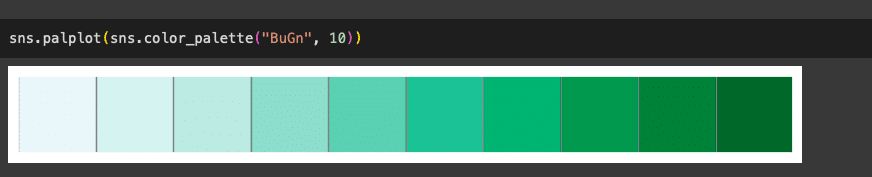
sns.palplot(sns.color_palette(“BuGn”, 10))
We can separate multiple classes using different colours as shown in Figure 7. You can use the code given below for this.
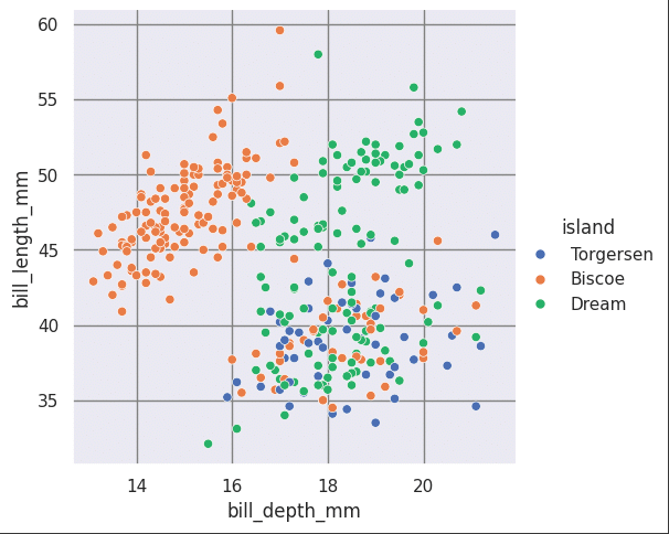
sns.relplot(data=df, x=”bill_depth_mm”, y=”bill_length_mm”, hue=”island”)
We can also separate classes based on a fourth feature, as shown in Figure 8.
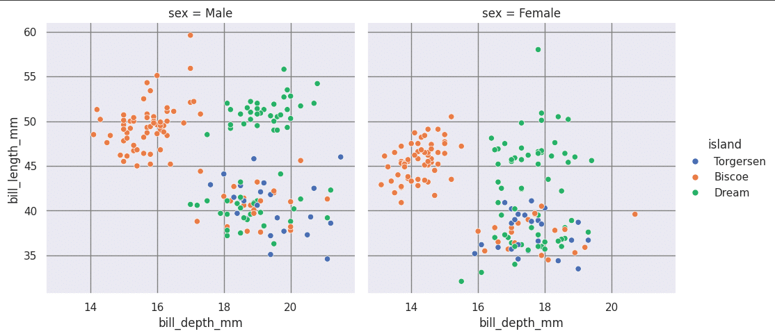
sns.relplot(data=df, x=”bill_depth_mm”, y=”bill_length_mm”, hue=”island”, col=”sex”, col_wrap=2)
There are many other kinds of graphs and visualisations in Seaborn. Let us look at a few of them now. The first one we will be looking at is the line graph. If you are familiar with basic statistics, you would know that a line graph uses lines to connect data points, showing how one data variable changes over a continuous interval of another variable. This can be done with Seaborn using the code given below (Figure 9).
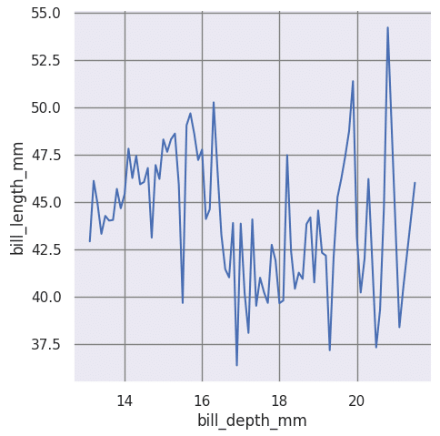
sns.relplot(data=df, x=”bill_depth_mm”, y=”bill_length_mm”,kind=”line”,ci=None)
Let us now look at the bar graph. Often referred to as a bar chart, it uses rectangular bars to compare distinct categories or groups of data. Each bar’s length represents the quantity of a category, making it effective for illustrating magnitudes and comparisons between different groups. This can be done by using the code given below:
sns.set_context(‘notebook’)
sns.barplot(x = ‘island’, y = ‘bill_length_mm’, data = df,ci=None
)
plt.legend()
plt.show()
A histogram is another interesting graph form. It is similar to a bar graph but the intervals are connected and continuous, frequencies are predefined, and the data is not categorical. The code given below can be used to create a histogram using Seaborn (Figure 10).
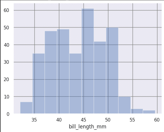
sns.distplot(df[‘bill_length_mm’],kde = False)
Now let’s look at a heatmap, which represents the correlation between each feature and another feature or variable, and helps us get a larger picture of the entire dataset. This can be done using the following code (Figure 11).
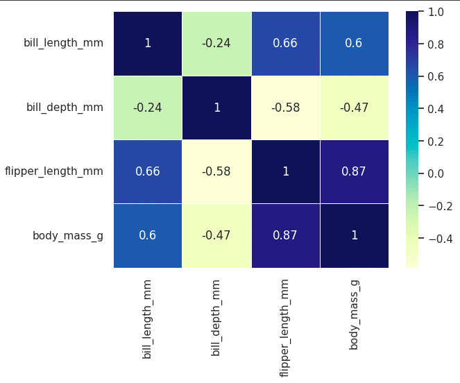
import seaborn as sns
corr=df.corr()
sns.heatmap(corr,annot=True,linewidths=.5,cmap=”YlGnBu”)
The next graph we are going to look at is called a violin plot. It is named so because the graph looks like a violin, and shows the range as well as the frequency of each of the groups. We can get an understanding of the entire group at once. This can be done using the following code (Figure 12).
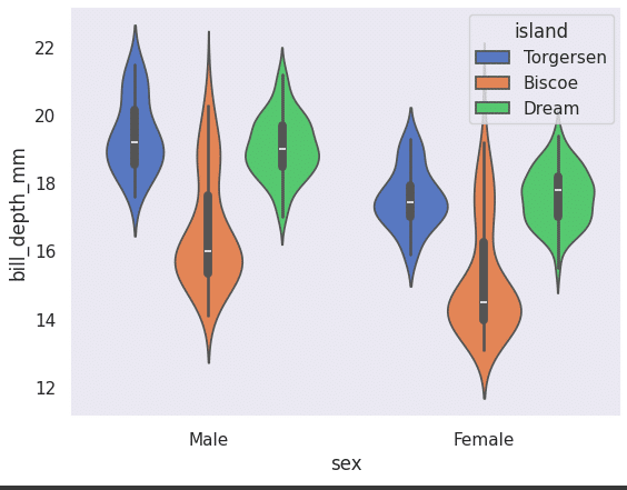
sns.violinplot(x=”sex”, y=”bill_depth_mm”, hue=”island”,
data=df, palette=”muted”)
A box plot tells us a lot about a feature/variable. We can get to know the range, lowest point, highest point, median and the quartiles using this plot. This can be plotted using the following code (Figure 13):
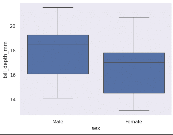
sns.boxplot(x=”sex”, y=”bill_depth_mm”, data=df)
A regression plot is a scatter plot that also has the regression line. This helps us understand data trends and figure out if a regression algorithm would be helpful to fit the data and train it for an ML model. This can be drawn using the following line of code. Figure 14 shows what the graph looks like.
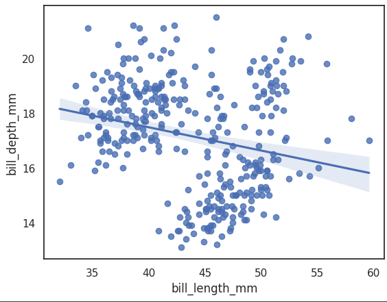
ax = sns.regplot(x=”bill_length_mm”, y=”bill_depth_mm”, data=df)
A joint plot is used to create a visualisation that combines univariate (histograms or kernel density estimates) and bivariate plots (scatter or regression plots) for two variables in a dataset. This can be plotted using the code shown below:
import seaborn as sns
import matplotlib.pyplot as plt
sns.set_style(“white”)
sns.jointplot(x=’bill_depth_mm’, y=’bill_length_mm’,data=df)
We can also use the ‘hex’ kind to create a type of heatmap using hexagons as shown below (Figure 15).
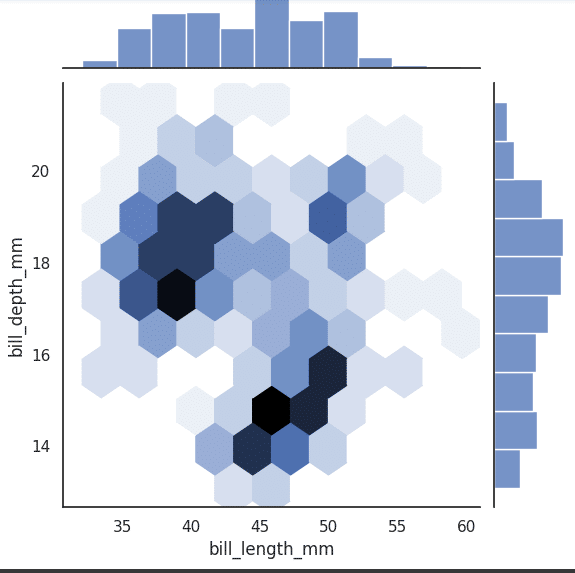
sns.jointplot(x=’bill_length_mm’, y=’bill_depth_mm’, data=df, kind=’hex’)
Pointplot is a function in the Seaborn data visualisation library for Python. It is used to create a point plot, which is similar to a line plot but displays the mean or central tendency of a quantitative variable at different levels of one or more categorical variables. Point plots are useful for showing comparisons between different groups or categories. These can be plotted using the following code (Figure 16).
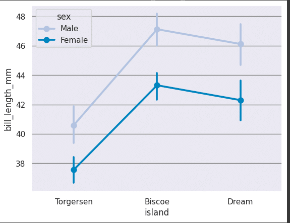
sns.pointplot(x=”island”, y=”bill_length_mm”, hue=”sex”,
data=df, palette=”PuBu”)
In some cases, a horizontal bar plot may be more understandable and the following code can be used for it. Refer to Figure 17.
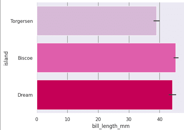
sns.barplot(x = ‘bill_length_mm’, y = ‘island’, data = df,
palette = ‘PuRd’, orient = ‘h’,
If you want to get an overall picture of the entire dataset, you can use the following command. This will generate different paired plots between different features and give us an overall view of the dataset with respect to a category. It can be used with a set of features multiple times to get a full view. Which features are related (and how they are related) can be understood easily as shown in Figure 18.
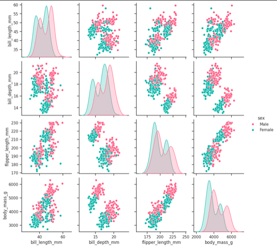
sns.set_style(“ticks”)
sns.pairplot(df,hue = ‘sex’,diag_kind = “kde”,kind = “scatter”,palette = “husl”)
This is it. You now have a basic working knowledge of data visualisation and the open source Seaborn library of Python. You can refer to the official documentation for more details and information. It will help you to get more creative and make beautiful visualisations that anyone can understand easily!!


