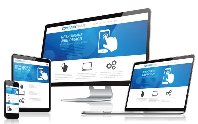
Responsive Web design is what makes pages render well on a variety of devices and screen sizes. In the current scenario, every customer expects a responsive website that is compatible with all devices, especially mobiles and smartphones. This article takes a quick look at some of the most popular RWD frameworks.
Responsive Web Design (RWD) involves the use of HTML and CSS to automatically resize, hide, shrink and enlarge a website to make it look good on all devices—desktops, tablets and mobiles.
A responsive design uses a fluid grid structure so that all page elements are sized by proportion rather than pixels. So if you have a four-column structure in your page, we can divide the website into a four-grid structure (how the website is rendered also depends on every column’s width). Suppose we have two columns that are wider than the other two, we divide the first two columns across 40 per cent of the width of the screen and the other two across 20 per cent of the screen’s width.
In responsive design, the image is sized for clarity on all devices. The viewport is the most determining factor of RWD. A viewport is the visible area of a Web page on the user’s device. In creating a RWD, the header of the HTML page mentions the viewport in the meta tag as:
<meta name=”viewport” content=”width=device-width, initial-scale=1.0”>
A <meta> viewport element gives the browser instructions on how to control the page’s dimensions and scaling.
The ‘width=device-width’ value sets the width of the page to adjust the screen-width of the device (which will differ depending on the device type). The ‘initial-scale=1.0’ value sets the initial zoom level when the page is first loaded by the browser.
In responsive design, the grid layout, which often has 12 columns and has a total width of 100 per cent, is very helpful; it automatically shrinks and resizes according to the browser window width. For design, any RWD gives first preference to mobiles, then to tablets and after that, to desktops.
Responsive Web design framework
Let us discuss some popular frameworks to create RWD, which look good and are easy to render to all devices.
Previously, RWD websites were created by writing a media query with the help of HTML and CSS. In a media query, we first add class in HTML based on the device’s requirement. Then we mention the column, write breakpoints in, and add CSS in the CSS file with the help of @media.
For example: If the browser window is 600px or smaller, the background colour should be blue:
@media only screen and (max-width: 600px) {

body {

background-color: blue;

}

}
When the screen (browser window) gets smaller than 768px, each column should have a width of 100 per cent:
/* For desktop: */

.col-1 {width: 8.33%;}

.col-2 {width: 16.66%;}

.col-3 {width: 25%;}

.col-4 {width: 33.33%;}

.col-5 {width: 41.66%;}

.col-6 {width: 50%;}

.col-7 {width: 58.33%;}

.col-8 {width: 66.66%;}

.col-9 {width: 75%;}

.col-10 {width: 83.33%;}

.col-11 {width: 91.66%;}

.col-12 {width: 100%;}

@media only screen and (max-width: 768px) {

/* For mobile phones: */

[class*=”col-”] {

width: 100%;

}

}
Nowadays, a RWD framework can be easily downloaded and be added to the code, or be directly integrated as a cloud link or CDN link in the code. Thus, less code is written and the website looks good and responsive, as per current requirements.
Now, let’s get acquainted with some popular RWD frameworks.
Bootstrap
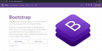
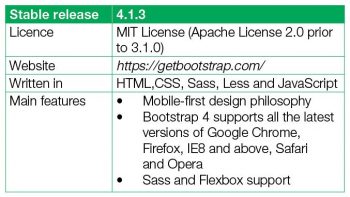
Bootstrap is one of the most popular open source HTML, CSS and JS front-end frameworks. Its latest available version is 4.1.3. In Bootstrap, a 12-grid responsive layout is available, apart from 13 jQuery plugins, SCSS (which is common for UI like carousals), pop-ups, modals, and other customised Bootstrap classes. Bootstrap is easy to learn and is used for creating responsive websites.
There are two methods to install Bootstrap in your project.
1. Bootstrap package installation using npm requires you to use the following code:
npm install bootstrap // if we write only bootstrap then its install latest

version of bootstrap

npm install bootstrap –v 3.0.0 (if you install specific version of bootstrap)
 2. The CDN method: When you are only using CSS and JS, you can use this method.
i) For CSS, add the CDN link in your head section, as follows:
<link rel=”stylesheet” ref=”https://stackpath.bootstrapcdn.com/bootstrap/4.1.3/css/bootstrap.min.css” integrity=”sha384-MCw98/ SFnGE8fJT3GXwEOngs V7Zt27NXFoaoApmYm81 iuXoPkFOJwJ8ERdknLPMO” crossorigin=”anonymous”>
ii) For JS, Proper.js and jQuery, use the following code:
<script src=”https://code.jquery.com/jquery-3.3.1.slim.min.js”integrity=”sha384-q8i/X+965DzO0rT7abK41JStQIAqVgRVzpbzo5smXKp4YfRvH+8abtTE1Pi6jizo”crossorigin=”anonymous”>

</script>

<script src=”https://cdnjs.cloudflare.com/ajax/libs/popper.js/1.14.3/umd/popper.min.js”integrity=”sha384-ZMP7rVo3mIykV+2+9J3UJ46jBk0WLaUAdn689aCwoqbBJiSnjAK/l8WvCWPIPm49”crossorigin=”anonymous”>

</script>

<script src=”https://stackpath.bootstrapcdn.com/bootstrap/4.1.3/js/bootstrap.min.js”integrity=”sha384-ChfqqxuZUCnJSK3+MXmPNIyE6ZbWh2IMqE241rYiqJxyMiZ6OW/JmZQ5stwEULTy”crossorigin=”anonymous”>

</script>
If you don’t have much knowledge about HTML, CSS and JavasScript or jQuery, there’s no need to worry because the Bootstrap framework is easy to learn and use.
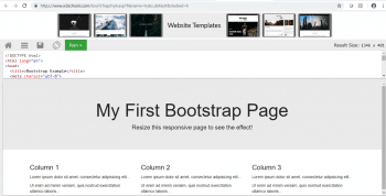
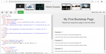
To try Bootstrap and execute it yourself, go to https://www.w3schools.com/booTsTrap/tryit.asp?filename=trybs_default&stacked=h.
Change the orientation and verify this yourself.
Semantic UI
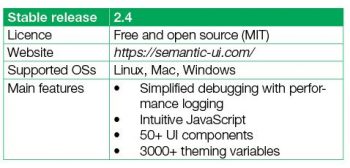
Semantic UI is basically used for 3D animation and provides various components for real-time debugging of output so that your code reveals what it’s doing in the mobile.
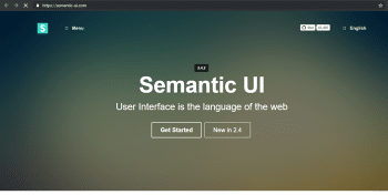
The Semantic UI framework is easy and provides an awesome user interface package using LESS. Semantic UI supports IE (9+), Chrome (latest), Firefox (latest) and Opera (12+). In this framework, we can disable state on icons and images that can be formatted in different sizes and colour codes.
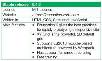
Foundation is another very powerful UI framework that is available as open source. It is a lightweight and scalable UI framework that’s used all over the Web. Foundation also provides the 12-column grid responsive layout. We can use Foundation in any CMS tool like Drupal.
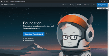
Foundation motivates us to write the best code for a good looking website. It abstracts repeatable elements in CSS, such as colour, margins, etc, into Sass variables.
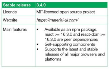
Material UI is the front-end framework for developing an RWD library that is compatible with Google’s features.
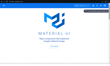
The Material UI CSS processor makes use of React components, and it is preferred by developers for optimising and customised Web design tools. This is the most popular React UI component.
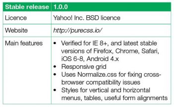
Pure.css is a CSS framework for developing a RWD. This is a small set of CSS modules. This framework is only used for mobile application development.
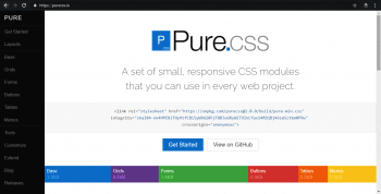
UI developers can use a wide array of styling, CSS parts as well as components, and the customisable tools used for mobile Web designs.
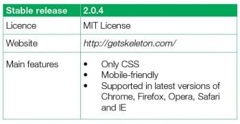
The Skeleton framework is used for small span websites. This framework is used in the rapid responsive development for any size; it is a very lightweight 960 grid that helps to create a responsive design for mobiles, tablets and desktops without compromising on the website quality.
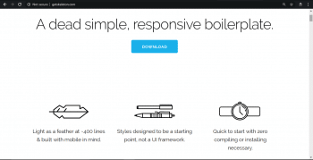
In Skeleton frameworks, we can use the basic UI elements such as forms, buttons, tabs and tables in an organised manner.
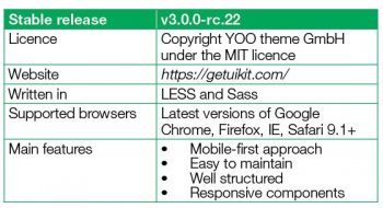
UI kit is a front-end framework that is built on Sass and the LESS pre-processor. It is very lightweight and is a combination of HTML, CSS and JS based small, responsive components using proper naming conventions without any conflicts. This framework is very simple, easy to use, customisable and extendable.
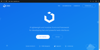
In this framework, built-in JavaScript commands such as pop-up modal dialogue and side navigation are available.
This framework is used for developing websites for any device.
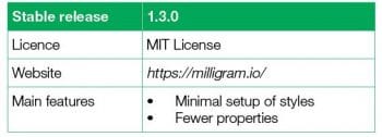
Milligram is a very lightweight framework for RWD. It occupies only 2KB of space. This program is based on Flexboxgrid modules.
Milligram has some basic components such as typography, buttons, lists, tables and block quotes.
Susy is one of the most powerful frameworks for RWD. It also supports a 12-grid layout and is helpful for quick calculations. Susy is very flexible and easy to develop for complex layout models.
 The only one drawback of this framework is that it doesn’t address all the requirements of website design; so other third party libraries are needed.


