A modern netbook is likely to have 150 GB of disk space, 1 GB of RAM, a screen resolution of 1024×800 pixels, and a wide range of connectivity options. It can hardly be called a minimalist device. Invariably, it will also be double the weight of the original EEEPC 701!
Also, a netbook screen is relatively small. Overlapping windows are a mess more often than not, and confuse users, rather than help them.
The operating system you choose for your netbook would really depend on what you want to use it for. The Ubuntu Netbook version is probably the most widely used. I opted for the 10.10 beta version with a new look and feel. MeeGo, promoted by Intel and Nokia, has been receiving a lot of attention. It boots very fast on an Atom CPU. A third option I found very exciting was KDE Plasma’s Netbook Workspace.
It is as simple as changing the theme on a standard desktop and the result is a very different interface. A common element of all three is that, usually, an application is opened in the full-screen mode. Each tries to increase the viewing area by removing the window decorations.
MeeGo
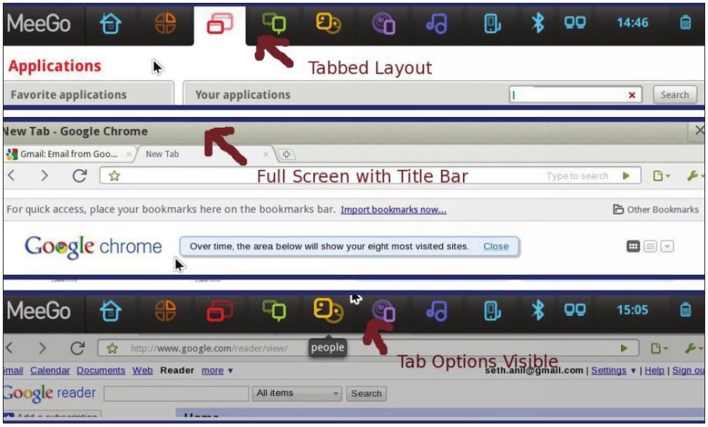
MeeGo organises the screen like a set of tabbed pages, with tab icons appearing in a horizontal bar at the top. The location and meaning of each tab is fixed. For example, the Time tab opens a calendar. The Applications tab lets you choose an application to start. Zones shows the open applications, and lets you switch between them. The Internet page shows a limited number of favourite Web pages. The People page shows your contacts.

An application starts in full-screen mode. The horizontal bar with tabbed options is hidden. Pushing the mouse against the upper edge of the screen displays the tabbed options. The title bar of the application has only one button, “X”, to close the application. Minimising or maximising does not have any relevance.
Usage is pretty simple and uncluttered. Getting used to the interface is not hard at all. Some applications, like games, did not open in full screen mode. In some cases, but not all, F11 would change it to the full-screen mode. However, the upper edge of the screen was then no longer active, which meant that it was not possible to display the options bar. F11 had to be pressed again in order to bring the display to normal size, and resume “normal” usage. Since the only button available to control the window is “X” (for closing the window), this behaviour seemed inconsistent and odd.
MeeGo uses RPM packages. A Fedora spin is in progress. Once that is available, the current limitation of the number of easily installable applications will disappear. I expect that the integration between GNOME and KDE applications and MeeGo window management will improve. It is, without doubt, an exciting interface.
KDE 4.5 Plasma Netbook Workspace
I opted for Arch Linux while exploring the KDE Plasma Netbook option; Kubuntu 10.10 beta is the easier option to explore it with. However, the Lenovo S10-3 would not boot with this version. The problem has since been resolved. The details, in case anyone is interested, are documented here.
There is an activity bar on the top. Aside from the status indicators of the netbook, it has a search and launch button. This shows you the page for selecting and starting an application. It is just like the KDE application launcher widget, but with a different interface.
When you launch an application, it uses the entire screen—it does not even waste space for a title bar. There are no window control buttons and the activity bar is hidden. As in the case of MeeGo, moving the mouse pointer against the upper edge of the screen displays the activity bar. The right-hand corner has an “X” button to close the window.
You can select the search and launch button to choose an alternate application. Clicking on the icon of the active application on the activity bar displays a list of the running applications, and you can switch to any. The usual desktop shortcuts like Alt+Tab may also be used.
A nice way of switching between running applications is by using active screen edges. It worked on Kubuntu Netbook 9.04; however, I could not get it to work on the current version of Arch Linux. Still, the Plasma netbook interface is evolving. We will wait and see.

The use of the full screen without even the title bar, as seen in the image, appealed to me a lot.
Ubuntu Netbook
Ubuntu’s new Netbook edition continues to use a panel on the top. In addition, it uses a vertical launcher on the left side. Since netbooks come in a wide-screen format, this is not a bad idea. The vertical application launcher is to keep icons of commonly used applications. It is similar to the dock bar of Mac OSX. When an application is launched, an icon is added to the vertical bar. You can keep it in the dock to be used in future conveniently.
Clicking on an icon starts the application, or brings it to the foreground, if it is already running. The icons are large enough to be useful with a touch screen. The use of the panel on the top is interesting (Figure 3). The status information about the machine is retained.
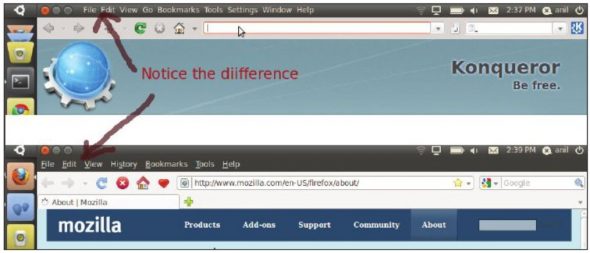
Icons for controlling the active window are displayed in the same panel. For the standard GNOME and KDE applications, the menu bar is also displayed in the panel, as the Konqueror example shows. However, the menu bars of applications like Firefox and OpenOffice are not extracted and displayed in the panel. I am not sure whether this is a current limitation, or cannot be avoided. Chrome does not have a menu bar. I found this interface offered the least surprises to a desktop user.
Verdict?
Each OS interface includes searching for an application to start it. Each offers a chance to store commonly used applications for convenient access. And each offers the applications in logically defined groups as well, like a traditional menu. It is tough to decide. I could use and switch between the three with little difficulty. Ubuntu Netbook offers the easiest way to start a “favourite” application. It is also the simplest for switching between active applications. A Linux desktop user is likely to feel comfortable with the Ubuntu Netbook edition.
The MeeGo interface seems remarkably streamlined. Even the top bar does not overwhelm a user with tightly packed information. It is difficult to imagine even a novice getting confused by it (except if games do not use all the available screen space).
Unlike Ubuntu and KDE, MeeGo shows the title bar of an application. I found the missing title bar disconcerting in the beginning, on KDE in particular, but got used to it quickly. However, I can imagine a user finding it difficult when selecting an application window from a list.
KDE’s Plasma netbook packs the power of KDE applications. The interface is sleek, simple and attractive. There’s a wealth of KDE add-ons available and “live” applications can be pinned to “Page One”. Personally, I may not use any of the add-ons, but I am likely to use the KDE netbook interface as the default. I find that the full-screen mode for applications minimises distractions, especially when reading or viewing media. I have always liked the full-screen interface of Sugar (OLPC).
Switching between application windows was the hardest with KDE. It would be nice if it was as easy as on Sugar — at the press of a function key. Currently, I expect to keep each of the three installed, and keep them updated. Maybe, after a year, one will become my definite favourite.


