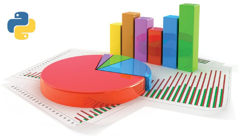
Data visualisation is an inevitable task, considering the prolific growth in the volume and nature of data that applications need to handle. In such a scenario, presenting data in the form of easy-to-comprehend visual representations increases its value. This article provides an introduction to five data visualisation libraries of Python.
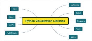
The extensibility of Python is one of the main reasons for its popularity among developers from a wide spectrum of domains. Invariably, all of these domains handle large volumes of data, and presenting this data in an easy-to-grasp format has become a mandatory requirement. Python is loaded with options when it comes to visualisation of data. Some of them are listed in Figure 1.
Each of these visualisation libraries has its own salient features. Depending on the context, specific libraries may be adopted for implementation. Moreover, some of these libraries are dependent on other libraries. For example, Seaborn is a statistical data visualisation library that uses Matplotlib, a visualisation library widely used by Python developers. This article presents an overall view of five visualisation libraries of Python, which are: Bokeh, Seaborn, Altair, ggplot and Pygal.
Bokeh
The Bokeh visualisation library is aimed at building interactive graphical representations. These are rendered in Web browsers. The visualisation rendered using Bokeh is in line with D3.js in terms of style. High performance and interactivity, even with large datasets, are important features of this library.
The official documentation recommends the use of the Anaconda Python distribution to set up Bokeh effortlessly, using the following command:
conda install bokeh
Nevertheless, Anaconda is not a mandatory requirement to install Bokeh. If the dependencies are satisfied, it can be installed using Pip as well.
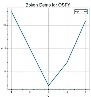
As stated earlier, making plots with Bokeh is very simple. The following code snippet is to build a simple line graph and render it in a browser:
from bokeh.plotting import figure, output_file, show

# 1. Load some data in X,Y variables
x = [1, 2, 3, 4, 5]
y = [23, 15, 7, 12, 21]

# 2. Specify the name of the output HTML file
output_file(“lines.html”)

#3. create a new plot with a title and axis labels
p = figure(title=”Bokeh Demo for OSFY”, x_axis_label=’x’, y_axis_label=’y’)

#4. add a line renderer with legend and line thickness
p.line(x, y, legend=”Age”, line_width=3)

#5. show the results
show(p)
The output of the above code is shown in Figure 2.
The major steps involved in building a plot with Bokeh are listed below:
- Load the data required for plotting in variables.
- Specify the name of the output HTML file. The visualisation built with Bokeh will be saved as an HTML file and the output loaded in the browser.
- Use the figure() function to build a plot with options.
- Specific graphs can be constructed using a renderer. In the earlier-mentioned example, the renderer used is Figure.line.
The final step is to call the show() or save() function.
The concepts involved in building visualisations using Bokeh are:
- Plot
- Glyphs
- Guides and annotations
- Ranges
- Resources
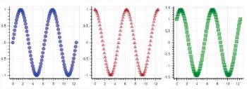
Bokeh facilitates linking various factors of different plots, which is referred to as linked panning. Here, some components are shared across multiple plots. Changing the range of one plot will update other plots as well. The sample code is given below and its output is shown in Figure 3.
import numpy as np
from bokeh.layouts import gridplot
from bokeh.plotting import figure, output_file, show
# prepare some data
N = 100
x = np.linspace(0, 4*np.pi, N)
y0 = np.sin(x)
y1 = np.cos(x)
y2 = np.sin(x) + np.cos(x)
# output to static HTML file
output_file(“linked_panning.html”)
# create a new plot
s1 = figure(width=250, plot_height=250, title=None)
s1.circle(x, y0, size=10, color=”blue”, alpha=0.5)
# NEW: create a new plot and share both ranges
s2 = figure(width=250, height=250, x_range=s1.x_range, y_range=s1.y_range, title=None)
s2.triangle(x, y1, size=10, color=”firebrick”, alpha=0.5)
# NEW: create a new plot and share only one range
s3 = figure(width=250, height=250, x_range=s1.x_range, title=None)
s3.square(x, y2, size=10, color=”green”, alpha=0.5)
# NEW: put the subplots in a gridplot
p = gridplot([[s1, s2, s3]], toolbar_location=None)
# show the results
show(p)
Altair
Altair is based on the declarative statistical visualisation approach available for Python. It is based on the high-level Vega-Lite visualisation grammar that provides JSON syntax for the production of visualisations.
Altair installation with Conda can be carried out with the following command:
conda install altair --channel conda-forge
Altair has a very simple-to-use API. As the official documentation highlights, Altair enables the developer to build elegant visualisation with very minimal code.
from altair import Chart, load_dataset

# load data as a pandas DataFrame
cars = load_dataset(‘cars’)

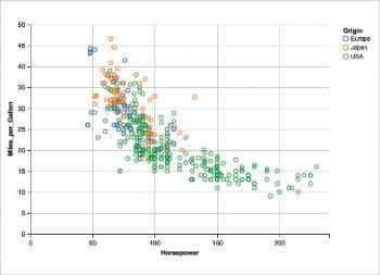
Chart(cars).mark_point().encode(
x=’Horsepower’,
y=’Miles_per_Gallon’,
color=’Origin’,
The output of the above code is shown in Figure 4. The data source is DataFrame.
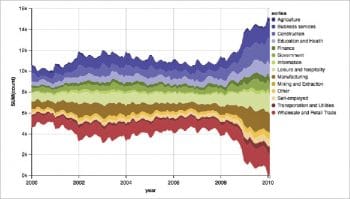
The major benefit of using Altair is that the developer has to specify only what is required and does not have to specify how to produce it. Altair has features to render various types of charts. For example, a code-snippet to produce a Streamgraph is shown below and its output is shown in Figure 5.
Chart(data).mark_area(stacked=’center’).encode(
X(‘date:T’, timeUnit=’yearmonth’,
axis=Axis(format=’%Y’, labelAngle=0, title=’year’)),
Y(‘sum(count)’),
color=Color(‘series:N’, scale=Scale(range=”category20b”))
)
Seaborn
The Seaborn library is aimed at building informative statistical graphics in Python. It is built on top of Matplotlib. Seaborn also has tight integration with the PyData stack. The major features of the Seaborn library are:
- The availability of various built-in themes, which help in improving the aesthetics of the visualisation.
- The support for various statistical features such as linear regression models and functions to plot statistical time series.
Seaborn can be installed easily with the following command:
pip install seaborn
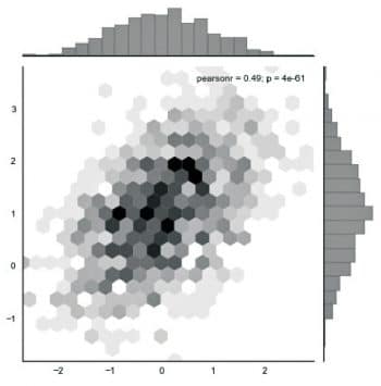
It provides options to build a variety of graphs. The Hexbin plot-building source code is shown below:
x, y = np.random.multivariate_normal(mean, cov, 1000).T
with sns.axes_style(“white”):
sns.jointplot(x=x, y=y, kind=”hex”, color=”k”);
The output of the above code is shown in Figure 6.
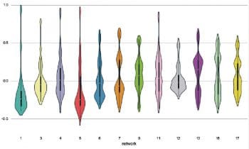
A Violin plot made with Seaborn is shown in Figure 7. The source code is shown below:
import seaborn as sns
import matplotlib.pyplot as plt
sns.set(style=”whitegrid”)

# Load the example dataset of brain network correlations
df = sns.load_dataset(“brain_networks”, header=[0, 1, 2], index_col=0)

# Pull out a specific subset of networks
used_networks = [1, 3, 4, 5, 6, 7, 8, 11, 12, 13, 16, 17]
used_columns = (df.columns.get_level_values(“network”)
.astype(int)
.isin(used_networks))
df = df.loc[:, used_columns]

# Compute the correlation matrix and average over networks
corr_df = df.corr().groupby(level=”network”).mean()
corr_df.index = corr_df.index.astype(int)
corr_df = corr_df.sort_index().T

# Set up the matplotlib figure
f, ax = plt.subplots(figsize=(11, 6))

# Draw a violinplot with a narrower bandwidth than the default
sns.violinplot(data=corr_df, palette=”Set3”, bw=.2, cut=1, linewidth=1)

# Finalize the figure
ax.set(ylim=(-.7, 1.05))
sns.despine(left=True, bottom=True)
ggplot
ggplot is a visualisation library that is based on ggplot2 of R. The plotting approach used in ggplot is based on Grammar of Graphics. ggplot is simple to learn. It can be installed using the Pip command as shown below:
pip install ggplot
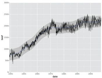
A code snippet to build a plot using ggplot is shown below and the output is shown in Figure 8:
from ggplot import *

ggplot(aes(x=’date’, y=’beef’), data=meat) +\
geom_line() +\
stat_smooth(colour=’blue’, span=0.2)
Pygal
Pygal is a simple visualisation library available in Python. The Pygal library can be installed using Pip.
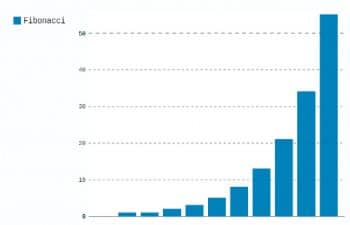
Building plots with Pygal is fairly straightforward. A code snippet to build a simple bar graph is shown below, and the output is shown in Figure 9.
import pygal
bar_chart = pygal.Bar()
bar_chart.add(‘Fibonacci’, [0, 1, 1, 2, 3, 5, 8, 13, 21, 34, 55])
bar_chart.render_to_file(‘bar_chart.svg’)
Some of the chart types supported by Pygal are listed below:
- Line
- Bar
- Histogram
- Pie
- Radar
- Box
- Dot
- Gauge
- Pyramid
- Treemap, etc.
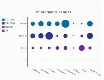
A sample code snippet to build a dot chart with Pygal is shown below and the output is shown in Figure 10.
dot_chart = pygal.Dot(x_label_rotation=30)
dot_chart.title = ‘V8 benchmark results’
dot_chart.x_labels = [‘Richards’, ‘DeltaBlue’, ‘Crypto’, ‘RayTrace’, ‘EarleyBoyer’, ‘RegExp’, ‘Splay’, ‘NavierStokes’]
dot_chart.add(‘Chrome’, [6395, 8212, 7520, 7218, 12464, 1660, 2123, 8607])
dot_chart.add(‘Firefox’, [7473, 8099, 11700, 2651, 6361, 1044, 3797, 9450])
dot_chart.add(‘Opera’, [3472, 2933, 4203, 5229, 5810, 1828, 9013, 4669])
dot_chart.add(‘IE’, [43, 41, 59, 79, 144, 136, 34, 102])
dot_chart.render()
This article has provided only an introduction to five plotting libraries available in Python. Each of these libraries has lots of features, which may be explored from the official documentation of the respective libraries. The choice of a particular library entirely depends on the nature of the task, the hardware and software ecosystem in which the task needs to be completed, and also the developers’ expertise.














[…] to let developers rapidly visualise and explore data sets. While visualising data sets at scale is quite difficult for individual programmers, a major user-engaged company like Uber can easily build and test an effective […]