
The key role of e-commerce development companies is to acquire and engage customers on their client’s websites. Here is how implementing the best UX patterns on e-commerce websites deliver an excellent customer experience.
New technology and online shopping have completely metamorphosed the buying behavior of consumers worldwide. For an e-commerce site owner, the competition is hard as nails. They have to think of a new idea every day to give consumers an innovative, more convenient and quicker way of buying from online stores. This certainly calls for finding and implementing the best UX patterns on your website.
Though there are many elements to consider, one of them includes the way of displaying products on the e-commerce site. This article focuses on three basic patterns of product display: pagination, infinite scrolling and a ‘Load more’ button. What is best liked by shoppers? You will get to know as you read further.
Infinite scrolling
As the name suggests, infinite scrolling hides or breaks the scrollbar and allows users to scroll through thousands of products or massive content on the same page. This results in an endless page that continues to load the content as the user continues to scroll. It is like a subliminal call to action, where the users do not have to do anything else but scroll. With providing passive loading of products, it is a modern and popular way of making websites users ‘stick’ to a page.
If we consider the benefits, infinite scroll increases the number of products a customer sees in one sitting, which results in an increased chance of selecting or choosing a product from the infinite list while widely improving customer experience.
For instance, Pinterest, the world’s largest catalogue of ideas, integrates infinite scroll effectively — displaying endless boards on one page. Since it is an enumeration of tons of ideas through images, Pinterest’s infinite scroll adheres visitors to a single page for hours.
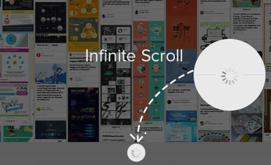
Infinite scrolling is immeasurably trending on blog websites, magazine sites and entertainment websites, displaying a whole slew of content because it does not bother the users to wait for the page to preload. Further, the website users enjoy a responsive behavior, whatever device they use.
However, there is a catch here. With so many products to browse, users lose focus on what they were actually searching for and end up buying nothing. They are lost in the stream of never-ending products. Sometimes, users are more satisfied with right results rather than infinite choices.
Etsy, a popular accessory and jewelry e-commerce marketplace, tested infinite scrolling on their website and observed fewer clicks than before. According to Etsy experts, it was unsuccessful because users felt off-track and could not effectively differentiate between the relevant and irrelevant (what they did not want).
So, it all depends on the type of website and amount of data you deal with. Undoubtedly, infinite scroll is the best choice for mobile sites. Clicking ‘next page’ links is bothersome on mobile phones; simply scrolling up and down is much easier and convenient.
The best examples of infinite scrolling pattern are Facebook, Twitter, Google Images, Slate (magazine: recently implemented). However, it is somehow less recommended for e-commerce websites. Do you know any of the e-commerce websites that display products through infinite scrolling?
Pagination
Classic and perennial, pagination is a one-size fits all approach. The largest e-commerce marketplace Amazon.com has a pagination pattern on its website. With pagination, you have a fixed start point and end point. This helps customers know what page exactly contains the type of products they want. They do not have to scroll endlessly but can control their searches. So, this sense of control causes a sense of completion that further results in contentment and happy buying.
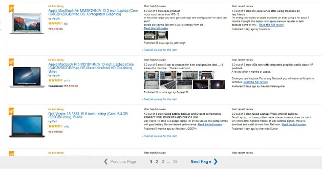
In the end, customer satisfaction is what generates ROI and conversions.
Pagination focuses on usability more than infinite scrolling. Simply put, it increases customer engagement because the user finds the right product from a limited collection on a page. More time is involved in decision-making rather than scrolling.
Google web search is the perfect example. Most times, people do not even click on the next page as the ten results on page one give them what they needed. Thus, the results are reachable.
In contrast, pagination leads to limited options, which sometimes disengage shoppers with a belief that there are no more options available, especially for the ones who visited to explore the collection. Also, loading a new page is burdensome; if you click on the wrong page, you have to wait for the page to load and then click on the right one. This becomes frustrating many times.
It has been observed that users love to scroll a high number of products that are more visual like furniture, apparel, home décor, footwear.
Load more button
Snapdeal, Flipkart, Crate&Barrel, Caratlane and various other renowned e-commerce websites enforce ‘load more’ on their product/catalogue pages. The concepts of the load more button and lazy loading are the most optimal ones found on e-commerce websites. Display 20-30 products on the immediate page load, then as the user scrolls down, ‘lazy load’ the next 30-50 and finally shows a ‘Load more/ View more/Show more’ button, which when clicked shows 30 more products and so on.
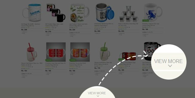
This is the most preferred choice among e-commerce stores as it helps them integrate scrolling with limited results. So, if customers did not find the right product in first 30 results, you can show them more in a lazy load pattern. But if the next 50 lazy loaded don’t work, you can offer them a ‘show more’ button. It is more of displaying plenty of products, and after a certain limit, display more on demand. The biggest UX benefit is that shoppers do not lose their focus on what they want to buy, resulting in a decent number of conversions.
But the pitfalls here are clicking ‘load more’ over and over, especially on your mobile screens. With mobile phone and tablets, customers need something to scroll. While some demand pagination, others ask for a load more button and very few demand infinite scrolling.
Clearly, infinite scrolling is best suited for websites that show immeasurable content for ardent readers like blog sites, magazine sites, entertainment sites like Facebook, Twitter. Conversely, pagination is a stellar selection, best suit for e-commerce stores, web searches, goal-oriented activities. You can add ‘load more’ to fit well for long content or product pages.
All in all, if implemented well, any of these three patterns can potentially boost user interaction and deliver a memorable customer experience.



















Great piece of information. E-Commerce is the leading platform for creating beautiful, intuitive E-Commerce websites. https://www.thinsquare.com/
Very good strategy for much familiar with the visitors of our site, all information are looking as very well analysed. Thanks for sharing with us