What do you think of when you read something like this: “Fixed over 10,000 bugs and implemented almost 2,000 feature requests in the last 6 months; close to 63,000 changes were checked in by a little under 700 contributors…”? Now, that’s what I call developers being really busy working on something solid.
Guess it’s time to start our journey with KDE 4.3.
The first thing you notice in this version is the brand new theme called Air. This replaces the default and darker Oxygen that’s been around since the inception of the KDE4 desktop. Air, by contrast, is a transparent white theme with nice stripes and spirals, which make it look quite appealing. Mind you, Oxygen is still available, besides various other themes that can be downloaded from KDE-Look.org by accessing the New Theme button from the Desktop Settings tool (you get it up by right clicking on an empty space on your desktop).
While we’re on the subject of Desktop Settings—this tool has also received some attention. First, you have another type of activity setting—apart from Folder View (the traditional desktop with icons), and Desktop (the default desktop containment introduced in KDE 4.1)—dubbed‘Plain Desktop’. It is basically a desktop without the toolbox you get on the top right corner to zoom-out of an activity and create new ones. Apparently, more activity types have been introduced, one of which can enable you to use your desktop screen as a whiteboard of sorts. However, I couldn’t figure out a way to install these. [Let us know if you can.]
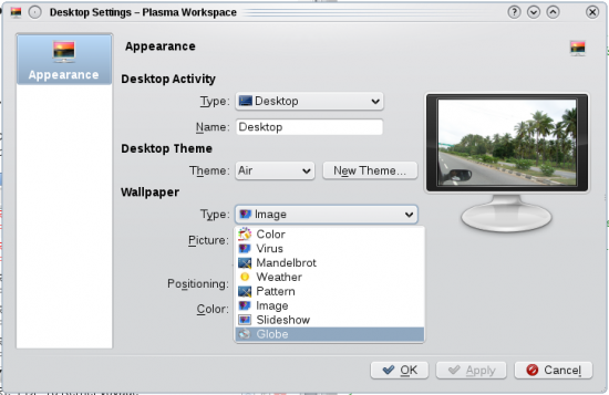
Another nice add-on under Desktop Settings is the additional wallpaper types—Virus, Mandelbrot, Weather and Globe, besides the slide show and patterns, which have been available for a while (Figure 1). Among these, I quite like the Globe add-on, which uses the Marble program to render an interactive glove as your desktop background.
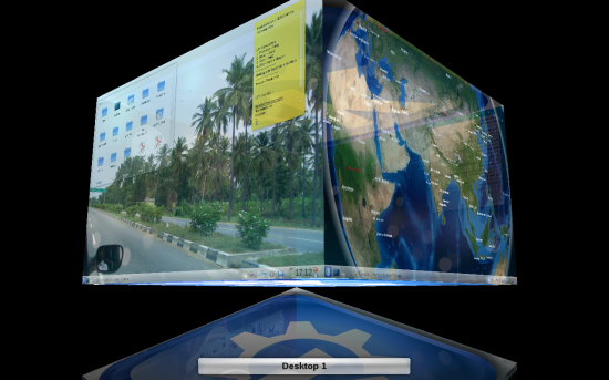
Another pleasant surprise is that now you can have different activities for different workspaces. If you are the type who uses a lot of widgets, and finds it difficult to fit all of these into one screen, in earlier versions you probably needed to switch between activities to set some other widgets that wouldn’t fit into your primary activity. However, let’s face it, switching between activities is not the easiest of jobs. With version 4.3, you can configure each workspace as a separate activity and thus have different widgets, wallpapers, etc, on different workspaces (see Figure 2)—and thankfully, switching between workspaces is much easier.
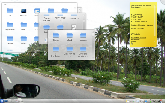
However, the best feature among the 50-odd widgets that come with KDE 4.3, is the new enhancement added to the Folder View widget, which prompted me to switch to my home directory as my default location from the ~/Desktop folder I have been using for a year. Now, hovering over a folder in Folder View lets me peak into the folder’s contents, thanks to an overlay effect (Figure 3). With this sort of feature now available, you don’t have to launch Dolphin to locate or access your files—just navigate the filesystem and access files straight from your desktop with a single (double) click.
To think about it, I must mention the inclusion of two widgets, the first of which is openDesktop. If you set the latitude and longitude on which you are located, this widget has the ability to show you other users who are nearby. However, for this to work, you need an account with opendesktop.org; besides, there’s not much you can do with the widget. It definitely shows some promise, and I won’t be surprised if it becomes a major contestant soon among the various social networking tools.
The second widget seems handy for those who like to plan their days with different tasks, et al. It’s called Remember the Milk, and its purpose is to keep you in sync with the RTM online service. Again, you need an online account to be able to use it. Besides these two, the Microblogging widget now has Identi.ca support, apart from Twitter.
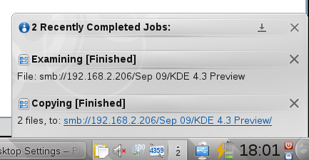
The system notifications have acquired some polish. Building on top of the notification system that was introduced in version 4.2, it now has a dedicated icon on the system tray. Running tasks now slide into this notification icon and are grouped together, not taking up too much of screen space. An animating icon signifies that jobs are still running. However, the ‘More’ and ‘Less’ buttons for notifications (for example, in the copy dialog), still need a lot of attention.
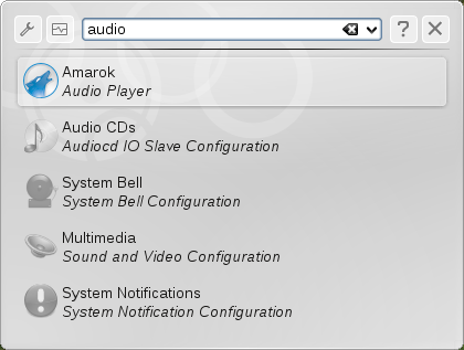
Coming to the various application enhancements, KRunner continues to improve. It now displays the search results as a list instead of as icons—the layout now gives it more room to display the application descriptions below their names. The option to run the apps as a different user is also back, which was available in the KDE3 series, but went missing in KDE4. Also, the addition of the help button (the ? icon) gives the user an idea of the different syntaxes that we can use. Earlier, it more or less depended on guesswork.
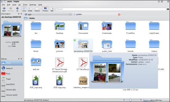
The Dolphin file manager now shows a slideshow of the images that are inside when you hover over a folder when using the file ‘Preview’ mode. A feature to play (preview) media files in the ‘Information’ pane has also been added.
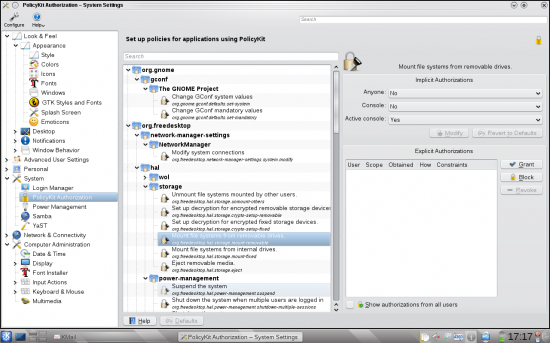
The optional tree-view is back in System Settings, reminiscent of KControl from KDE3, for those who need it. A major bug fix, I’d say, is the ability to configure items that require root-level changes (like, for example, KDM) from within System Settings. Any option that required root privileges used to be greyed out earlier—now it prompts for a root password instead. Also, PolicyKit has been integrated into the desktop and a module is made available here. With this you can fine-tune certain privileges. Like, for example, Dolphin usually lists all available partitions in the side pane, whether an entry has been set in the /etc/fstab file or not. However, in previous KDE versions, trying to access such a partition would result in a Not permitted error message. Now if you set the settings correctly in the PolicyKit module, you can give a normal user the privilege to mount these partitions.
All these are small add-ons, which makes 4.3 more of an incremental update rather than a major overhaul like its predecessors. There are, of course, numerous other enhancements; I’ve only listed the ones that drew my attention.
The most impressive factor is the overall stability of the applications and Plasma, and thereby the stability of the desktop as a whole. However good KDE4 has been till date, it’s always been a tad unstable compared to its predecessor or alternative desktop environments. Having used 4.3 since the RC1 release, I’ve hardly faced crashes. And when it does crash, the crash report tool has a button to restart whatever has crashed—provided it’s a KDE app.
The news is that work had already started on version 4.4 much before 4.3 was released; so expect many new additions in the version that comes out next January.































[…] You can read a what’s new in KDE 4.3 here. Email […]
i USE kde 4.3.1 and its awsome.. dont feel like going back 2 xp or gnome.. accessibility wise it has improved a lot
In KDE 4.3 we can turn On and Off the compositing in the Desktop Settings
This is very useful when doing very heavy tasks.
How do you know which KDE one is using currently? any command or file to see?
I dunno…I don’t even like the concept of switching from KDE 3.5 to KDE4.3 Anyways many new features introduced…crappy and buggy in the beginning and finally some stable version with less number of bugs.
The real idea is not KDE 4.3 but the Linux distro using KDE 4 in their spins actually they should thoroughly test and then release a distro. They should give less number of features but whatever they provide should be robust and shouldn’t break in case of any software updates.
Used so many distros after the release of KDE4 but switch to GNOME instead, with every distro the problem was either they were buggy or wud break after some update. The most stable KDE 4 distro according to me would be Mandriva 2010 and OpenSuSE 11.2.