A design language or design vocabulary is an overarching scheme or style that guides the design of a suite of complementary products or architectural settings. Designers wishing to give their suite of products a unique but consistent look and feel define a design language for it, which can describe choices for design aspects such as materials, colour schemes, shapes, patterns, textures or layouts. They then follow the scheme when designing each object in the suite. In simple words, software design is a set of guidelines, which provides or suggests the design aspects in your software for a consistent look across entire applications. Heres an example: the themes for all activities in Android have the same look and feel. Design languages are only guidelines; they are not rules. These guidelines are designed such that users broadly follow them, but one can surely innovate and bend all the rules of a design language. People tend to consider them hard and fast rules and never do anything outside those guidelines, which is not a good thing in developing engaging user interfaces. These guidelines were also generated by innovation.
The history of design languages
The concept of a design language has existed ever since the design of user interfaces. The most popular examples of software design languages are:
- Skeuomorphism
- Metro Design
- Flat Design
Skeuomorphism
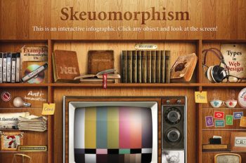
A skeuomorph is a derivative object that retains ornamental design cues from structures that are necessary in the original. In simple words, skeuomorphism enforces the UIs to be designed to look like the original object of the real world and behave in that way too. Many computer programs have a skeuomorphic graphical user interface that emulates the aesthetics of physical objects.
An example of this trend was the 1998 RealThings package. A more extreme example is found in many music synthesis and audio processing software packages, which closely emulate physical musical instruments and audio equipment. Functional input controls like knobs, buttons, switches and sliders are often careful duplicates of those found on the original physical device being emulated. Some software even include graphical elements of the original design that serve no user interface function, such as handles, screws and ventilation holes. Even systems that do not employ literal images of some physical object frequently contain skeuomorphic elements, such as slider bars that emulate linear potentiometers and tabs that behave like tabbed file folders.
Skeuomorphs need not be visual. The shutter-click sound emitted by most camera phones when taking a picture is an auditory skeuomorph; it does not come from a mechanical shutter, which camera phones lack, but from a sound file in the phones operating system. Another example is the swiping hand gesture for turning the pages or screens of a tablet. People who are in favour of this language argue that it makes it easier for those familiar with the original device to use the digital emulation by making certain affordances stronger. On the other hand, people opposing this design language say that it requires resemblance of the original object, so it limits the creativity of a programmer or of UI designers to design or try anything new in their interfaces.
Metro Design
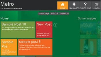
Metro is a typography- and geometry-focused design language created by Microsoft primarily for user interfaces. A key design principle is better focus on the content of applications, relying more on typography and less on graphics (content before chrome). Early examples of Metro principles can be found in Encarta 95 and MSN 2.0. The design language evolved in Windows Media Centre and Zune, and was formally introduced as Metro during the unveiling of Windows Phone 7. It has since been incorporated into several of the companys other products, including the Xbox 360 system software, Xbox One, Windows 8, Windows Phone, and Outlook.com under the names Microsoft Design language and Modern UI after Microsoft discontinued the name Metro supposedly because of trademark issues.
Flat Design
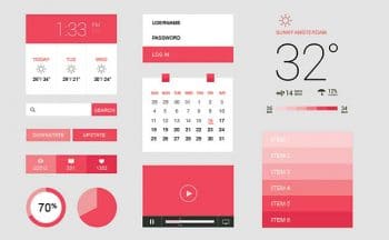
Flat Design is a minimalist UI design genre, or design language, currently used in various graphical user interfaces (such as websites or Web applications). Flat Design is a style of interface design without any stylistic elements that gives the illusion of three dimensions (such as excessive use of drop shadows, gradients or textures) and is focused on a minimalist use of simple elements, typography and flat colours. Designers may prefer Flat Design because it allows interface designs to be more streamlined and efficient. It makes it easier to quickly convey information while still looking visually appealing and approachable. It also makes it easier to design an interface that is responsive to changes in browser size across different devices. With minimal design elements, websites are able to load faster and resize easily, and still look sharp on high-definition screens. As a design approach, it is often contrasted to skeuomorphism and rich design. (Though it should be noted that Flat Design can and does use skeuomorphs just as much as a realistically designed UI can.)
Material Design
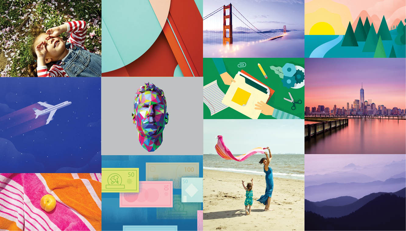
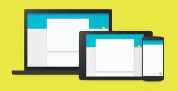
Material Design is a modern design language which enforces a consistent look and feel of the application across devices such as a phone, tablet and a computer. It is a very broad concept now, and has guidelines for almost all the user interfaces and patterns. Material Design is a live process; it is continuously evolving and making itself better by including other design patterns in the document. This language is mainly about concentrating on three things:
- Material
- Motion
- Layout
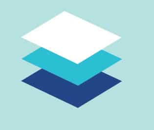
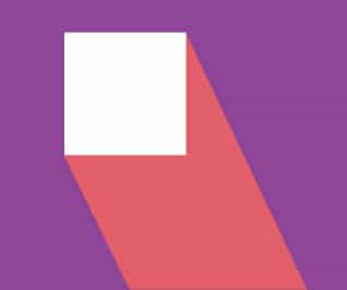
Material: In Material Design, one of the goals is to make the UIs natural. In nature, everything is in a 3D space, so elements in Material Design exist and behave like objects in the real world. It provides meanings and visual cues to the user. Material in Material Design instantly reacts to user input. An example would be the button; when the button is pressed, it rises from its position to make contact with the finger of the user. In that process, the button also casts a shadow as it rises, giving the impression that the button is in a 3D world. This also implies that the material is opaque and solid, so that touch or any kind of input events cannot pass through the material and interact with the material behind the foremost material sheet.
Other guidelines are:
- To show stacking of material, usage of shadows to separate them
- Material can grow or shrink, but it cannot bend or fold
- Various guidelines for shadows, such as different shadows for resting and the active state of objects
Motion: Motion is great. We all love motion and animations in interfaces. It makes the application feel alive, which is what motion in Material Design is all about. Motion is a very important part of design nowadays. If an object is to be placed on a screen, making it appear with some motion (such as fade or reveal), rather than just popping it in front of the user, would make it easier to understand for the user. However, putting random animations anywhere does not help users either; rather, it could irritate them. Motion is to provide continuity between different states of the application.
Motion should be applied so that it guides the user about where the flow of the application is headed and whats the result in response to the input of the user. For example, suppose there is a card on the screen, showing some information; when the user clicks on the card, it expands to fill the whole screen and shows more information. This provides continuity between these two states of the application. Going back would shrink the card again, and users will get continuity back and forth in the application.
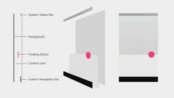
Layout: Layout in Material Design is composed of many components. Mobiles, tablets and desktopsall share almost the same elements such as toolbars, bottom bars, floating action buttons, SideNav bars, etc. The Material Design specification shows different layout arrangements for these elements on the different screen sizes of phones, tablets and desktops.
It also explains each element, and shows some Android-specific elements and how these can be used in user interfaces. In layout, a very important thing to note is the stacking of elements. As stated before, objects in Material Design move and exist in a 3D space. In 3D space, material is stacked one on top of the other rather than every object being on the same plane. So the layout section shows how all the elements, such as the background plane, toolbar, floating action button, etc, are placed on one another, and how they cast crisp or soft shadows according to their position along the z-axis.
References
[1] https://www.google.co.in/design/spec/material-design/introduction.html
[2] http://papyros.io/qml-material/
[3] https://github.com/samvidmistry/PyMaterial
[4] http://www.materialup.com/
[5] https://www.materialpalette.com/
[6] http://www.hongkiat.com/blog/material-design-resources/


