Personal safety is of prime concern to each one of us. Many a time we are in difficult and dangerous situations and need a helping hand to extricate us from harms way. As the proverb says, Prevention is better than cure. So it is better to be prepared with a solution before a potentially harmful situation arises.
In this article, we are attempting to build a personal safety application, which in times of trouble can help us. Our goal here is to inform the ones who care for us about where we are and the activities we are involved in. We will be building a mobile application using which, on pressing a single button, we can send critical information about ourselves to the people we intend to send it to.
This tutorial series requires some basic as well as a little advanced knowledge about building Android applications with App Inventor. So lets use the knowledge acquired from the past articles in this series, to build this app.
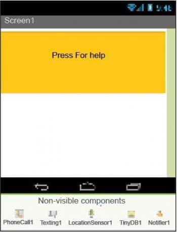
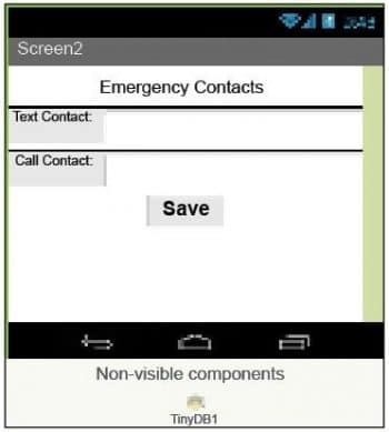
The purpose of the application
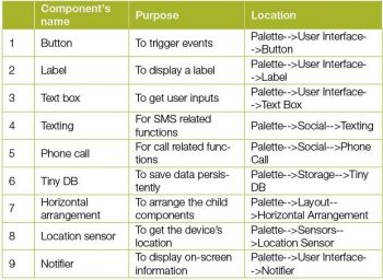
As explained earlier, the purpose of this application revolves around the need to extricate the mobile device user from a dangerous situation. We hope to build an Android mobile application which will send the location of the user, along with some predefined text, to certain people/agencies and place a call to them to describe the situation. We will enable users to set the contact numbers of the people they wish to contact in case of emergencies. You are already aware of all the components that will be used for this application like the texting component, the phone call component, location sensor, buttons, labels, Tiny DB, etc.
GUI requirements
Every application requires a graphical user interface or GUI, which helps the user to interact with the on-screen components. How each component responds to user actions is defined in the blocks editor section. As per our current requirements, we hope to have a single button which will trigger all the events, and a dedicated screen where the user can fill certain details like phone numbers to contact in case of an emergency. Since we are using multiple screens this time, lets note down their components separately. The very first screen, which will have the trigger button, is Screen1 and the other will be Screen2. How to add a new screen into the application will be explained as we move further.
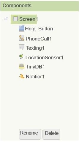
GUI requirements for Screen1
1. Button: The button will let you trigger the event and is a very essential component.
2. Texting component: This is essential to SMS/text message related functionality. It enables you to read and write text messages to the desired phone numbers.
3. Phone call component: This is essential for call related functionality. It can detect your incoming calls and place new outgoing calls, as required.
4. Tiny DB: When you need to store some data persistently within the device, Tiny DB comes into the picture. It enables you to store values corresponding to unique tags, into the phone database.
5. Location sensor: This will sense your current location in terms of latitude and longitude.
6. Notifier: This is used to display some instructions or give controls over your existing components. You will understand its functionality better as we implement it in the app.
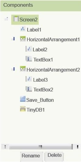
GUI requirements for Screen2
1. Button: This will let you trigger the event and is a very essential component.
2. Label: The label component gives you control to write static text or headings. The text of the label component remains as it is until you change it in the blocks editor.
3. Text box component: This allows users to give their inputs as required by the application. As soon as the text box is highlighted, it activates the device keyboard to make it visible on the screen.
4. Tiny DB: When you need to store some data persistently within the device, Tiny DB comes into the picture. It enables you to store values, corresponding to unique tags, in the phone database.
5. Notifier: This is used to display some instructions or give controls over your existing components. You can see how it functions in more detail as we will be implementing it in the app.
6. Horizontal arrangement: This component plays a crucial role in keeping the child components horizontally aligned. Whichever component you put into it will be kept horizontally aligned.
Given above are the components that we require for this application. Lets drag them on to the designer from the left hand side palette.
Drag and drop the components mentioned in the table above the viewer.
Visible components can be seen by you while the non-visible components will be located beneath the viewer under the tag non-visible.
Put separate components for Screen1 and Screen2.
To create a new screen, click on the Add Screen button just above the designer viewer.
If you have dragged and placed everything, the layout will look something like whats shown in Figures 1 and 2.
Make the necessary property changes like we did when changing the text properties for label and button components in previous articles in this series.
Renaming the components helps to identify them in the blocks editor.
So now, your graphical user interface is ready. Figure 1 shows exactly how the application will look after the installation.
The hierarchy of the components that we have dragged to the designer is illustrated in Figures 3 and 4.
After having read the previous articles on App Inventor, I am sure you are pretty clear about how to prepare a GUI. It isnt a complex task the components just have to be placed on the viewer and a few property changes are required to make them look clearer.
So lets move on and add these behaviours using the blocks editor. I hope you remember how to switch from designer to the blocks editor. There is a button available right above the Properties pane to do this.
But before we move on, I would like to go over what we want from our application. Listed below are the functionalities that we are looking for:
- On pressing the button, a custom SMS should be sent to the number already saved in the database.
- On pressing the same button, a phone call should be placed to another number saved in the database.
- By any means, the user should be able to change the emergency contact numbers.
- If the people whose numbers have been saved for emergencies are not available, the user should be duly notified.
Blocks in the blocks editor
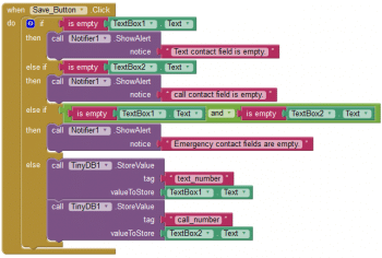
I have already prepared the blocks for you. All you need to do is to drag the relevant blocks from the left side palette and drop them on the viewer. Arrange the blocks exactly as shown in the images (Figures 5, 6, 7 and 8). I will explain what each
does and how it is called.
The blocks in these figures may look a bit daunting; so let me help you understand them.
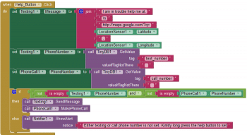

Screen1: When the Help button is clicked, the following things will happen (depicted in Figures 5 and 6).
It will generate a custom text message for the texting component, taking the current latitude and longitude values from the location sensor.
Next, it will decide which number the text message should be sent to, and will then fetch the phone number from the database.
Similarly, for the call component, we will need a phone number to which the call should be placed.
It is a good practice to think of all the user scenarios and be prepared in advance; so if such a scenario occurs, the user can be notified to take the necessary action.
The next lines will check whether the fields returned by the DB component are empty. If they are, then the user should be notified to take appropriate action.
If the phone number fields are not empty, we should proceed with the text message and phone call facility.
When the Help button is given a long press, it will open Screen2 where the user has set the emergency numbers.
Dont forget to create Screen2 in advance though.
Screen2: When the Save button is clicked, the following things will happen (depicted in Figures 7 and 8):
1. First, it will check whether the user inputs given are blank.
2. If they are, then nothing will be saved and the user will be notified.
3. If both the fields are filled, it will allow the user to save the numbers into the database.
When the back button is pressed from Screen2, it will close the current screen and will take the user to Screen1.
You are now done with the blocks editor. The next step is to download and install the app on your phone to check how it works.

Packaging and testing
To test the app, you need to get it on your phone. First, download the application to your computer and then move it to your phone via Bluetooth or a USB cable. Ill tell you how to download it.
1. In the top row, click on the Build button. It will show you the option to download the APK to your computer.
2. While downloading this, you can see its progress and after a successful download, the application will be placed in the download folder of your directory or the preferred location you have set for it.
3. Now you need to get this APK file to your mobile phone either via Bluetooth or via USB cable. Once you have placed the APK file on your SD card, you need to install it. Follow the on-screen instructions to install it. You might get some notification or warning saying, Install from untrusted source. Allow this from the settings and after successful installation you will see the icon of your application in the menu of your mobile. Here you will see the default icon, which can be changed, and we will tell you how to do this as we move ahead on this course.
I hope your application is working exactly as per your requirements. Now, depending upon your needs and customisation, you can change various things like the image, sound and behaviour also.
Debugging the application
We have just created the prototype of the application with very basic functionality. What else might the user be interested in? Now, lets look at various cases which require serious thought so as not to annoy the user. Then lets ensure that your app addresses these requirements. Consider the following cases:
1. Wouldnt it be nice to add some background for Screen1?
2. What other ways could we use to trigger the SMS and call functions rather than clicking the button?
3. Wouldnt it be nice if we could provide a recording feature to capture all that is happening around the user during that period of danger?
These are some of the possible scenarios that could occur and users will be pretty happy seeing these problems addressed.
Think about all these scenarios and consider how you could integrate these into the application. Do ask me if you fail to address any of the above requirements.
You have successfully built another useful Android app for yourself. Happy Inventing!


























my app texts location latitude and longitude as 0, 0 even with the location feature of mobile being on
dear Sir can you update the app to send GPS location to a 2 given number.
Also can you sen the .aia File.
thanks
best regards
wasantha
Please Share .aia file