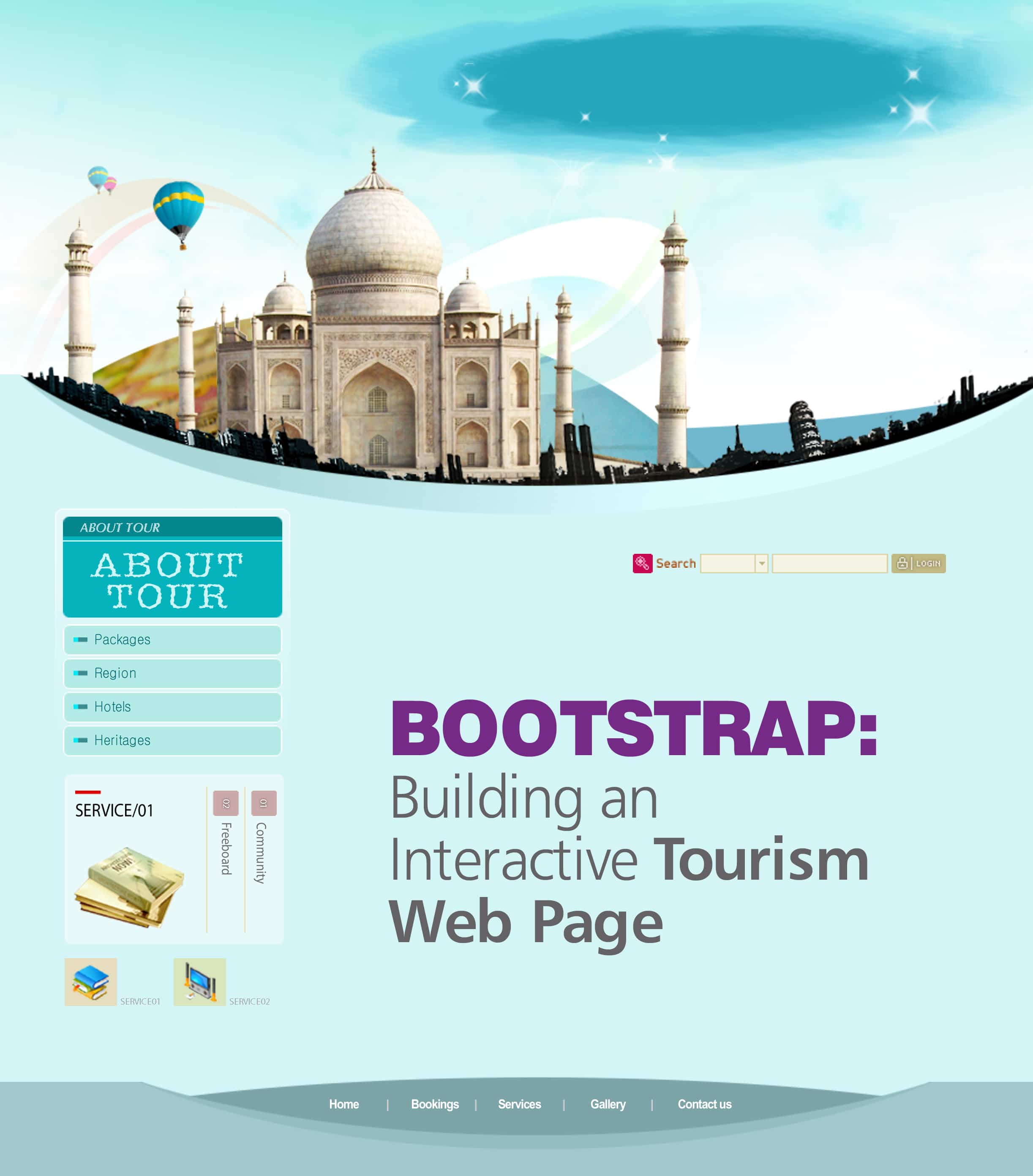
Bootstrap is a free and open source HTML5, JS and CSS framework for building well designed, responsive, mobile first websites and Web applications, at very short notice. Besides, the Twitter Bootstrap framework provides a standard and consistent way to render Web pages across browsers and devices (from phones and tablets to desktops). In this article, we explore the fundamentals of this very handy tool, and demonstrate how to create a simple yet interactive tourism Web page using Bootstrap as one of the templates.
Get started with Bootstrap
To get started, one can download the latest Bootstrap version from http://getbootstrap.com, copy it in a folder of your choice or include it from CDN. For the example below, we are going to use CDN, as many users have already downloaded Bootstrap from MaxCDN when visiting other websites. It will be loaded from the cache when they visit our website, resulting in faster website access.
Designing the first page using Bootstrap
The first thing any Web developer needs to do is to create a design for the Web page. Bootstrap provides some predefined website templates, which can be extended, or websites can be built from scratch. The templates or examples can be found in http://getbootstrap.com/getting-started/#examples. Our Web page is divided into four sections using the marketing template provided by Bootstrap:
- Navigation bar
- Navigation tab and slide show
- Content section
- Footer
To get started, add HTML5 DOCTYPE. Bootstrap uses HTML5 elements and CSS properties, which require HTML5 DOCTYPE at the beginning of the page.
<!DOCTYPE html> <html lang=en> Defining <head>:
To build a responsive, mobile first Web page and to ensure proper rendering in any device, add the following line:
<meta name=viewport content=width=device-width, initial-scale=1>
The next step is to add relevant style sheets and JavaScript files to the head section, as follows:
<link href=https://maxcdn.bootstrap.com/bootstrap/3.3.2/css/bootstrap.min.css rel=stylesheet> <link rel=stylesheet type=text/css href=CSS/custom.css> <link rel=stylesheet href=http://maxcdn.bootstrapcdn.com/bootstrap/3.3.2/css/bootstrap-theme.min.css> <link href=https://maxcdn.bootstrap.com/bootstrap/3.3.2/css/bootstrap.min.css rel=stylesheet> <script src=https://ajax.googleapis.com/ajax/libs/jquery/1.11.1/jquery.min.js></script> <script src=http://maxcdn.bootstrapcdn.com/bootstrap/3.3.2/js/bootstrap.min.js></script>
Lets begin with the <Body> section.
We need to first define a fixed navigation bar at the top of the Web page:
<nav class=navbar navbar-default> <!This will be fixed at the top --> <div class =container> <!see everything as container--> <div class=navbar-header> <button type=button class=navbar-toggle collapsed data-toggle=collapse data-target=#navbar aria-expanded=false aria-controls=navbar> <span class=sr-only>Toggle navigation</span></button> <a class=navbar-brand href=#Home style=margin-top: 0> <h4><em><strong>Leisurely Getaways</strong></em></h4></a> </div> <div id=navbar class=navbar-collapse collapse> <form class=navbar-form navbar-right> <div class=form-group> <input type=text placeholder=Email class=form-control></div> <div class=form-group> <input type=password placeholder=Password class=form-control></div> <button type=submit class=btn btn-success>Sign in</button> <button type=submit class=btn btn-success>Register</button> </form> </div><!--/.navbar-collapse --> </div> <!-- container closed-->
Adding the navbar-brand class gives the Web pages name. Following that, there is the form-group div containing the placeholder for the username and password, followed by two form elements-Sign In and Register, which can be used to navigate to the required pages.
Now, let us add a slide show of pictures as the background for our Web page. The Bootstrap carousel is an interactive slider that is both responsive and flexible enough to contain not just pictures but videos, divs, frames, etc. The code for the carousel is divided into three parts. The first part, which is the DOT indicators, aims at displaying simple dots in the bottom centre of the images or the content to be displayed. These are meant for manual sliding across the different slides. The second part contains the actual content in the form of div elements. In our case, we have collected a few images that will be shifting around in the background. The last part contains the controls in the form of left and right arrows, also meant for the user to slide across the content.
<div id=myCarousel class=carousel container slide> <ol class=carousel-indicators> <!-- Dot Indicators --> <li data-target=#myCarousel data-slide-to=0></li> <li data-target=#myCarousel data-slide-to=1 class=active></li> <li data-target=#myCarousel data-slide-to=2></li></ol> <div class=carousel-inner> <!-- slides --> <div class=item><img src=images/pic1.jpg alt= /></div> <div class= active item><img src=images/pic2.jpg alt= /></div> <div class=item><img src=images/pic3.jpg alt= /></div></div> <!Slide Navigation --> <a class=left carousel-control href=#carousel-example-generic role=button data-slide=prev> <span class=glyphicon glyphicon-chevron-left aria-hidden=true></span> <span class=sr-only>Previous</span></a> <a class=right carousel-control href=#carousel-example-generic role=button data-slide=next> <span class=glyphicon glyphicon-chevron-right aria-hidden=true></span> <span class=sr-only>Next</span></a></div>
Bootstrap offers multiple ways of customising the way the carousel is rendered on the browser.
The small JavaScript code snippet shown below makes the carousel more interactive:
<!-- Java Script to set interval timing for images-->
<script type=text/javascript>
$(document).ready(function() {
$(.carousel).carousel({interval: 4000});
});
</script>
Apart from this, the carousel plugin also offers several options like intervals, pauses and wraps to showcase your content, which makes the Web page even more dynamic, in terms of features.
Closing with the footer
The last section in our Web page, the footer, is going to contain Help and Terms and Conditions, with text aligned to the centre and the right side:
<footer class=footer> <div class=span4 text-center> <p> <a href=#>Help</a>   <a href=#> Terms & Conditions</a>   © Leisurely Getaways 2014</p> </div></footer> <div class=span4 text-right> <p> Powered by Twitter Bootstrap 3.3.2</p></div>
You can download the entire source code of this Web page from https://github.com/VinayPatkar/Tourist_Bootstrap.git. It contains custom.css and index.html files.
As we are done creating a basic Web page using Bootstrap, its time to now dive deeper into it and explore its more advanced features. For more learning, refer to the links given under References.
References
[1] http://getbootstrap.com/examples/carousel/
[2] http://getbootstrap.com/components/#dropdowns
[3] https://wrapbootstrap.com/


