
In the last article, we worked on the backbone of GUIs, the signal and slot mechanism. In this article, we move ahead to the GUI part of Qt.
The basic block of any GUI application is the widget, which provides the functionality of GUI components like buttons, lists, etc. In Qt, QWidget is the base class of all other GUI classes. It provides the main functionality, like keyboard and mouse events.
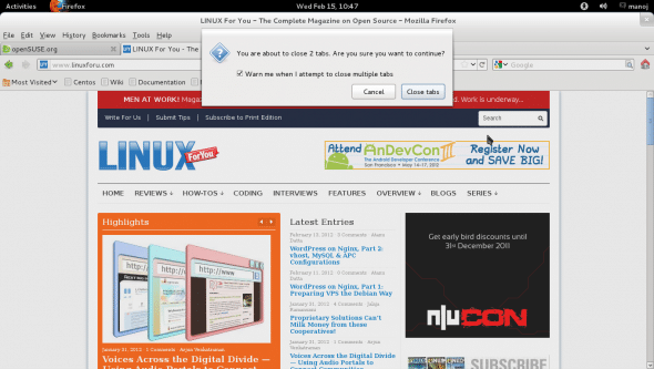
One of the simplest, yet most important widgets is the button. For example, in Figure 1, when I tried to close Firefox with multiple tabs opened, I was prompted by a dialogue box with two push-buttons, Cancel and Close Tabs. Without buttons, a GUI would be useless. All button widgets are derived from the QAbstractButton class, which provides four signals — clicked(), pressed(), released() and toggled(), and provides five states — isChecked(), isEnabled(), isDown(), setCheckable() and setAutoRepeat(). We will cover these in the sample code. Some of the classes derived from QAbstractButton are: QPushButton, QRadioButton and QCheckBox.
Let’s start with QPushButton. This widget is used to let the user initiate some action, like OK, Cancel, Apply, Save, etc. The QPushButton widget emits clicked(), pressed() and released() signals. We will use the signals and slot mechanism covered in the last article, to demonstrate the use of buttons.
Create a GUI application and drag-drop a pushButton on the dialogue window. You can change the name from the default pushButton by right-clicking the widget, then select Change objectName, and give it a new name. Similarly, you can rename the dialogue window and other classes.
The sample code from this article is available as a zip file here.
Here is sample code for the QPushbutton class (dialog.h):
1 2 3 4 5 6 7 8 9 10 11 12 13 14 15 16 17 18 19 20 | #ifndef DIALOG_H#define DIALOG_H#include <QDialog>namespace Ui { class Dialog;}class Dialog: public QDialog{ Q_OBJECTpublic: explicit Dialog(QWidget *parent = 0); ~Dialog();private: Ui::Dialog *ui;private slots: void button_clicked(); void button_pressed(); void button_released();};#endif // DIALOG_H |
This file is dialog.cpp:
1 2 3 4 5 6 7 8 9 10 11 12 13 14 15 16 17 18 19 20 21 22 23 24 25 26 27 28 | #include "dialog.h"#include "ui_dialog.h"#include<QtCore>Dialog::Dialog(QWidget *parent): QDialog(parent), ui(new Ui::Dialog){ ui->setupUi(this); connect(ui->clickme, SIGNAL(clicked()), this, SLOT(button_clicked())); connect(ui->clickme, SIGNAL(pressed()), this, SLOT(button_pressed())); connect(ui->clickme, SIGNAL(released()), this, SLOT(button_released()));}Dialog::~Dialog(){ delete ui;}void Dialog::button_clicked(){ qDebug() << "Button Clicked";}void Dialog::button_pressed(){ qDebug() << "Button Pressed";}void Dialog::button_released(){ qDebug() << "Button Released";} |
This file is main.cpp:
1 2 3 4 5 6 7 8 9 | #include <QtGui/QApplication>#include "dialog.h"int main(int argc, char *argv[]){ QApplication a(argc, argv); Dialog w; w.show(); return a.exec();} |
In dialog.h, we declared three private slots — button_clicked(), button_pressed() and button_released(). Their definition in dialog.cpp simply prints a debug message stating what event occurred. In the Dialog class constructor, we connected these slots with the clicked(), pressed() and released() signals from the clickme(QPushbutton) object. The pointer “ui” refers to the dialogue window; using it, we can access its child widgets — just as we did to access the clickme push button in the connect() lines.
The first argument of the connect() function (a static function from the class QObject) is the source object of the signal; the second is the signal itself; the third is the signal-receiving object, and the last is the slot function. Compile and execute the above code. When the dialogue window comes up, click the clickme button and check that you find the appropriate debug output on the console. The output shows that three signals are emitted when a pushbutton is clicked: first pressed, then released and finally clicked.
Message-boxes
Before moving to other GUI classes, we need to cover one important class, QMessageBox, which is used very often. For example, when you try to close an unsaved document, the pop-up prompt asking if you want to save/close the document (in Qt) uses this class. Its main use is as an alert; some text and even icons can be displayed on it, and a user might even be asked to enter some text through it.
QMessageBox also supports a message severity level, which displays different icons along with the text message. Here is an example:
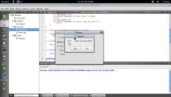
int res = QMessageBox::information(this,"Option", "Want to choose " + item + "?",QMessageBox::Yes | QMessageBox::No ); switch(res) { case QMessageBox::Yes: ui->label_2->setText("You have chosen " + item); break; case QMessageBox::No: ui->label_2->setText("You haven't made any choice."); break; } |
A message box with “severity information” is created. The arguments for the QMessageBox constructor are the parent’s address, title, text to be displayed, and then a list of OR-ed enum members like Yes, No, Save, etc., which will provide the buttons on the message-box.
When a message-box is executed, and the user clicks one of the buttons, the message box will disappear, and the enum value associated with the button will be returned — which you can use to decide what to do, using a switch statement, as shown above.
Radio buttons
Radio buttons are used to select a single choice from a group — only one in a group can be selected at a time. When a radio button is selected, it emits the clicked() signal. Here is sample code for a slot to handle the signal:
void Dialog::on_radioButton_clicked(bool checked){ if(checked) item = ui->radioButton->text();} |
Based on the bool value, you can respond accordingly. Radio buttons have a “built-in” label; you don’t need to use a separate label widget for the text.
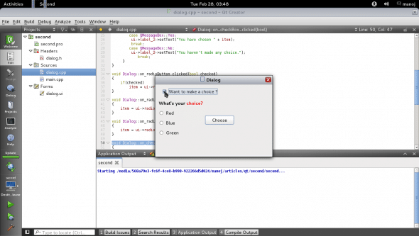
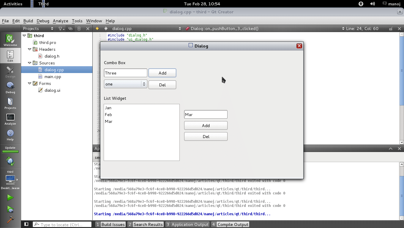
Sometimes, we need to allow multiple choices in a group — like, the user chooses three colours from five. Here, radio buttons won’t work; so use the checkBox widget, which gives check/uncheck options to enable/disable an option or features. Once again, the clicked() signal is emitted when the widget is clicked, with the bool value passed to the slot. Example code can be downloaded from the LFY site. Figures 2 to 4 are screenshots of the application.

Besides these buttons, basic GUI applications need list widgets. We will cover two of them — combo box and list widget.
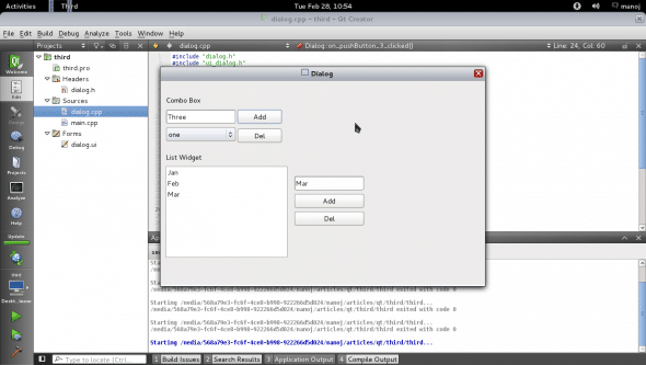
The combo box provides a drop-down list, and shows only the current selected item — which is an advantage, since it uses minimum space on the window. In Qt, this widget is provided by the QComboBox class. Items can be inserted and deleted at run-time too. A signal is generated when the item selection is changed. If you need the user to see the full list, then use QListWidget. Look at Figure 5. The combo box shows one item, QListWidget shows the full list. The following code inserts items in them…
For combo box:
ui->comboBox->addItem(ui->lineEdit->text()); |
For list:
QListWidgetItem * item = new QListWidgetItem( ui->lineEdit_2->text(), ui->listWidget); ui->listWidget->insertItem(ui->listWidget->count(), item); |























How do I get a text browser to display out put from a file in QT?
Please come on gmail IM. My ID: kumar.manoj412
I have written a sample qt based browser but i am unable to set it’s background transparent. It is always showing white background. Could you please guide me on this ?