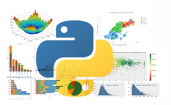
Data visualisation techniques have a significant role in the representation of data in a pictorial or graphical format. This article takes a quick look at the most popular data visualisation plotting libraries that can ease the tasks of data scientists.
When presented with data in a table or database file, it is challenging to provide inferences by just looking at the data on that file. This is when the data visualisation technique is used, whereby all the data is transformed into plots and analysed further. A data visualisation technique allows the data scientist to perform analytics, grasp difficult concepts, and identify new patterns with ease.
Popular libraries for data visualisation
Python offers popular data visualisation libraries that come packed with lots of different features. A brief description of these libraries is provided below.
- Matplotlib is the most popular data visualisation Python library and supports all the accessible graphs like line charts, bar charts, scatter plots, etc. It offers various features such as customisation from a single dot to the entire graph, with the capabilities of multiple Python APIs.
- Seaborn is built on top of Matplotlib and provides a simple interface for creating visualisations with a few lines of plotting codes. One of the benefits of using a Seaborn library is the ample choice of default styles and colour palettes, enabling coders to create aesthetically pleasing and, most importantly, comprehensive chart designs.
- Plotly is a Web based toolkit for data visualisation. It is used to create visualisations that are highly interactive for the user. Plotly supports a variety of plots, right from a basic chart to the unique capability of 3D and contour plots.
- Geoplotlib is an open source Python toolbox that serves to visualise geographical data. Its library supports the development of hardware-accelerated interactive visualisation and provides implementations of dot maps, kernel density estimation, spatial graphs and many other spatial visualisations.
- Matplotlib is the mother of all Python libraries. It serves as an excellent base, enabling coders to wrap other tools over it. Now let’s go into a detailed exploration of the Matplotlib data visualisation library and how it can be used to visualise various types of graphs.
Different types of data visualisation plots
There are six key plots that you can use to understand data better. Each plot type is described below.
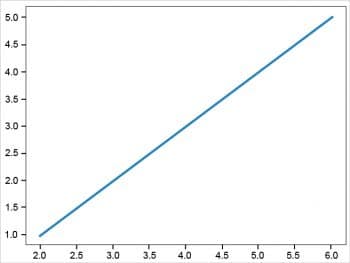
1) Visualisation using a line plot: This is generally used to present observations collected at regular intervals. In Matplotlib, a line chart can be created by calling the plot method. The example below creates a sequence of even numbers on the X-axis and odd numbers on the Y-axis. The results are plotted as a line plot using the following Python code:
# importing the matplotlib library
import matplotlib.pyplot as plt
# the alias ‘plt’ has been set for simplification purpose
# defining the dataset
x = [2, 4, 6]
y = [1, 3, 5]
#plotting the datapoints
plt.plot(x, y)
# display the plot
plt.show()
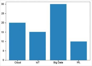
2) Visualising data with bar plots: Bar plots show the distribution of data over several groups. A bar chart can be created using the bar method. The bar chart is useful for categorical data that doesn’t have a lot of different categories.
# importing the matplotlib library
import numpy as np
import matplotlib.pyplot as plt
# The alias ‘plt’ has been set for simplification purpose
# creating the dataset
data={‘Cloud’:20, ‘IoT’:15, ‘Big Data’:30, ‘ML’:10}
names=list(data.keys())
values=list(data.values())
fig=plt.figure(figsize=(7,5))
#Creating the bar plot
plt.bar(names, values)
plt.show()
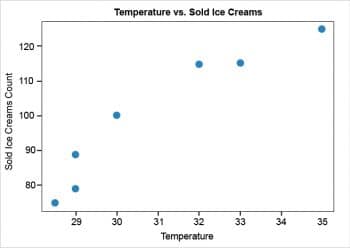
3) Plotting data with a scatter plot: A scatter plot shows the data as a collection of points. To make a scatter plot with Matplotlib, we can use the plt.scatter() function. In this, the first argument is used for the data on the horizontal axis and the second for the vertical axis. The results are plotted as a scatter plot using the following Python code:
import matplotlib.pyplot as plt
temp = [30, 32, 33, 28.5, 35, 29, 29]
ice_creams_count = [100, 115, 115, 75, 125, 79, 89]
plt.scatter(temp, ice_creams_count)
plt.title(“Temperature vs. Sold Ice Creams”)
plt.xlabel(“Temperature”)
plt.ylabel(“Sold Ice Creams Count”)
plt.show()
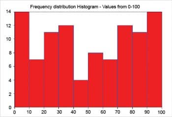
4) Creating a histogram:
A histogram divides the values within a numerical variable into ‘bins’ and counts the number of observations that fall into each bin. In Matplotlib, a histogram can be created using the hist method:
import matplotlib.pyplot as plot
import numpy as np
# Random number generation from 0 to 100
x1 = np.random.random_integers(0,100,100)
# Plot frequency distribution using histogram
plot.hist(x1, facecolor=”r”, edgecolor=’b’)
plot.title(“Frequency distribution Histogram - Values from 0-100”)
plot.margins(0)
plot.xticks(range(0,110,10))
# Display the histogram
plot.show()
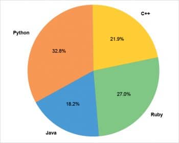
5) Visualisation using a pie chart: Pie charts show proportions and percentages between categories, by dividing a circle into proportional segments. In Matplotlib, a pie chart can be created using the pie() function:
import matplotlib.pyplot as plt
# Pie chart
labels = [‘Python’, ‘Java’, ‘Ruby’, ‘C++’]
sizes = [32.8, 18.2, 27, 21.9]
#colors
colors = [‘#ff9999’,’#66b3ff’,’#99ff99’,’#ffcc99’]
fig1, ax1 = plt.subplots()
patches, texts, autotexts = ax1.pie(sizes, colors = colors, labels=labels, autopct=’%1.1f%%’, startangle=90)
for text in texts:
text.set_color(‘grey’)
for autotext in autotexts:
autotext.set_color(‘grey’)
# Equal aspect ratio ensures that pie is drawn as a circle
ax1.axis(‘equal’)
plt.tight_layout()
plt.show()
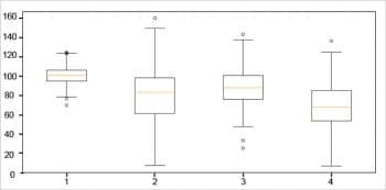
6) Visualisation using a box plot: A box plot is the visual representation depicting groups of numerical data through their quartiles. It is used to analyse how distributed the data is across the data sets. Box plots summarise the sample data using the 25th, 50th and 75th percentiles. These percentiles are also known as the lower, median and upper quartile.
import matplotlib.pyplot as plt
np.random.seed(10)
one=np.random.normal(100,10,200)
two=np.random.normal(80, 30, 200)
three=np.random.normal(90, 20, 200)
four=np.random.normal(70, 25, 200)
to_plot=[one,two,three,four]
fig=plt.figure(1,figsize=(9,6))
ax=fig.add_subplot(111)
bp=ax.boxplot(to_plot)
fig.savefig(‘boxplot.png’,bbox_inches=’tight’)
In the landscape of machine learning and data science, raw data does not make sense until the user can look at it in a visual form, such as with charts and plots. This article will help data scientists to understand the different types of plots that are needed when visualising data in Python.


