R is an excellent environment for visualisation. The well-designed ggplot2 package with a planned structure for any kind of graphics is available in R. The qplot() function of the ggplot2 bundle can play a key role in producing fast and proficient plots.
R programming offers an exceptional set of libraries to build astonishing visualisations to represent data. The most accepted and valuable libraries of visualisation in R are ggplot2, lattice, higher charter, leaflet, RGL and Ploty. Of these, ggplot2 is the trendiest package, which was written by Hadley Wickham (http://hadley.nz/). The ggplot2 package has a vital implementation of the grammar of graphics. The basic elements of the grammar of ggplot2 are depicted in Table 1.
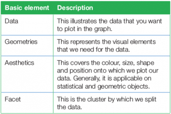
In addition to the basic elements of the grammar of graphics, ggplot2 also contains some advanced elements of the grammar of graphics. The ggplot2 package has the capability to plot simple as well as complex graphs based on the problem statement. This article will focus on simple and quick graph generation using ggplot2. With the help of the function qplot() of ggplot2, we can create a variety of plots effortlessly. We will then discuss the installation and basic structure of the ggplot2 library before moving on to the qplot() function and, eventually, look at useful options and how to generate different categories of graphs using qplot() with examples.
Installation and basic structure of ggplot2
ggplot2 is not the component of the regular distribution of R, and hence it is to be installed explicitly by using the install.packages() command. To install ggplot2, the following syntax is to be used:
> install.packages(“ggplot2”) |
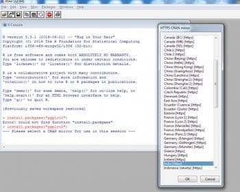
When you enter the above command on the R console, the installation process will start and ask for the HTTP CRAN mirror. Select India(https) from the menu, as is shown in Figure 1.Once it is installed, load the ggplot2 library with the following command:
> library(“ggplot2”) |
Now, you are able to perform the functions of ggplot2. The basic components of ggplot2 are:
- ggplot() function to create a new ggplot.
- aes() parameter to construct an aesthetic mapping of the plot. Each ‘aesthetic’ can be used in a number of ways based on the requirement of the plot.
- ‘+’ component to add other components to a basic plot.
- ggsave() function to save the plots with default settings.
- qplot() or quickplot() function to generate basic plots quickly.
qplot() function with useful options
The qplot() function of the ggplot2 library is a powerful function to generate different types of plots quickly, and its general syntax is:
qplot(n1,n2,….,df,facets,geom,xlim,ylim,log,main,xlab,ylab,asp) |
…where,
n1 n2,…, are the aesthetics passed into each layer. They are the values that we want in the graph;
df is the data frame, tt may be optional;
facet indicates the faceting formulae;
geom is the character vector that indicates the geom to draw. By default, it is a point (dot) if both values are specified or a histogram if there is only one value;
xlim and ylim are the axes limits;
log is a character vector indicating which axes values should be logged;
main, xlab and ylab are the character vectors to give the titles of three entities; and
asp indicates the y/x aspect ratio.
qplot() for different categories of graphs
The qplot() function is very vital for generating different categories of graphs like histograms, scatter plots, box plots, density plots, dot plots, violin plots, etc, quickly.
A histogram represents the distribution of numerical data. It relates to a single variable. Assume that the weight of several children is stored in one vector variable x.
x <- c(10,20,30,40,10,20,50) // stores the weights of children |
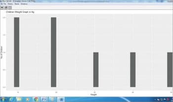
Now, we can generate the histogram for this using the qplot() function with the following command (Figure 2):
> qplot(x,main=”Children Weight Graph in Kg”,xlab=” Weight”,ylab=”No.of Children”) |
A scatter plot is a two-dimensional visualisation technique that uses the dots to represent the data. For example, vector x stores the weight and y stores the height of the children.
x <- c(10,20,30,40,10,20,50) // Stores the weight of childreny<-c(75,78,80,85,67,78) // Stores the height of children |
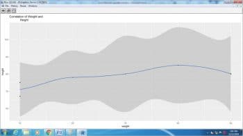
The following qplot() function is used to represent the scatter plot of the above situation (Figure 3).
>qplot(x,y,geom=c(“point”,”smooth”),main=”Correlation of Weight andHeight”,xlab=”weight”,ylab=”height”) |
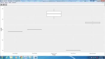
The boxplot is another technique for visualisation that graphically represents the clusters of numeric data through quartiles. For example:
> weight <- c( 10,30,28,35,38,40,45,50) // First vector of weight> Group <-c (“Play Group”,”FIrst Grade”,”First Grade”,”Second Grade”, “Second Grade”,”higher Grade”,”higher Grade”,”higher Grade”) // Second vector of different groups> df <-data.frame(Weight=weight, Gropus= Group) // Data frame is created based on two// vectors> qplot(Group,weight,data=df,geom=c(“boxplot”)) |
Figure 4 depicts the boxplot of the above scenario.
The dotplot and violin plots are created by changing the geom parameter in the above situation as dotplot and violin, respectively:
>qplot(Group,weight,data=df,geom=c(“dotplot”))> qplot(Group,weight,data=df,geom=c(“violin”)) |
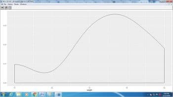
Density plot is another important chart that depicts the distribution of data over a time period in a visual manner. It can be considered as a variation of the histogram:
>qplot(weight, data =df,geom = “density”) |
Figure 5 depicts the density plot using the qplot() function.
The qplot() function has an excellent capability to generate different categories of graphs with simple code. However, qplot() is not a generic function, which means that it cannot work for all kinds of R objects.
R software consists of the ggplot2 package that produces elegant graphics. There are two main approaches for creating plots in ggplot2 — by using ggplot() or by using qplot(). In this article, the second approach for creating plots was discussed with syntax, useful options and examples of various categories of plots. The qplot() function surpasses other functions for all simple plots but is not a generic function; so it is applicable for only limited R objects.


