Today’s real-time applications deal with large volumes of data. The mammoth size of the data makes it mandatory to have powerful visualisation tools. This article provides an introduction to visualisation in Julia. As the syntax in Julia is very user friendly, the visualisation process can be understood fairly easily.
Software applications consume data. The user benefits only if this data is rendered in a recognisable format. As the volume of data being fed to applications is rising exponentially, rendering the data in a human-understandable format becomes an important aspect of building any successful application software. Hence, data visualisation has become a powerful tool for app builders. There are many libraries to ease this complex task of rendering the data in an easy-to-infer, graphical representation. Almost all of the modern day programming languages have libraries to perform this task.
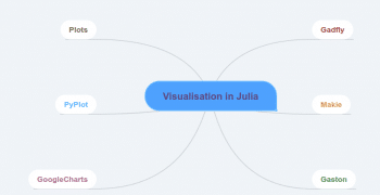
Julia is a modern programming language that successfully combines the speed of C with the ease of Python. It is becoming popular in developer circles as it has the capabilities to perform various tasks without burdening programmers. Let’s look at some of the prominent visualisation libraries of Julia (Figure 1).
Gadfly
Gadfly is an important data visualisation library in Julia. The Gadfly visualisation system is coded in the Julia programming language. The official document states that the Gadfly is inspired by the book,‘The Grammar of Graphics’.
The prominent features of Gadfly are listed below:
- The graphics rendered through Gadfly are of publication quality. It supports PNG, SVG, PDF and Postscript.
- Gadfly works without any additional configuration requirements in Julia.
- Another major advantage of Gadfly is that it has been tightly integrated with DataFrames.jl.
- Dynamic visualisation abilities such as zooming and panning are important features of Gadfly.
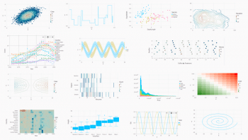
A gallery of visualisation that’s been provided in the documentation is shown in Figure 2.
A simple plotting example is shown in the following code block:
using Gadfly, RDatasets

# Load the Data Set

iris = dataset(“datasets”, “iris”)

# Plot the Data

p = plot(iris, x=:SepalLength, y=:SepalWidth, Geom.point);

#Save it to SVG Image format with the specified dimensions

img = SVG(“iris_plot.svg”, 14cm, 8cm)

#Draw it on screen

draw(img, p)
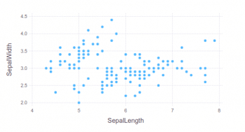
The output of the code is shown in Figure 3.
Gadfly has support for various types of charts. A complete tutorial on Gadfly is provided in the official documentation at http://gadflyjl.org/stable/tutorial/#Tutorial-1.
Makie
Makie is a powerful visualisation package available in Java. To give readers some background information — Maki-e is the Japanese technique of spraying gold and silver powder. In today’s cyber world, data is the gold dust. Makie enables the developer to use it to build stunning visualisation. The prominent features of Makie.jl are listed below:
- High performance
- The ability to extend
- Support for multiple platforms
Any package can be added to Julia with Pkg.add. The process of adding Makie is shown below:
Pkg.add(“Makie”)
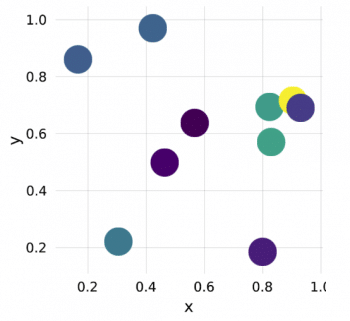
The code to create a simple scatter plot is shown in the following code block:
using Makie

x = rand(10)

y = rand(10)

colors = rand(10)

scene = scatter(x, y, color = colors)
The output of the code is shown in Figure 4.
The Makie code to build a line plot is shown in the following code block:
using Makie

x = range(0, stop = 2pi, length = 80)

f1(x) = sin.(x)

f2(x) = exp.(-x) .* cos.(2pi*x)

y1 = f1(x) y2 = f2(x)

scene = lines(x, y1, color = :blue)

scatter!(scene, x, y1, color = :red, markersize = 0.1)

lines!(scene, x, y2, color = :black)

scatter!(scene, x, y2, color = :green, marker = :utriangle, markersize = 0.1)
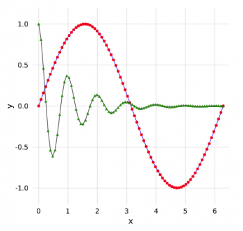
The output of this code is shown in Figure 5.
The code to generate a basic heat map with Makie is given below:
using Makie

using AbstractPlotting: hbox, vbox

data = rand(50, 100)

p1 = heatmap(data, interpolate = true)

p2 = heatmap(data, interpolate = false)

t = Theme(align = (:left, :bottom), raw = true, camera = campixel!)

title1 = text(t, “Interpolate = true”)

title2 = text(t, “Interpolate = false”)

s = vbox(

hbox(p1, title1),

hbox(p2, title2),

)
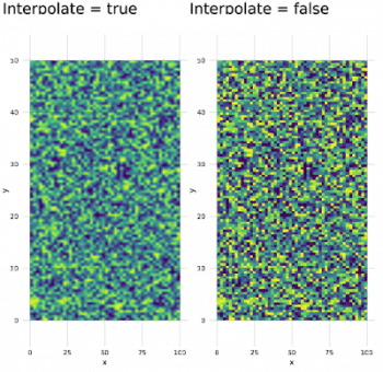
The heat map generated with the above code is shown in Figure 6.
The Makie code blocks shown above are from the official documentation page: http://makie.juliaplots.org/stable/basic-tutorials.html#Tutorial-1.
Plots
The Plots package has been built by Thomas Breloff. Plots is an advanced visualisation library with many features. The major design goals of Plots, as specified in the official documentation, are to be:
- Powerful
- Lightweight
- Intuitive
- Consistent
- Concise
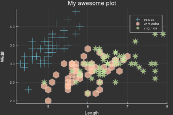
The Plots package is powerful and at the same time, it is simple to understand and build the plots with it. An example is shown below
:
# load a dataset

using RDatasets

iris = dataset(“datasets”, “iris”);

# load the StatPlots recipes (for DataFrames) available via:

# Pkg.add(“StatPlots”)

using StatPlots

# Scatter plot with some custom settings

@df iris scatter(:SepalLength, :SepalWidth, group=:Species,

title = “My awesome plot”,

xlabel = “Length”, ylabel = “Width”,

m=(0.5, [:cross :hex :star7], 12),

bg=RGB(.2,.2,.2))

# save a png

png(“iris”)
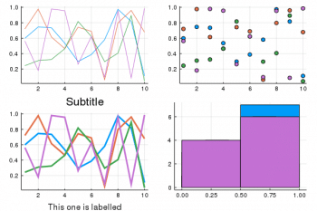
We can build plots of plot objects with the help of Layouts. A simple code to generate the 2×2 matrix of plots is shown in the following code block. The corresponding output is given in Figure 8.
p1 = plot(x,y) # Make a line plot

p2 = scatter(x,y) # Make a scatter plot

p3 = plot(x,y,xlabel=”This one is labelled”,lw=3,title=”Subtitle”)

p4 = histogram(x,y) # histograms

plot(p1,p2,p3,p4,layout=(2,2),legend=false)
PyPlot
In addition to the above mentioned visualisation libraries from Julia, you can also use the Matplotlib plotting library. For this purpose, you can use the PyCall package (which is used to call Python functions from the Julia language) to invoke the Matplotlib functions with negligible overheads.
Google Charts
Google Charts is the Julia interface to the Google Chart tools. Plotting with the Google Chart tool is similar to the other libraries specified in this article, with some minor changes. The major steps are listed below:
- Specify a Google data table
- Indicate the chart options
- Make a call to the function to make and draw the chart
A simple example is shown below
:
using GoogleCharts, DataFrames

scatter_data = DataFrame(

Age = [8, 4, 11, 4, 3, 6.5],

Weight = [12, 5.5, 14, 5, 3.5, 7 ]

)

options = Dict(:title => “Age vs. Weight comparison”,

:hAxis => Dict(:title => “Age”,

:minValue => 0,

:maxValue => 15),

:vAxis => Dict(:title => “Weight”,

:minValue => 0,

:maxValue => 15)

)

scatter_chart(scatter_data, options)
The primary objective of this article is to introduce the various visualisation packages available in Julia. It can be inferred that because of the speed of the C programming language, Julia packages are ideal when you need to build production quality visualisations very fast.


