We continue with the article that appeared in the March 2017 issue of OSFY, which was a first for this series on App Inventor 2. For newbies joining us now, please refer to the previous article, and do try and read the other articles in the series as these will help you to create mobile apps successfully.
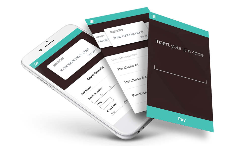
In the last article, we completed the design part of our most innovative app idea so far, i.e., a digital wallet application using App Inventor 2. Now you must be curious to see the block editor as well. So, continuing from where we left off, let’s head towards the block editor.
I will summarise the work so far:
1. We started with the idea of making a digital wallet application using App Inventor 2.
2. We thought of having four different screens for dedicated actions that a user might perform with the application.
3. We decided and designed the GUI part for all the four screens.
Switching to block editor
If you have been following our App Inventor series, then you are probably familiar with switching between the App Inventor designer and block editor screens. If you are on the designer screen where you see the actual appearance of your application, there is a button at the top right corner, called Blocks to switch the window to the block editor. Likewise, the Designer button will bring you back to the designer screen from the block editor view.
Required logic for Screen1
Screen1 will be our first screen when the application is loaded. It has two buttons, namely:
- New User
- Sign In
This is the way the logic should go:
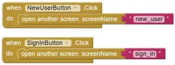
1. On clicking the ‘New User’ button, the user should be moved to new_user.
2. Clicking the ‘Sign In’ button should bring the user to the sign_in screen.


Required logic for the New User screen
The New User screen will be called from Screen1 upon pressing the new_user button. The purpose of the screen is to take the user credentials and save them in the database for successful login procedure. This is the way the logic should go:
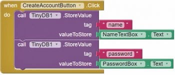
1. Upon clicking the Create_Account button, tinyDB should store the name and password into the database.
2. We will store the name under the ‘name’ tag.
3. We will store the password under the ‘password’ tag.
Required logic for Sign In screen
If you are already registered on the device, you should be able to log in by providing validation fields. This is the way the logic should go:
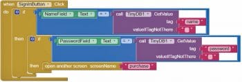
1. Upon clicking the ‘Sign In’ button, tinyDB should be called for validating the name and password fields.
2. If the name and password match the already stored values, the user should be able to navigate to the ‘purchase’ screen.
Required logic for the purchase screen
This is one of the complex screens, and involves multiple actions and validation points. This is the way the logic should flow:
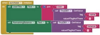
1. Once the screen is opened, the database should be called to fetch the user name, which will be displayed at the top.
2. The database should be called for getting the user credit balance for the application.
3. The user should be able to select any product from the listed products.
4. Upon selecting a product, its name and price should be displayed to confirm the selection.
5. Upon clicking the Purchase button, the user’s balance should be deducted.
6. Upon clicking the ‘Add Balance’ button, the user should be able to add a sum to the user application account.


Packaging and testing
To test the app, you need to get it on your phone. First, you have to download the application to your computer and then move it to your phone via Bluetooth or USB cable. I’ll tell you how to download it.
1. On the top row, click on the ‘Build’ button. It will show you the option to download the apk to your computer.
2. After a successful download, the application will be placed in the Download folder of your directory or the preferred location you have set for your downloading.
3. You now need to get this apk file to your mobile phone either via Bluetooth or via USB cable. Once you have placed the apk file on your SD card, you need to install it. Follow the on-screen instructions to install it. You might get some notification or warning saying that the install is from an untrusted source. Allow this from the settings, and after successful installation you will see the icon of your application in the menu of your mobile. Here, you will see the default icon, which can be changed and we will tell you how to do this as we move ahead.
I hope your application is working exactly as per the requirements you have given. Now, depending upon your usability and customisation, you can change various things like image, sound and behaviour.
Debugging the application
We have just created the prototype of the application with very basic functionality, but what else might the user be interested in? Let us analyse various cases, which require serious planning, so that using the app does not annoy the user. Consider the following cases:
1. If a user is registered, can we make him/her login automatically to the application?
2. How will we enable lower case and upper case credential validations?
3. What if the price of the selected product is more than the remaining balance — how will we prompt the user to add balance before proceeding for payment?
4. How will a purchase receipt be generated after a successful purchase?
5. What happens if the user gives a text input on the ‘add balance’ screen?
These are some of the scenarios that might occur and users will be pretty happy seeing them addressed.
Think over all these scenarios and look at how you can integrate these into the application. Do get in touch with me if you fail to accomplish any of the above cases.














I meant to mention about the driving license us..which you wan to apply for
lost driving licence
how to pass driving test
thanks for the sharing
Can you please share the source code?