Visualisation of data in the form of plots is an important requirement in today’s Big Data scenario. This article introduces Gadfly – a visualisation system for Julia. Gadfly enables developers to build publication-quality graphics in various forms such as SVG, PNG, PDF, etc. With its wide variety of plot types, Gadfly provides a rich canvas for aesthetic statistical graphics.
Julia is becoming increasingly popular with developers from various domains, primarily due to the simplicity and power it offers. One important feature provided by most modern day programming languages is the ability to visualise data. As today’s applications handle large volumes of data, visualisation becomes a mandatory component.
Julia is an extensible programming language, i.e., its features can be extended by adding many custom packages. The external packages that facilitate plotting in Julia are listed below (http://julialang.org/downloads/plotting.html):
- PyPlot
- Gadfly
PyPlot uses the Python calling feature (PyCall) to directly call MatPlotLib of Python. To use PyPlot in Julia programs, Python and MatPlotLib need to be available in the system.

Gadfly
The focus of this article is to illustrate the features of Gadfly, which is based on the Wickham-Wilkinson style ‘Grammar of Graphics’ in Julia. Detailed information on the Grammar of Graphics is available at https://www.cs.uic.edu/~wilkinson/TheGrammarOfGraphics/GOG.html. The ggplot2 for R forms the basis of Gadfly. Daniel C. Jones is the pioneer in developing Gadfly. An active community of Julia developers now maintains this package (https://github.com/GiovineItalia/Gadfly.jl).
Features of Gadfly
The major features of the Gadfly Julia package are listed below:
- Gadfly has the important feature of rendering publication quality graphics. It enables rendering in various formats such as SVG, PostScript, PD, etc.
- It offers support for 20+ plot types.
- Gadfly is available in Julia, out-of-the-box.
- The facility to integrate with DataFrames.jl is another key feature of GadFly. DataFrames.jl enables working with tabular data in Julia.
- It provides interactive features in plots such as panning, zooming, etc. These interactivity features are enabled through snap.svg (http://snapsvg.io/).
Installing Gadfly
Installation of Gadfly can be easily done using the following command (at Julia REPL):
julia> Pkg.add(“Gadfly”) |
After successful installation, it can be loaded as shown below:
Julia> using Gadfly |
Gadfly: A simple plot
Julia programs can be executed in two different ways—one is by installing Julia locally in the system and the other is to execute it directly in JuliaBox (https://juliabox.com/).
The steps involved in plotting a simple graph are illustrated in this section.
- Step 1: Load the Gadfly package, as follows:
using Gadfly |
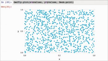
- Step 2: Load the values in X and Y. In this example, we are loading 1000 random values in two variables— xvalues and yvalues.
xvalues = rand(1000)yvalues = rand(1000) |
- Step 3: Plot the graph with the Gadfly.plot function.
Gadfly.plot(x=xvalues, y=yvalues, Geom.point) |
The output of Step 3 is shown in Figure 2.
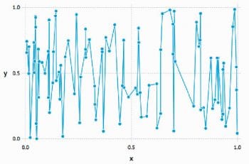
The following code sequence generates a line graph as shown in Figure 3:
using Gadflyxvalues = rand(100)yvalues = rand(100)Gadfly.plot(x=xvalues, y=yvalues, Geom.point, Geom.line) |
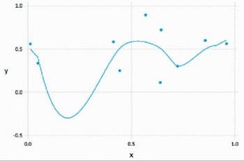
The smoothened version is generated with Geom.smooth, as shown in Figure 4.
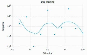
The plot can be customised with details such as axis title with the following code:
Gadfly.plot(x=1:10, y=2.^rand(10),Scale.y_sqrt, Geom.point, Geom.smooth,Guide.xlabel(“Stimulus”), Guide.ylabel(“Response”), Guide.title(“Dog Training”)) |
The output of the code is shown in Figure 5.
Gadfly: Histogram with RDataSets
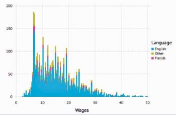
Gadfly enables the creation of histograms effortlessly. A sample histogram with RDataSets is shown in Figure 6.
using RDatasetsGadfly.plot(dataset(“car”, “SLID”), x=”Wages”, color=”Language”, Geom.histogram) |
Multilayer plots
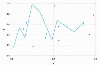
Gadfly provides options to layer and stack plots. A sample code to layer a point plot and line plot is shown below:
Gadfly.plot(layer(x=rand(10), y=rand(10), Geom.point, order=1),layer(x=rand(10), y=rand(10), Geom.line, order=2)) |
Here, the keywords layer and order are used to provide multilayer plots in a specified order.
Gadfly backends
Gadfly provides support to write to various backgrounds such as SVG and SVGJS. The support for SVG and SVGJS is provided by default. However, the other backends such as PNG, PDF, etc, require Cairo Julia bindings, which is a 2D graphics library (https://github.com/JuliaGraphics/Cairo.jl):
samplePlot = Gadfly.plot(layer(x=rand(10), y=rand(10), Geom.point, order=1), layer(x=rand(10), y=rand(10), Geom.line, order=2))draw(SVG(“myplot.svg”, 4inch, 3inch), samplePlot)draw(PDF(“myplot.pdf”, 4inch, 3inch), samplePlot) |
Themes
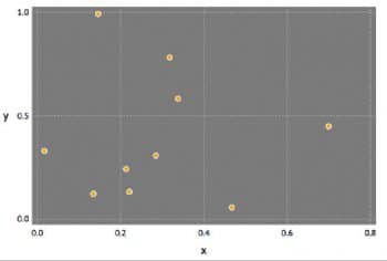
Gadfly has various options to customise the plot with themes. A sample code is shown below and its output is given in Figure 8. In this plot, the panel background colour is gray and the default_color is set as orange.
using Gadflydark_panel = Theme(panel_fill=colorant”gray”, default_color=colorant”orange”)Gadfly.plot(x=rand(10), y=rand(10), dark_panel) |
The plots can be customised with various parameters. Some of them are listed below:
- line_width
- panel_fill
- panel_opacity
- grid_color
- discrete_color_scheme
- continuous_color_scheme
Geometries
The core drawing of the plot is made by geometries, and those which are available are represented using ‘Geom’. Gadfly provides more than twenty styles. Some of the Geom types are listed below:
- Geom.point
- Geom.line
- Geom.polygon
- Geom.boxplot
- Geom.ribbon
- Geom.violin
The complete list of all Geoms is available at http://gadflyjl.org/stable/man/geometries.html.
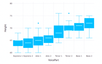
For example, a Boxplot with RDataSets can be easily built as shown below:
using Gadflyusing RDatasetsGadfly.plot(dataset(“lattice”, “singer”), x=”VoicePart”, y=”Height”, Geom.boxplot) |
To summarise, the features provided by Gadfly are really useful in making publication-quality plots. At the same time, making these plots is fairly simple. This excellent combination of features makes Gadfly a great choice with respect to visualisation of data.


