Publication quality 2D plots can be produced by matplotlib, which is an open source object-oriented Python library. With this article, we begin a series that will take the reader through the nuances of 2D plotting with matplotlib.
matplotlib is a Python library for creating 2D plots. It was originally created by John D. Hunter and is now maintained by a large team of developers. It integrates well with IPython – the component in the standard scientific Python toolset. matplotlib uses NumPy – a fundamental package for scientific computing with Python. The matplotlib code is conceptually divided into three parts — the pylab interface, the front-end and the back-end. The pylab interface is a set of functions which allow the user to create plots. The front-end (matplotlib API) is a set of classes for creating and managing figures, text, lines, plots, etc. Basically, this is an abstract interface. The back-end is a drawing device (renderer) that transforms the front-end representation to a hard copy or a display device.
Installation
Use the following commands to install matplotlib:
python –m pip install -U pip setuptools
python –m pip install matplotlib
Pyplot
matplotlib.pylot is a collection of command style functions. Each function makes some change to a figure, like creating a figure, creating a plotting area in a figure, decorating the plot with labels, etc. Now, let us create a very simple plot for some given data, as shown below:
import matplotlib.pyplot as plt
plt.plot([1,2,3,4])
plt.ylabel(‘Y values’)
plt.show()
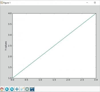
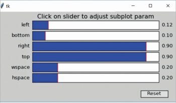
We do not need to worry about window creation and other basic event handling. matplotlib provides some basic operations of the plot. The basic operations are: Reset original view, Back to previous view, Forward to next view, Pan axes with left mouse, Zoom with right, Zoom to rectangle, Configure subplots and Save the figure. If you click on the ‘Configure subplots’ button, another window with the following parameters will open: left, bottom, right, top, wspace, and hspace to adjust the plot (see Figure 2).
To plot X versus Y, we can use the commands shown below, as plot() takes an arbitrary number of arguments.
import matplotlib.pyplot as plt
plt.plot([1, 2, 3, 4], [1, 4, 9, 16])
plt.xlabel(‘X values’)
plt.ylabel(‘Y values’)
plt.show()
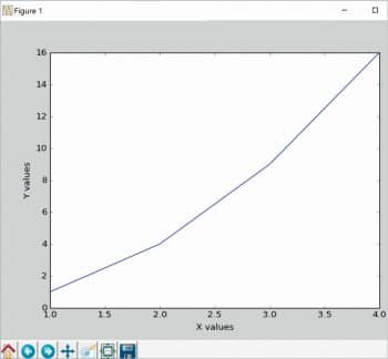
The output of the code above is shown in Figure 3.
To control the axis, matplotlib has the axis() command; it takes a list of values (Xmin, Xmax, Ymin, Ymax) and also specifies the viewport of the axes.
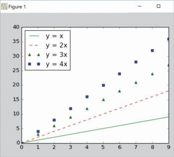
To plot several lines with different styles, use the following commands:
import matplotlib.pyplot as plt
import numpy as np
x = np.arange(10)
plt.plot(x, x, ‘g’)
plt.plot(x, 2 * x, ‘r--’)
plt.plot(x, 3 * x, ‘g^’)
plt.plot(x, 4 * x, ‘bs’)
plt.legend([‘y = x’, ‘y = 2x’, ‘y = 3x’, ‘y = 4x’], loc=’upper left’)
plt.show()
Controlling line properties
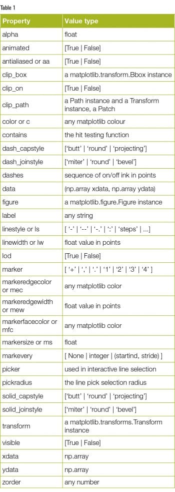
We can set many attributes to a line. The Table 1 shows a list of available Line2D properties.
Adding text into the plot
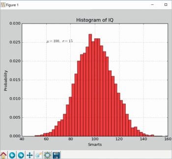
The text() command can be used to add text in an arbitrary location. The xlabel(), ylabel() and title() are used to add text in the indicated locations. The code below creates a histogram and some text. The output is shown in Figure 5.
import numpy as np
import matplotlib.pyplot as plt
mu, sigma = 100, 15
x = mu + sigma * np.random.randn(10000)
# the histogram of the data
n, bins, patches = plt.hist(x, 50, normed=1, facecolor=’g’, alpha=0.75)
plt.xlabel(‘Smarts’)
plt.ylabel(‘Probability’)
plt.title(‘Histogram of IQ’)
plt.text(60, .025, r’$\mu=100,\ \sigma=15$’)
plt.axis([40, 160, 0, 0.03])
plt.grid(True)
plt.show()
This is only an introductory article on matplotlib. Next month, we will explore the topic in greater depth along with examples. The code is taken from http://matplotlib.org and readers are advised to look at the examples provided at http://matplotlib.org/examples/index.html.


