
Python is a very versatile piece of software. It offers many choices for Web applications and can be used in thousands of third party modules. Python is also an effective tool for regression analysis.
I think that machine learning, data mining, chemometrics and statistics are not the same thing but there are aspects that are common to all four topics. For example, a chapter about regression analysis (the techniques for estimating the numeric relationship among data elements) can be found in books on each of them. Some examples include Reference 1 chapter 6, Reference 2 chapter 13, Reference 3 chapter 2, and Reference 4 chapter 7. In the real world, sometimes there are problems with the fundamentals of linear algebra. There is also the idea that a higher explained variance or a higher correlation means a better model. Or that the only way is the use of a commercial spreadsheet. For these reasons, I think that it’s necessary to clarify some things with an introductory article.
From a more technical point of view, for example, if I need to measure the concentration of a certain substance in an underground water sample, I must be capable of measuring a concentration less than 10 times the minimum concentration admitted. For example, if the contamination limit is 1.1 micrograms per litre, I must, at least, be capable of measuring a concentration equal to 0.11 micrograms per litre (these values depend on national laws). With a limit settled by the law, the choice of a regression model becomes even more important. That choice is important also in ion chromatography, because it’s better to speak of calibration rather than linearity. The calibration can’t always be represented by a regression of the first order, but can be represented sometimes, by a second degree curve. So the concept of linearity should be carefully considered, particularly with regard to the measurement for suppressed conductivity (see Reference 5). This problem is not considered in some methods in which the calibration is valid only if it’s linear, discarding a priori any other type of model.
The toolbox
This article is based on Mint 18 Xfce, Emacs 24.5, Geany and Anaconda. The last software can be freely downloaded from https://www.continuum.io/downloads. Then, from the terminal window, type bash Anaconda3-4.1.1-Linux-x86.sh and just follow the instructions on the screen. Because the packages PrettyTable and Seaborn are not available in the Anaconda distribution, I have easily installed them by typing the following code in a terminal window:
cd /home/<your-username>/anaconda_4.1.1/bin
easy_install prettytable
easy_install seaborn
My Emacs configuration for Python on Linux is almost the same as on Windows (see the September 2016 issue of OSFY). There is only one difference, because I have replaced the line given below:
(add-to-list ‘exec-path “C:\\WinPython-32bit-3.4.4.2\\python-3.4.4”)
… with the following ones:
(setq python-shell-interpreter “/home/<your-username>/anaconda_4.1.1/bin/python”
org-babel-python-command “/home/<your-username>/anaconda_4.1.1/bin/python”)
With respect to Geany, I have settled only the ‘Execute’ command /home/<your username>/anaconda_4.1.1/bin/python “%f”
Regression models
The first way to build a polynomial model is by using matrix algebra. Let’s consider the following code, which is used instead of equations:
w=xlrd.open_workbook(“filename.xls”).sheet_by_name(“Sheet1”)
x,y=w.col_values(0),w.col_values(1)
degree=1
weight=1/array(x)**2
f=zeros((w.nrows,degree+1))
for i in range(0,w.nrows):
for j in range(0,degree+1):
f[i,j]=x[i]**j
q=diag(weight)
fT=dot(transpose(f),q)
fTf=dot(fT,f)
# fTf=fTf+diag([0.001]*(degree+1))
fTy=dot(fT,y)
coef=dot(inv(fTf),fTy)
xx=linspace(min(x),max(x),1000)
yp=polyval(coef[::-1],xx)
In the example, the degree is equal to 1 (a linear model) and the weight is equal to 1/x2 (this is a weighted model). For a simple linear model, degree=1 and weight=1 (or weight=1/array(x)**0). For a simple quadratic model, degree=2 and weight=1. With some simple matrix calculations, it’s possible to know the coefficients coef of the model and then plot the curve xx vs yp. For fitting through zero, set weight=1/array(x)**0 and for j in range(1,degree+1); add a small constant, for example 0.001, to the diagonal of fTf. For a linear model, the predicted values (x values back calculated) are calculated with predicted=(y-intercept)/slope and, for a quadratic model, with predicted=(-b+sqrt(b**2-(4*a*delta)))/(2*a) in which delta=c-y. The a, b and c values are about the coefficient of the second degree term, the coefficient of the first degree term and the constant value, respectively. The accuracy is then calculated as accuracy=predicted*100/x. The following tables present a linear simple and a linear weighted model for the same experimental data. I’m not a big fan of the squared correlation coefficient, but, considering only that, I should choose the linear model simple, because it’s the one with the highest value of R2. I think it would be better to consider the ‘Accuracy’ column in both tables and choose the weighted model. In this particular example, we must also consider what is already mentioned in the ‘Introduction’ section about the values established by law. Carry out these calculations using a spreadsheet (and without using macros), As I think that’s unnecessarily complicated.
Linear simple
Intercept -9343.97333
Slope 16984.40793
R2 0.99860
+------+---------+-----------+-------------+
| X    |    Y    | Predicted |   Accuracy  |
+------+---------+-----------+-------------+
| 0.1  |   1633  |   0.65    |    646.30   |
| 0.5  |   7610  |   1.00    |    199.64   |
| 1.0  |  14930  |   1.43    |    142.92   |
| 2.5  |  35347  |   2.63    |    105.25   |
| 5.0  |  69403  |   4.64    |    92.73    |
| 10.0 |  141643 |   8.89    |    88.90    |
| 25.0 |  402754 |   24.26   |    97.05    |
| 50.0 |  850161 |   50.61   |    101.21   |
+-----+----------+-----------+-------------+

Linear weighted 1/x2
Intercept 123.19563
Slope 15010.23851
R2 0.99422
+--------+---------+--------------+-----------+
|   X    |    Y    |   Predicted  | Accuracy  |
+--------+---------+--------------+-----------+
|  0.1   |   1633  |     0.10     |  100.58   |
|  0.5   |   7610  |     0.50     |   99.76   |
|  1.0   |   14930 |     0.99     |   98.64   |
|  2.5   |   35347 |     2.35     |   93.87   |
|  5.0   |   69403 |     4.62     |   92.31   |
|  10.0  |  141643 |     9.43     |   94.28   |
|  25.0  | 402754  |     26.82    |   107.29  |
|  50.0  | 850161  |     56.63    |   113.26  |
+--------+---------+--------------+-----------+
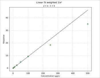
Figure 1 shows the plot for another data set, a simulation more or less typical for a pharmacokinetics study.
Another way is to build a certain matrix via vstack and then apply lstsq on it. Each A matrix created with vstack has the structure shown in the following examples. There are two important things: if the model is built to fit through zero, there is a column of zeros and, if the model is quadratic, there is a column of squared x. The coefficients of each model are a, b and c (if quadratic).
Linear fit simple
A=vstack([x,[1]*w.nrows]).T
a,b=linalg.lstsq(A,y)[0]
        +------+-----+
A =     | 0.1  | 1.0 |
        | 0.5  | 1.0 |
        | 1.0  | 1.0 |
        | 2.5  | 1.0 |
        | 5.0  | 1.0 |
        | 10.0 | 1.0 |
        | 25.0 | 1.0 |
        | 50.0 | 1.0 |
        +------+-----+

Linear fit through zero
A=vstack([x,[0]*w.nrows]).T
a,b=linalg.lstsq(A,y)[0]
         +------+-----+
A =      |  0.1 | 0.0 |
         |  0.5 | 0.0 |
         |  1.0 | 0.0 |
         |  2.5 | 0.0 |
         |  5.0 | 0.0 |
         | 10.0 | 0.0 |
         | 25.0 | 0.0 |
         | 50.0 | 0.0 |
         +------+-----+

Quadratic fit simple
A=vstack([x,[1]*w.nrows,array(x)**2]).T
a,b,c=linalg.lstsq(A,y)[0]
         +------+-----+--------+
A =      |  0.1 | 1.0 |  0.01  |
         |  0.5 | 1.0 |  0.25  |
         |  1.0 | 1.0 |  1.0   |
         |  2.5 | 1.0 |  6.25  |
         |  5.0 | 1.0 |  25.0  |
         | 10.0 | 1.0 |  100.0 |
         | 25.0 | 1.0 |  625.0 |
         | 50.0 | 1.0 | 2500.0 |
         +------+-----+--------+

Quadratic fit through zero
A=vstack([x,array(x)**2,[0]*w.nrows]).T
a,b,c=linalg.lstsq(A,y)[0]
         +------+--------+-----+
A =      |  0.1 |  0.01  | 0.0 |
         |  0.5 |  0.25  | 0.0 |
         |  1.0 |  1.0   | 0.0 |
         |  2.5 |  6.25  | 0.0 |
         |  5.0 |  25.0  | 0.0 |
         | 10.0 |  100.0 | 0.0 |
         | 25.0 |  625.0 | 0.0 |
         | 50.0 | 2500.0 | 0.0 |
         +------+--------+-----+
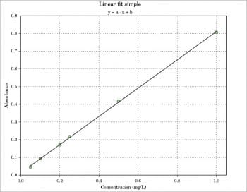
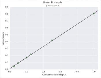
Probably, the simplest way is the use of polyfit with the syntax coef=polyfit(x,y,degree). For a better graphical presentation, I would like to say something about the use of LaTeX and about the couple Pandas + Seaborn, specifying also that the Pandas and Seaborn packages have more complex applications than the one presented here. LaTeX must be previously installed on your system; then just add rc(“text”,usetex=True) in your script. The result is shown in Figure 2. About Pandas, in the following example, a DataFrame with three columns is created. Then, x vs y data are plotted using Seaborn with regplot (lw=0 and marker=”o”) and, last, the linear model is plotted always with regplot but with some different options (lw=1 and marker=””). The result is shown in Figure 3, which is practically the same as with ggplot for R. Note that the ggplot plotting system exists also for Python and it is available at http://ggplot.yhathq.com. Another way to obtain a ggplot like plot is with the use of a style sheet. For example, put style.use(“ggplot”) before the plot command. To know all the styles available just use print(style.available).
import pandas as p
import seaborn as s
coef=polyfit(x,y,1)
yp=polyval(coef,x)
df=p.DataFrame({“Conc”:x,”Abs”:y,”Abs pred”:yp})
s.regplot(x=”Conc”,
          y=”Abs”,
          data=df,
          ci=False,
          scatter_kws={“color”:”g”,”alpha”:0.5,”s”:90},
          line_kws={“color”:”w”,”alpha”:0,”lw”:0},
          marker=”o”)
s.regplot(x=”Conc”,
          y=”Abs pred”,
          data=df,
          ci=False,
          scatter_kws={“color”:”w”,”alpha”:0,”s”:0},
          line_kws={“color”:”k”,”alpha”:1,”lw”:1},
          marker=””)
The data frame here is printed via prettytable:
+------+-------+-----------+
| Conc |   Abs |  Abs pred |
+------+-------+-----------+
| 0.05 | 0.046 |   0.053   |
| 0.10 | 0.093 |   0.092   |
| 0.20 | 0.171 |   0.172   |
| 0.25 | 0.217 |   0.212   |
| 0.50 | 0.418 |   0.412   |
| 1.00 | 0.807 |   0.811   |
+------+-------+-----------+
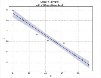
I have never used the confidence band in practice, but there are several ways to calculate and plot it. Here, a calculation is proposed based on the t-distribution from scipy.stats, where ip is the part below (inferior) the model and sp the part above (superior) it. The data set is taken from Reference 7. A nice explanation about the confidence intervals is reported, for example, in Reference 2 pages 86-91.
from scipy import stats
n=w.nrows
coef=polyfit(x,y,1)
yp=polyval(coef,x)
xx=linspace(min(x),max(x),1000)
dx=sum((x-mean(x))**2)
dy=sqrt(sum((y-yp)**2)/(n-2))
dd=((xx-mean(x))**2/dx)
t=stats.t.ppf(0.95,n-2)
ip=coef[1]+coef[0]*xx-(t*dy*sqrt(1/n+dd))
sp=coef[1]+coef[0]*xx+(t*dy*sqrt(1/n+dd))
plot(x,y,”o”,markerfacecolor=”lightgreen”,zorder=3)
plot(x,yp,”k-”,zorder=3)
fill_between(xx,ip,sp,where=sp>=ip,edgecolor=”b”,facecolor=”b”,alpha=0.2,interpolate=True)
The StatsModels package
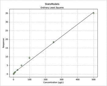
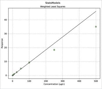
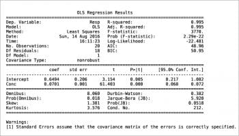
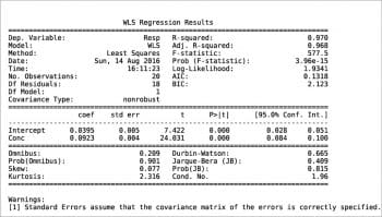
Another way to build a regression model is by using the StatsModels package in combination with the Pandas package. An example is shown in the following code. The values for x and y are read from an xls file, then the weight is defined as 1/x2. Using the Pandas package, a DataFrame is defined for the couple x, y and a Series for the weights. Two types of regression are then calculated: OLS (Ordinary Least Squares, the one previously called the linear fit simple) and WLS (Weighted Least Squares). Last, both models are plotted with a simple plot. More information can be printed for slope ols_fit.params[1], intercept ols_fit.params[0], r-squared ols_fit.rsquared, a little report ols_fit.summary() or the equivalent for the weighted model using ‘wls’ instead of ‘ols’. Two examples are shown in Figures 7 and 8. Further information, such as residuals and Cook’s distance, can be printed or plotted using resid, resid_pearson and get_influence() respectively. A nice and large collection of examples is presented in Reference 8.
import pandas as p
import xlrd
from statsmodels.formula.api import ols,wls
w=xlrd.open_workbook(“pk.xls”).sheet_by_name(“Sheet1”)
x,y=w.col_values(0),w.col_values(1)
weight=1/array(x)**2
df=p.DataFrame({“Conc”:x,”Resp”:y})
w=p.Series(weight)
ols_fit=ols(“Resp~Conc”,data=df).fit()
wls_fit=wls(“Resp~Conc”,data=df,weights=w).fit()
figure(0)
plot(x,y,”o”,markerfacecolor=”lightgreen”,zorder=3)
plot(df[“Conc”],ols_fit.predict(),color=”k”,zorder=3)
figure(1)
plot(x,y,”o”,markerfacecolor=”lightgreen”,zorder=3)
plot(df[“Conc”],wls_fit.predict(),color=”k”,zorder=3)
Even for the regression models, the Python language offers different ways to calculate the same things. Some of them have been presented here. I would like to say something about the piecewise, or segmented, regression models. In Python there are, for example, some techniques based on numpy.piecewise and scipy.optimize, but I’m not completely satisfied by them. For a segmented regression, as previously discussed in the article, ‘Get analytical with R’ published in September 2015 issue of OSFY, I prefer to use R with the package segmented. An interesting Python port called pysegmented is available from https://github.com/e-koch/pysegmented but, at present, it’s only a partial port. More complex applications can be done with the Scikit-learn package (Reference 9), but this is another story, perhaps for another article in the future.


