This article presents a few examples on the use of the Python programming language in the field of data mining. The first section is mainly dedicated to the use of GNU Emacs and the other sections to two widely used techniques—hierarchical cluster analysis and principal component analysis.
This article is introductory because some topics such as varimax, oblimin, etc, are not included here and will be discussed in the future. The complete code is too long for a printed article, but is freely available at https://github.com/astonfe/iris.
The toolbox used in this article is dependent on WinPython 3.4.4.2 and GNU Emacs 24.5 on Windows. My Emacs configuration for the Python language is very simple. The following lines are added to the dot emacs file:
(setq python-indent-guess-indent-offset nil)
(org-babel-do-load-languages
    ‘org-babel-load-languages
    ‘((python . t)))
(add-to-list ‘exec-path “C:\\WinPython-32bit-3.4.4.2\\python-3.4.4”)
(global-set-key (kbd “<f8>”) (kbd “C-u C-c C-c”))
(setenv “PYTHONIOENCODING” “utf-8”)
(setenv “LANG”             “en_US.UTF-8”)
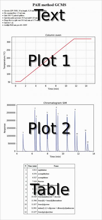
The first line is useful to avoid the warning message: ‘Can’t guess python-indent-offset, using defaults: 4’ from Emacs. The next three lines are to use Python in the org-mode, and the last four lines are to use Emacs as an IDE. In the following org file, text, code, figures and a table are present at the same time. This is not very different from a Jupyter Notebook. Each code section can be evaluated with C-c C-c. The export of the whole file as HTML (C-c C-e h h) produces the output shown in Figure 1.
#+title:   PAH method GCMS
#+options: toc:nil
#+options: num:nil
#+options: html-postamble:nil
<...some-text-here...>
#+begin_src python :var filename=”method.png” :results file :exports results
<...some-python-code-here...>
#+end_src
#+results:
[[file:method.png]]
#+begin_src python :var filename=”chromatogram.png” :results file :exports results
<...some-python-code-here...>
#+end_src
#+results:
[[file:chromatogram.png]]#+attr_html: :frame border :border 1 :class center
<...a-table-here...>


To do this, it is necessary that Python is recognised by the system. You can do this by going to (Windows 7) Start → Control panel→System→Advanced system settings → Environment variables → User variables for <your-username>→Create, if not present, or modify the variable path→Add C:\WinPython-32bit-3.4.4.2\python-3.4.4;
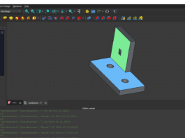
Another method is to use Emacs as an IDE. A Python file can simply be evaluated by pressing the F8 function key (see the above mentioned kbd “<f8>” option). Figure 2 shows an Emacs session with three buffers opened. On the left side is the Python code, on the right side on the top a dired buffer as file manager and on the right side bottom is the Python console with a tabular output. This is not very different from the Spyder IDE (which is included in the WinPython distribution) shown in Figure 3, with the same three buffers opened.
Hierarchical cluster analysis
This example is about agglomerative hierarchical clustering. The data table is the famous iris flower data set and is taken from http://en.wikipedia.org/wiki/Iris_flower_data_set. It has 150 rows and five columns: sepal length, sepal width, petal length, petal width, species’ name (iris setosa from row 1 to 50, iris versicolor from row 51 to 100, iris virginica from row 101 to 150). The code is short, as shown below:
import scipy.cluster.hierarchy as hca
import xlrd
from pylab import *
rcParams["font.family"]=["DejaVu Sans"]
rcParams["font.size"]=10
w=xlrd.open_workbook("iris.xls").sheet_by_name("Sheet1")
data=[]
data=array([[w.cell_value(r,c) for c in range(w.ncols)] for r in range(w.nrows)])
dataS=data-mean(data,axis=0)
o=range(1,w.nrows+1)
y=hca.linkage(dataS,metric=”euclidean”,method=”ward”)
hca.dendrogram(y,labels=o,color_threshold=10,truncate_mode=”lastp”,p=25)
xticks(rotation=90)
tick_params(top=False,right=False,direction=”out”)
ylabel(“Distance”)
figtext(0.5,0.95,”Iris flower data set”,ha=”center”,fontsize=12)
figtext(0.5,0.91,”Dendrogram (center, euclidean, ward)”,ha=”center”,fontsize=10)
savefig(“figure.png”,format=”png”,dpi=300)
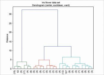
First, the table is read as an array with a nested loop; then, column centring is performed. There are various other scaling techniques, column centring is an example of one of them. The ‘S’ in dataS is for ‘scaled’. In this example, the euclidean metric and the ward linkage method are chosen. Many other metrics are available—for example, canberra, cityblock, mahalanobis, etc. There are also many other linkage methods —for example, average, complete, single, etc. Finally, the dendrogram is plotted as shown in Figure 4. In this example, the clusters are coloured by cutting the dendrogram at a distance equal to 10, using the option color_threshold. To enhance its readability, the dendrogram has been condensed a bit using the option truncate_mode.
Principal component analysis
This second example is about three different techniques —matrix algebra, singular value decomposition (SVD) and modular toolkit for data processing (MDP). About the first, the covariance matrix is calculated on the scaled data. Then, Eigenvalues and Eigenvectors are calculated from the covariance matrix. Lastly, the Eigenvalues and Eigenvectors are sorted. The scores are calculated by a dot product with the data scaled and the Eigenvectors. The percentage of variance is explained and its running total is also calculated.
covmat=cov(dataS,rowvar=False)
eigval,eigvec=linalg.eig(covmat)
idx=eigval.argsort()[::-1]
eigval=eigval[idx]
eigvec=eigvec[:,idx]
scores=dot(dataS,eigvec)
percentage=[0]*w.ncols
runtot=[0]*w.ncols
for i in range(0,w.ncols):
    percentage[i]=eigval[i]/sum(eigval)*100
runtot=cumsum(percentage)
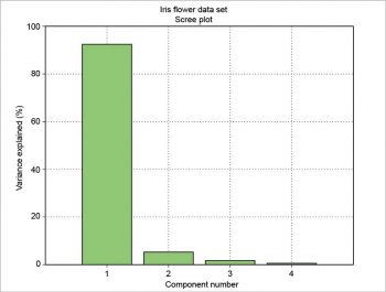
The number of components (N), the variance explained by each component (VAR), its percentage (PCT) and the percentage running total (SUM) can be presented as a table. This table can be drawn using the package prettytable. The results are formatted with a certain number of decimal figures and then each column is added to the table.
from prettytable import *
o=range(1,w.nrows+1)
v=range(1,w.ncols+1)
e=[“%.2f” % i for i in eigval]
p=[“%.4f” % i for i in percentage]
r=[“%.2f” % i for i in runtot]
pt=PrettyTable()
pt.add_column(“N”,v)
pt.add_column(“VAR”,e)
pt.add_column(“PCT”,p)
pt.add_column(“SUM”,r)
pt.align=”r”print(pt)
The result is a well-formatted table:
+----+------+--------+-------+
| N  | VAR  |   PCT  |  SUM  |
+----+------+--------+-------+
| 1  | 4.23 | 92.4619| 92.46 |
| 2  | 0.24 | 5.3066 | 97.77 |
| 3  | 0.08 | 1.7103 | 99.48 |
| 4  | 0.02 | 0.5212 | 100.00|
+----+------+--------+-------+
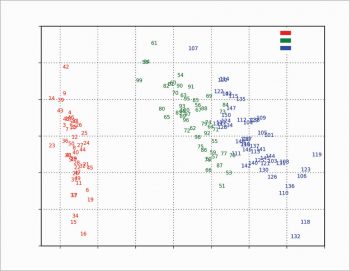
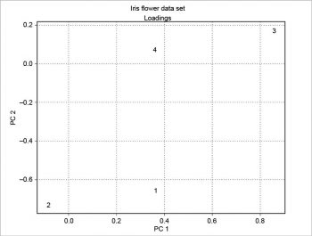
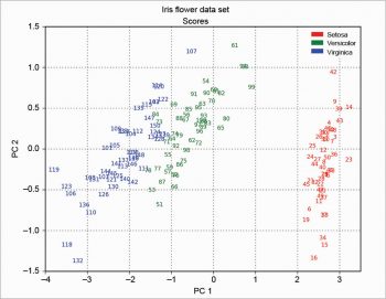
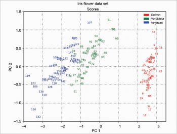
The scree plot is plotted with a simple bar plot type (Figure 5), the scores (Figure 6) and the loadings (Figure 7) with plot. For the scores, the colours are chosen according to the different iris species, because in this example, the data are already categorised.
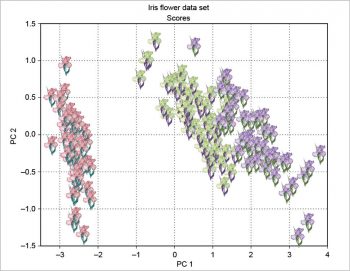
A bit more complex is the scores plot with clipart, as shown in Figure 8 as an example. The original clipart is taken from http://www.worldartsme.com/images/iris-flower-clipart-1.jpg, and then processed via ImageMagick. Each clipart is read with imread, zoomed with OffsetImage and then placed on the plot at the scores coordinates with AnnotationBbox, according to the following code:
import matplotlib.image as imread
from matplotlib.offsetbox import AnnotationBbox,OffsetImage
i1=imread(“iris1.png”)
i2=imread(“iris2.png”)
i3=imread(“iris3.png”)
o=range(1,w.nrows+1)
ax=subplot(111)
for i,j,o in zip(s1,s2,o):
    if o<51: ib=OffsetImage(i1,zoom=0.75)
    elif o>50 and o<101: ib=OffsetImage(i2,zoom=0.75)
    elif o>100: ib=OffsetImage(i3,zoom=0.75)
    ab=AnnotationBbox(ib,[i,j],xybox=None,xycoords=”data”,frameon=False,boxcoords=None)
    ax.add_artist(ab)
The two plots about scores and loadings can be overlapped to obtain a particular plot called the biplot. The example presented here is based on a scaling of the scores as in the following code:
xS=(1/(max(s1)-min(s1)))*1.15
yS=(1/(max(s2)-min(s2)))*1.15
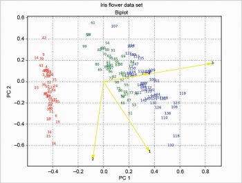
Then the loadings are plotted with arrow over the scores, and the result is shown in Figure 9. This solution is based on the one proposed at http://sukhbinder.wordpress.com/2015/08/05/biplot-with-python; it probably is not the best way, but it works.
The 3D plots (Figures 10 and 11) do not present any particular problems, and can be done according to the following code:
from mpl_toolkits.mplot3d import Axes3D
ax=Axes3D(figure(0),azim=-70,elev=20)
ax.scatter(s1,s2,s3,marker=””)
for i,j,h,o in zip(s1,s2,s3,o):
    if o<51: k=”r”
    elif o>50 and o<101: k=”g”
    elif o>100: k=”b”
    ax.text(i,j,h,”%.0f”%o,color=k,ha=”center”,va=”center”,fontsize=8)
Using the singular value decomposition (SVD) is very easy—just call pcasvd on the scaled data. The result is shown in Figure 12.
from statsmodels.sandbox.tools.tools_pca import pcasvd
xreduced,scores,evals,evecs=pcasvd(dataS)
The modular toolkit for the data processing (MDP) package (see References 4 and 5) is not included in WinPython; so it’s necessary to download the source MDP-3.5.tar.gz from https://pypi.python.org/pypi/MDP. Then open the WinPython control panel and go to the install/upgrade packages tab. Drag the source file and drop it there. Click on ‘Install packages’. Last, test the installation with the following command:
import mdp
mdp.test()
This is a bit time consuming; another test is the following command:
import bimdp
bimdp.test()
In the following example, the scores are calculated using the singular value decomposition; so the Figures 12 and 13 are equal among them but rotated compared with Figure 6. This has been explained at http://stackoverflow.com/questions/17998228, where, to quote user Hong Ooi: “The signs of the Eigenvectors are arbitrary. You can flip them without changing the meaning of the result, only their direction matters.”
import mdp
pca=mdp.nodes.PCANode(svd=True)
scores=pca.execute(array(dataS))
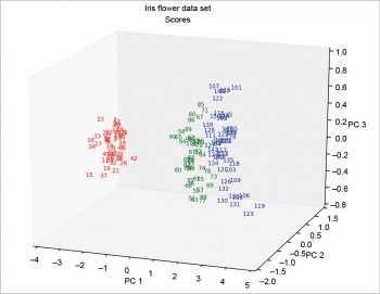
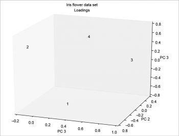
The MDP package is more complex than described here. Many other things can be done with it. It’s also well documented; for example, the tutorial is more than 200 pages long.
The examples presented here are also typical applications for another, very widely used, free and open source software, R. An interesting comparison of Python and R for data analysis was published some time ago (Reference 7). I can’t make a choice, because I like them both. Currently, I use Python almost exclusively, but in the past, R was my preferred language. It’s useful to develop the same script for both and then compare the results.


