The value of data is enhanced by visualisation. With numerous methods of visualisation available, one would like to choose an option that gives the best results. The versatile Python programming language offers one such option.
With new domains emerging daily in the world of computer science, data has come to play a major role in everyday life. There are several emerging fields dedicated to data related activities such as data wrangling, data mining, Web analytics, data analysis, and so on. The field of data visualisation has seen a steep rise because data also needs to be represented graphically and in a way that people can understand. Several tools have come up with various graphical presentation styles, which make the task of data visualisation much easier.
Python, as a language, has evolved in several domains of data search and analysis. It also has a lot of tools and libraries that make the task of visualisation much easier to implement.
The Python tools and libraries available for data visualisation are Matplotlib, Pandas, Seaborn, Ggplot, Bokeh, Pygal, Plotly, NumPy and SciPy. Some of the visualisation that can be achieved using the above tools and libraries is: histograms, box plots, violin plots, bar charts, line charts, stacked column charts, scatter plots, bubble plots, pie charts, heat maps, etc.

The above mentioned tools can be developed using Python only, but there are other ways to achieve visualisation. Various JavaScript libraries and other Web frameworks can be used for the same purpose. For example, D3.js or chart.js can be used in combination with Python for visualisation. The Django Web framework is another good tool for this purpose, as well as to create complete Web apps in Python. These days, data scientists and analysts make extensive use of the above tools in combination with others to achieve the desired visualisation. JavaScript, along with HTML5 and CSS, adds more style to suit ones taste and beautify the visualisation. Lets look at some examples using these tools.
First, make sure you have the following installed in your system.
OS: Windows 7
Python version: 3.5.1
Editor: Notepad++
Now, take the following steps.
1. Install the required tools and library.
2. Use Pip to install Pandas, Seaborn and other libraries.
3. The command to use is pip m install XXXX. Replace X with different libraries.
4. Create a folder pydev and an empty file python_visualization.py.
5. Keep your csv or other file format in the pydev folder for which you want to generate the visualisation.
Note: Certain libraries need to be manually downloaded and then Pip is run to install the libraries. In case you are using Anaconda, it comes with a complete suite of libraries.
In our example, we will use a csv file which contains certain records to be visualised, for which we will generate a bar chart.
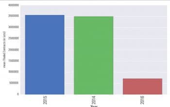
The csv file has been downloaded from one of the commodity trading indices and depicts the volume of contracts traded during three financial years2014, 2015 and 2016. We will plot the year against the number of contracts traded, as follows:
File: - Python_visualization.py import pandas as pd line 1 import seaborn as sns line 2 import matplotlib.pyplot as plt line 3 commodity = pd.read_csv(Historical_Quantity_Data.csv) . line 4 commodity = commodity.sort(Traded Contracts (in Lots),ascending=False) line 5 sns.set_style(darkgrid) line 6 bar_plot = sns.barplot(x=commodity[Year],y=budget[Traded Contracts (in Lots)], palette=muted, order=commodity[Year].tolist()) . line 7 plt.xticks(rotation=90) .line 8 plt.show() .line 9
We import the necessary libraries in Lines 1, 2 and 3. Here we are using Pandas, Seaborn and Matplotlib.
“In Line 4, we declare a variable `commodity` and assign it the value read from the CSV file. The Pandas variable `pd` is used as the file handler to read the file. Next, in Line 5, we sort the values of the column ‘Traded Contracts’ in descending order. In Line 6, we set the style of the grid as ‘darkgrid’. In Line 7, we declare a variable `bar_plot`, which will contain the values to be plotted on the x-axis and y-axis. We don’t want a palette; so, we mute it and order it year-wise. We don’t want our plot to be rotated; so, we fix the rotation at 90 degrees. Finally, we need to show the bar plot in the window; hence, we call the `show()` function.”
Now run the program and you will get the image shown in Figure 2.
This is one example of how we can generate bar charts easily.
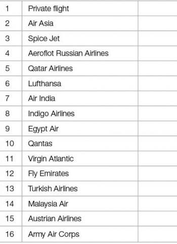
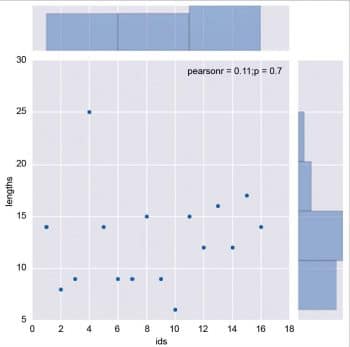
Next, let’s look at another example of a scatter plot visualisation in Python. For this example, we have sample data of the list of airlines in csv format. We will be plotting a scatter diagram to check the length of airlines’ names against their IDs.
Scatter_visualization.py
# Import the pandas library.
import pandas as pd
import seaborn as sns
import matplotlib.pyplot as plt
# Read in the airlines data.
airlines = pd.read_csv(airlines.csv, header=None, dtype=str)
#Provide Column Header names
airlines.columns = [id, name]
name_lengths = airlines[name].apply(lambda x: len(str(x)))
#plot scatter x axis as ids and y axis as length of names
data = pd.DataFrame({lengths: name_lengths, ids: airlines[id].astype(int)})
sns.jointplot(x=ids, y=lengths, data=data)
plt.show()
Once you run the above program, you will get the result shown in Figure 4.
Hint: There are many sites that offer different datasets in various formats. You can use https://catalog.data.gov/dataset?res_format=CSV for this purpose. It gives a list of various data in json, xml and csv format.
Python provides a lot of tools that are simple to use and can generate different kinds of data visualisation. Enjoy coding.

















You can also use D3.js in combination with Python3.5 directly in your browser, without server support. See d3.js example that is part of the demo’s coming with the Transcrypt distribution at http://www.transcrypt.org. The demo is at http://www.transcrypt.org/live/transcrypt/demos/d3js_demo/d3js_demo.min.html