Like our previous article in this series, this one also concentrates on visualising data. It explores the role of Python-Pandas in analysing, organising and displaying data.
Digital Janitor caught my attention the first time I came across it. It does capture the essence of what you need to do if you want to make sense of data. You need to search for data, find what is needed, sort it, clean it and then put it in a format you can use. Only after all that work is done can you begin to analyse it.
In order to prepare the data to show the motion charts in the previous article, we relied on a spreadsheet. But this is manual, tedious and boring. In case it has to be done with lots of datasets, it is prone to errors as well, especially caused by the monotonous activity.
This is where the Python-Pandas package (http://pandas.pydata.org/) comes in handy. It is inspired by the dataframe objects of R.
Consolidating data
If you download historical indices from the BSE (Bombay Stock Exchange) site, you will get csv files like the following:
Date,Open,High,Low,Close1-January-2016,26101.50,26197.27,26008.20,26160.90, |
For using the googleVis package, you need the data to look something like the following:
Date Index Open High Low Close2016-02-29 SENSEX 23238.5 23343.22 22494.61 23002 2016-02-29 IT 10488.4 10507.62 10044.59 10229.49 |
So, you may have multiple entries for the same date, one for each index, and need an additional column to specify to which index a row belongs.
Download the csv files containing historical data of an index from bseindia.com and save each file as Index name‘.csv. Try the following code first in the Python interpreter:
>>> import pandas as pd>>> df = pd.read_csv(SENSEX.csv,parse_dates=[Date],dayfirst=True,usecols=range(5),index_col=Date)>>> df.info() |
You need to instruct it as to which column is a date, and that the day is the first part. You can explicitly load only the desired columns by using the usecols option, e.g., the first five columns. In the downloaded data, using this option will exclude the extraneous empty column resulting from the trailing comma. The df.info method would give you the information about the newly created dataframe object.
Now, you may add the extra column you need. Notice that all the rows in the dataframe are assigned the same value for a new column.
>>> df[Index]=SENSEX>>> df.info() |
You can now write a small Python script to read multiple files. Create a list of dataframes by reading each csv file. Then, concatenate the list into a single dataframe. Add a new column, Volatility, which is the difference of the high and low column values for each row. Finally, you may create a new dataframe with only the columns you need and save it as a csv file.
import pandas as pddef read_bse_index(index):df = pd.read_csv(index + .csv,parse_dates=[Date], dayfirst=True,index_col=Date,usecols=range(5))# add a column with a fixed valuedf[Index]=indexreturn dfindices=[SENSEX,IT,Healthcare,FMCG,Bank]df_list = []for index in indices:df_list.append(read_bse_index(index))# concatenate all dataframes into onedf = pd.concat(df_list)# add a column computed from other columnsdf[Volatility]=df[High] - df[Low]# create a new dataframe with only needed columns# Date is implicitly included as it is the index columndf2 = df[[Index,Close,Volatility]]# list the entries for Jan 1, 2016print(df2[2016-01-01])# save the dataframe as a csv filedf2.to_csv(BSE_indices.csv) |
Plotting data from a dataframe
An attraction of the dataframe object is that you can select parts of data very easily. Try the following:
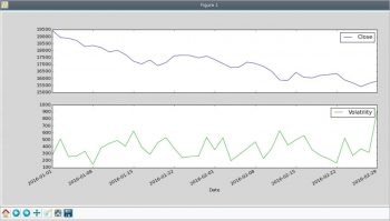
>>> import pandas as pd>>> import matplotlib.pyplot as plt>>> df = pd.read_csv(BSE_indices.csv,index_col=Date)>>> bank=df[Index]==Bank>>> df[bank].plot(figsize=(15,7),subplots=True)>>> plt.legend(loc=best)>>> plt.show() |
In the above code snippet, you have selected the rows in which the index is Bank, and plotted the Close and Volatility columns as sub-plots. The result is shown in Figure 1.

Reorganising data
As you might have discovered, it is easy to select the rows you want and add columns. So if you want to organise the data such that each index corresponds to a column, you can do so using the following code:
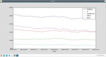
import pandas as pddef select_index(df,index):# Select rows for a specific indexs = df[Index] == index# return a dataframe with selected rowsreturn df[s]df = pd.read_csv(BSE_indices.csv, index_col=Date)# the unique values of Index columnindices=set(df[Index])# Create an empty dataframedf_col = pd.DataFrame()for index in indices:# add the closing value as a columndf_col[index] = select_index(df,index)[Close]# plot the indicesimport matplotlib.pyplot as pltdf_col.plot(figsize=(15,7))plt.legend(loc=best)plt.show() |
Select the unique index names. Then, for each index, select only the desired rows and add the closing value column to a dataframe as a new column. Finally, plotting the data is easy. The result is shown in Figure 2.

Hopefully, you are convinced that if you need to make sense of data from various sources, Python-Pandas can be an immensely valuable tool.


