Ubuntu 12.04 is the fourth LTS release from Canonical that came out about a month back, and the first LTS with the revamped user interface, Unity, as the de-facto interface. Let’s take it up from the long-term support point of view — that will be supported for five years for both desktop and servers — considering how Canonical should aggressively push it to be preinstalled on OEM PCs for both enterprises and consumers alike.
Grab and put!
The interface to system installation hasn’t changed much — download the hybrid ISOs, dd it to a USB drive, followed by boot from USB. You can either choose to install it straight to hard drive, or run the live OS to test (for hardware compatibility — all hardware, including the Broadcom Wi-Fi, are compatible on my Intel Core i5 first-generation-based Samsung RV509 test laptop) — and then install. The installer still prompts you to install third-party (proprietary) multimedia codecs support during installation, which will only work provided you have an active Internet connection.

Installing proprietary codecs come with its own set of quirks — but let’s not get into that. A point to note: you can easily install FOSS libraries to get the same functionality later. Canonical can’t ship with these libraries due to software patent restrictions at some parts of the world. Unfortunately, most users blame the absence of codecs to “Linux”, and this install-third-party-(licensed)-codecs option has been a nice add-on by Team Ubuntu since a few releases that let’s you have a working system from go-live with MP3, and somehow even Flash support!
Typically, the installation takes around 15-20 minutes depending on your broadband speed, and could be more if you also choose to install all updates made available online since the ISO was released. On the contrary, if you don’t want to install any codecs or updates during installation, or you don’t have an active Internet connection, the installation is over within 5-7 minutes.
Another thing to note is, if your network is configured, Ubuntu automatically picks up your time zone correctly — something the latest Chromium OS build doesn’t.

Overall, the installer remains a no-brainer, and only has a few steps for the user to configure… and if any newbie is able to get past the partition setup (all these swap, home and root partitions typically confuse first-timers from the world of C:\, D:\ drives), he should be all set.
A real nice addition is the installer’s concluding slide. While it introduces the user to the Ask Ubuntu question bank, it additionally also pulls in recent updates from Twitter land that has anything to do with Ubuntu and Canonical. Whoever thinks marketing and open source can’t comfortably sit together is plain old-fashioned — you can’t sell if you refuse to market, stand out from the rest, and do your PR!

I forgot to time how much time it took to boot up for the first time after a fresh install — anyway, it’s irrelevant since the subsequent boot times is what we’ll all be looking at. From start to LightDM on subsequent bootups it takes around 22 seconds on my laptop (a Core i5 M 480 system, with 3 gigs of RAM). And from DM to Unity is another 5-7 seconds (Ubuntu 12.04-based Mint 13 turned out to be quicker — does it in 2 seconds on the same system). It isn’t so bad! Besides, suspend to RAM works like a charm — and both suspend and wake up take less than 5 seconds.
Unity and Usability
Back on LightDM — it has been the default display manager in Ubuntu for the last few releases, and you gotta admit, it looks much more elegant than the vanilla GDM, and also MDM that the recently-released Mint 13 sports.
Login, and you see what many have have been raving about, and others bit**ing, depending on whose side you’re on. Since I’ve never been a hardcore GNOME 2 user, both GNOME Shell and Unity come as nice alternatives when I need a change from my usual KDE desktop.
Note: Unity is powered by Compiz. In case your graphics card doesn’t support 3D acceleration, or you don’t have drivers that work well with GNU/Linuxes, Ubuntu comes with Unity 2D that looks pretty similar to the default Unity 3D. Select from LightDM login screen before logging in.
Based on my past experience, Unity (not so much as GNOME Shell) had always been a sore experience — too many usability issues to deal with in order to continue using it. Thankfully, most of these irritants now seem a history with this current release. The main one, among the many, was how the launcher behaved with auto-hide enabled (the default settings till v11.10). It would always take a few seconds to show up — and add to that sometimes it would only be partially visible (like 10% or less with no way to access applications on it). I mean, you know the launcher has triggered but somehow it wasn’t able to come forth.
Fortunately, in this release, auto-hide is disabled out of the box. That, I guess, left the initial positive impression for me to get used to the rest of the environment. (You can, of course, enable auto-hide from System Settings –> Appearances –> Behaviour). Also in this release, and I can’t remember if this was there in the earlier editions, a nice addition is the progress bar we get for any download/copy activity on the Application launcher (see screenshot for a system update in progress). This helps us carry on with our routine while still keeping an eye on the “progress”.

You get the progress bars for Nautilus copy/move activities also. However, not when you download anything using Firefox. For that you might want to try this Firefox extension. However, I wasn’t able to dig out anything for Chromium.
Memory consumption with no apps right after a system restart is around 250MiB — pretty decent. On standard usage it easily shoots over 1GiB (see the screenshot).

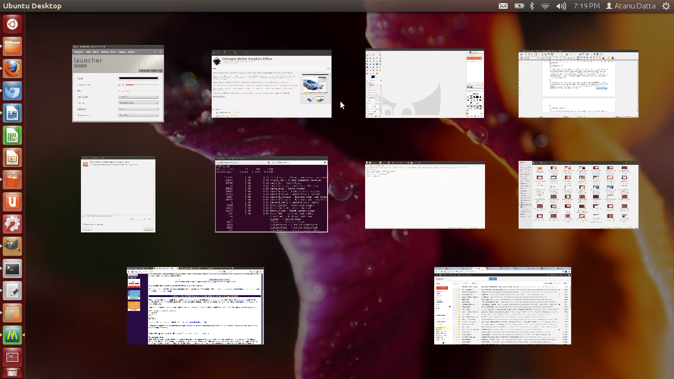
The Unity Dash has seen some subtle improvements. You can trigger it by clicking the Ubuntu button on the launcher, or pressing the super key (MS Winduhs key). In fact, a real nice addition is the Keyboard Shortcuts reference overlay (see screenshot) — trigger it by pressing and holding the super key for a couple of seconds — which helps you quickly look up associated Unity-related actions and triggers. My favourite is Super + W to get a bird’s eye view of all the apps I’m currently running.


Back to the Dash, compared to the last release, it now comes with quite a few additional lenses. These lenses are basically a neat interface to search for your applications (installed on your system or available in Software Centre), files and other assorted data stored on the computer. Of note are the Music and Video lenses that are introduced in this release.
While using the Music lens helps you sort and search your collection using filters based on genre and year, the video lens also shows what’s available online (from popular sources like YouTube, TED Talks, Dailymotion, etc.) besides your local video collection stored in the hard drive. Although, in a period of one month, I never found any of the videos from the Web it suggested interesting enough to watch :-(

While an easy interface to search for music, videos and assorted files stored on the desktop is a welcome change, the primary purpose of Unity Dash is to also serve as an application launcher. This is where I strongly feel Alt+F2 should be merged with Dash’s home screen generic search lens.
Take a look at the following screenshots. On the former, I’m searching for the calculator application on the Run dialogue, where I gotta say, the results ridiculous. On the latter, it’s the home screen lens, and here search results are as expected. Given GNOME’s run dialogue isn’t as powerful as KDE’s KRunner utility, but since it’s all open source, and Unity anyway is diverging from GNOME 3, shouldn’t it adopt a more KRunner like behaviour? I, for one, only see a better user experience if Alt+F2 run dialogue/lens is merged with the home-screen search or even the Applications lens interface.


Coming to the applications lens, it nicely divides apps installed and available for download — from one single interface. However, since it dumps all apps on once place, the only way to look around what’s available is either using search or using the filters (using the Filter results drop down, as seen on the following screenshot).

Applications and more…
Being a 700MB ISO, not a lot is available out of the box. I guess Team Ubuntu has done an adequate job with the defaults, besides making sure the latest versions for each application are made available through the updates channel. For example, the distro released with Firefox 11. And v12 was provided through the updates channel. Hope this trend is followed for all essentials applications like LibreOffice, GNOME tools and libraries, etc.
Of course, if we need more apps, what comes in handy is the Ubuntu Software Centre — the celebrated “app store” of the Linux userland. I guess, the only distro that has a visually more appealing store is the Ubuntu-based and China-made Linux Deepin.

If I remember correctly, in the initial incarnations of the Software Centre, it didn’t list any application that was not GUI oriented. Thankfully, before I shot the Terminal to install Synaptic, I ran a search for some common server and command-line utilities and my doubt was put to rest. Yes, it does let me search for any and all utilities that Synaptic enables me to search it seems.
As an add-on, I find the layout neater and more intuitive, except for the feature apps banner on the home screen that hardly ever updates. I remember seeing one of the EA games featuring on it (see screenshot) when they made the news earlier this month (which has since disappeared). Guess it could take up more of a Google Play for Android like behaviour, where an editor updates the featured sections weekly with the top rated, or most popular apps for the week. Heck, can’t someone come with up with an automated algorithm for the functionality?
Another thing I have beef with is this: although while checking out an application before installation (for details, ratings, reviews, etc.) it lists certain add-ons that can come in handy, there is no way to check the detailed description of these add-ons without searching for them individually. Refer to the screenshot below — a user might not know what Dia is (why is Dia listed twice, by the way), and even if he does, he might not be sure how would Dia serve as an add-on for Inkscape.

On the brighter side (depending on whose side you’re on), it seems the Software Centre is the longer run would like to become a major hub for offering third-party commercial (read: non-freedom) tools as well, which you can buy right from here. It’s already selling some magazines, et al.
Some titbits
Of note is the Ubuntu One cloud storage. As we already know for a while, anyone is free to create an account and get 5GB of storage, and buy more if need be. The best part of using Ubuntu One, if you’re going to stick to Ubuntu as your primary desktop, is how well the software is integrated with the rest of the system. However, where Ubuntu One lags is availability of its client software for other GNU/Linux distros — a reason that stops many users to adopt it over popular choices like the platform-independent Dropbox.

What’s appreciable from Team Ubuntu’s part is the software doesn’t come installed by default. Only an icon is available in the launcher to begin with. Clicking it takes you through the install wizard in case you’d like to set it up. Else, you can simply remove the launcher shortcut.

Likewise, Windows or Samba Share is something a lot of people use in an enterprise environment. Now, although Samba is not installed by default, you can easily install it by selecting “Share this Folder” from folder properties dialogue. Ubuntu takes care of the rest. It is these intuitive ways to facilitate installation of some of these common services, that could be useful to a set of users but not all, is what wins Ubuntu over. Avoid bloat out of the box!

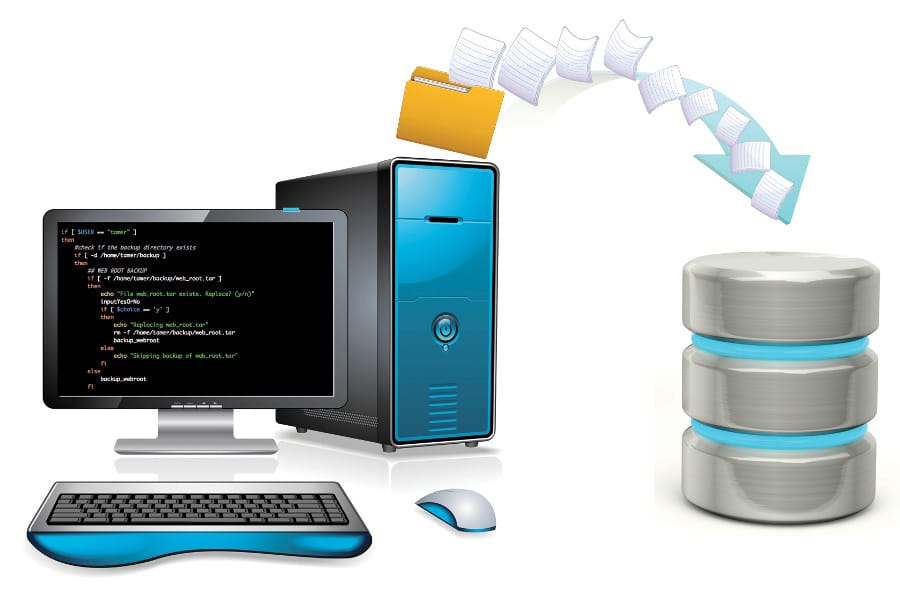
Back to Ubuntu One, if you install it, it will be the primary source of backup and restore even in the Deja Dup Backup tool, that comes installed by default. Of course, Deja Dup comes with provision for additional storage services — like FTP, SSH, WebDAV, Windows Share, or a local directory or partition on the hard drive.
Second thing to note is the online Music store integrated right into the default music manager/player — Rhythmbox. Many thanks to Ubuntu for going with 7Digital for this — a service available to all users throughout the world, unlike other popular source like Amazon MP3, which are restricted to parts of the world. Unfortunately, 7Digital’s catalogue is not that handy — many popular artists and bands are missing.
The experience of buying music from Rhythmbox is neat and very well integrated. I ended up buying a collection of Miles Davis (20 songs for $1.99 — nice deal, eh?) to test the seamlessness of the experience. The files once bought, are first transferred from the 7Digital store to the Ubuntu One cloud account, and soon available on my Rhythombox library. The only grudge? I found the version of Rhythmbox that comes with Ubuntu rather unstable, as it likes to crash on me every now and then.

Overall experience
I’ll note just a few small things before I conclude here. First is how professionally the overall theme blends with the desktop. The translucent notification bubbles in this release blends to match the colour of the wallpaper, and some nice wallpapers are available by default if you don’t fancy purple. In fact, the user wallpaper even reflects on the LightDM login manager the moment you select your user name — a very pretty gimmick! Besides, if you’d rather customise the theme further to your liking, you can install the MyUnity tool.
Another thing of note is the introduction of the privacy settings manager inside of GNOME System Settings. This is where you can fine tune your system-wide preferences as far as privacy is concerned. A nice use-case: you might want to block certain files to show up under recent files and folders, search, or the music and video lenses — hint: pr0n, if you will ;-)

Next up, although the global menu is a nuisance to get used to to begin with, I think it’s only matter of time before you get used to it. It makes a lot of sense, considering most laptops now default to 768px vertically, instead of the older 800px standard — so whatever space we can save is a bonus. Besides, the top panel, if you think about it, is a waste of space. Why not try to make good use of it? Then again, users with HD resolution displays tend to complain a lot more about the integration. It would have been nice if there was a setting (as was planned initially) to turn this off “globally”. So, of course, there is a lot of room for improvement, and it should plan to accommodate users from all workspaces. By the way, LibreOffice still looks out of place since it comes with a regular menu out of the box.
A stupid bug with the power manager: there is no progress bar on the battery icon on the top panel to reflect how much is left when you’re charging it. As you can see in the following screenshot, it seems as if the battery is completely drained out while plugged in, when, it fact, it’s around 75% charged as per the indicator window below. On the other hand if I disconnect the charger, the indicator shows the right level on the panel icon.

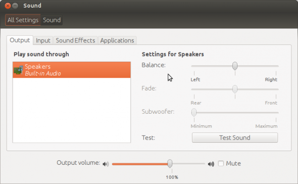
Of note is also the sound/volume preference window that looks significantly different than what comes with vanilla GNOME 3.
Of another note is the screenshot below. You get these random “Report Problem” dialogues sometimes — that more often than not fails to tell you which application or service crashed or caused the error. And many a times when you click Report Problem it asks you random questions only to advice you in the end that you should rather use the bug tracker to submit your issue than this software now that Ubuntu 12.04 has released. WTF? Seriously, make up your mind, and fix this bug submission tool!

Finally the HUD menu is a nice add-on. Although, it will take a lot of time before I personally can remember to use it instead of the regular applications menu, it likes to show up as an annoying surprise when I hit the Alt key by mistake (you trigger it by pressing Alt). But, I do like the idea. Maybe this will be a success, maybe it won’t — but, at least, Ubuntu is trying many things new in the desktop space. By the way, it doesn’t work with LibreOffice, again!

That’s all folks! Time to go. Overall, if you can ignore the minor bugs and irritants, I certainly feel 12.04 is one of the most polished, not just Ubuntu releases, but GNU/Linux distros in the market currently. You should definitely try out, evaluate and then recommend. Yes, Unity needs getting used to. But if you’re a long-time GNU/Linux desktop user it shouldn’t bother you that much. In fact, you could even surprise yourself by falling in love with it — like I did. After all, GNOME and I just don’t go together — and this is perhaps the first time I’ve used a GNOME system for better part of a month.
Allow me to leave you with the reboot menu — love the fact that standby icon (on the extreme top right corner) turns red from white to indicate the system needs a reboot to finish update.

P.S. → Forgot to report another bug; although I’m not sure how many people actually use the messaging menu, especially the Gwibber app. When I tried to authenticate Facebook, I got the correct English (my preferred desktop language) login authorisation page. Somehow Twitter authorisation pulled up a Hindi page — and I confess being a Bengali, and having only learned Hindi as a subject till eighth grade, I had a hard deciphering this:














[…] guys who made it. After all, who knows the software better than the people who make it?Check out our review of official Ubuntu 12.04 release, from a consumer point of view.Related Posts:Ubuntu 9.10 Unleashed, Amid Windows 7 & Snow […]
This is good distro. But there is one big problem for us here in India. I connect to the internet using a BSNL EVDO Capitel modem. After plugging it in, it is detected (as shown by lsusb) but Network Manager does not show the modem so that i can configure it to connect to the net. There are some workarounds in the Ubuntu forum but they don’t work all the time. This problem was non existent in 11.10 and 11.04 but is a major pain in this version. Linux Mint 13, based on Ubuntu 12.04 suffers from the same problem. Fedora 16 correctly detects the modem and allows me to configure it to connect to the net.
same problem with me…-(
Wlan not function properly in my Laptop, it detect the Broadcom STA driver.
I don’t like Unity , hence the first thing I did after getting Ubuntu 12.04 was “sudo apt-get install gnome-shell” , believe me, Gnome3 is super-duper-awesome !! Do try it out :)
nice review, congrats.
[…] to copy the image on to the hard disk. Just to note, the time zone doesn’t configure the correct time zone automatically like in case of Ubuntu; I had to manually click on Kolkata from the world map for IST.The user setup step comes after you […]
u r provided a cd for tis magzin bt i hav doubt is that is for 64bit or 32bit os? will u plz tell me
[…] This article mentions the feature I’m looking for (just above the second pic): https://www.opensourceforu.com/2012/05/ubuntu-12-04-precise-pangolin-review/ […]
Ubuntu 12.04LTS is buggy,It’s crashing so often and some times freezing the computer.I switched to Ubuntu cuz of Fedora 16,which was loaded with crappy G-shell. Now shell has been improvised and can be customizable using the addons,hoping for a stable system…
still typing from LTS
Ubuntu 12.04 is verrry buggy. It keeps crashing. If this is a LTS they better get it right. I am starting to hate it and I am the biggest Ubuntu fan. 10.04 super stable loaded everything on it. Nautilus keeps crashing to. It got worse when I did the update after installing the main distro. In the Ubuntu forums it seems they are ignoring us. Very unlike my previous experiences.
There is no other distro that does it all and with panache like Ubuntu LTS which I can confidently deploy at my university and office as well as at homes and with seniors and juniors alike.
GoBang 1.04.2 (32 bit)
Code Name: “Eliza”
Kernel: 3.2.0-39-generic-pae i686
Display manager: MDM
Window manager: Openbox 3.5.0
File manager: Thunar 1.6.2
Last Upgrade: 16.06.2013
Multi language iso suport Hindi Language
Home page: http://www.gobangos.wordpress.com
Minimum Hardware:
Pentium 4, 1GHz Desktop system
RAM: 64 – 256
Hard Drive 2,5 – 4 GB