No Unity. No GNOME Shell. But a GNOME 2*ish-looking GNOME 3 + Compiz Muffin window manager, dubbed Cinnamon. It comes with a certain amount of polish, subtle desktop effects, and the right amount of default software to get most people started.
An hour into Linux Mint 13 “Maya” made me certain that this is finally a Linux distro I can suggest to the new-comers. Given it’s a bit boring for some of us (and the number of this “some” could be like real small) who won’t really enjoy using it regularly. We’re not the target audience.
So, with that out of the system, let’s see how the GNOME 2*ish-looking GNOME 3 works.
Mint 13 is based on Ubuntu 12.04, and likewise it’s an LTS edition which will be supported for five years. The installer’s look and feel has remained the same from last version — even the slides haven’t changed. The only addition is an odd-looking screen that shows up as the partitioner. It took me by surprise, and then I ended up clicking the “advanced partitioning tool” link to get back to the Ubiquity (Ubuntu installer) partitioner that I’m more familiar with.

It took around 20 minutes to install on hard drive. The basic copying operation was done in a matter of minutes. It’s the connecting to online software repos and then fetching stuff part that took a helluva lot of time. Since it’s a 800 MB ISO, the Mint team could have also packed the language packs in it, rather than making one wait at the end of installation.

Reboot. It takes 5 seconds flat to shutdown, and 28 seconds to boot up to the display manager (DM), on an average. The DM’s called MDM — a fork of GDM 2.20. Naturally, it comes with the age-old GDM settings options (available once you’re logged in obviously). Good news is, it’s themeable. Bad news? The default Mint theme would fail to give you the high.
From MDM to the desktop after login takes around a couple of seconds – now, that’s dead fast. The desktop looks like what we’re used to (assuming you’ve used Mint before)… a slim panel at the bottom, and the rest of the desktop space is yours to fill up with all sorts of random folders and icons (of course, who like it this way). The panel has the application menu (Mint menu) on the extreme left, followed by the show desktop icon, a few application launch shortcuts (Firefox, Terminal and Nautilus file manager, by default), the task manager, and finally the system tray that holds the clock, volume, battery indicator and Bluetooth, among other things. There is also a Cinammon settings menu shortcut (note the ^ icon) that additionally holds the panel settings options.

I gotta say the desktop theme colour palette is very cool (excluding the wallpaper). The panel is a darker share of grey and the window manger color is a very subtle shade of grey. This is the Mint-X theme, and unlike the default GNOME Adwaita theme, this one is seriously much more elegant. In fact, it’s better than Ubuntu’s Ambiance, me feels.
The only regret is the icon theme — with all those Apple-like squarish icons it sort of looks hideous. But this can be easily changed to your liking, so a minor issue there. Although, it’s really about personal tastes, I can’t stand that Acdsee logo for image viewer (see screenshot below), and its Firefox icon is also ridiculous. Besides, many of the icons are just not obvious enough — for example, the Software Manager icon looks more like a favourites/bookmarks icon.

The above screenshot is the default Alt+Tab toggle. I gotta say it looks much more pleasant and is functionally more usable compared to both GNOME Shell and Unity’s version of the same. Back to the quirks with the icon theme, in the above screenshot note that both System Settings and Cinammon Settings use the same icon/thumbnail, yet for the latter it looks scaled up.
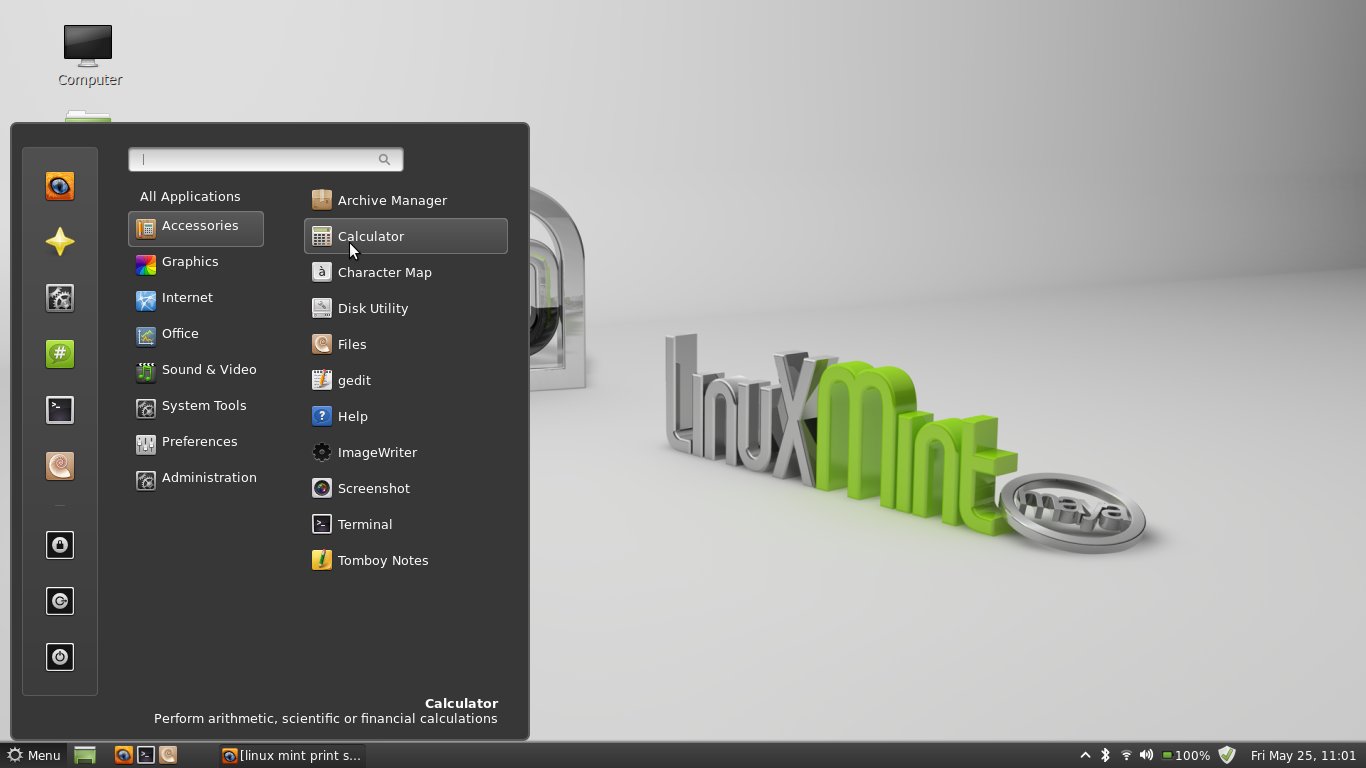
Somewhere the Mint developers have actually applied logic is the Mint Menu for launching applications. Given, nothing much has changed for the last few years, but it’s the overall polish the menu has received that’s commendable — a much cleaner and saner implementation compared to GNOME Shell’s apps menu, Unity’s dash, as well as KDE’s Kickoff. Of course, given the overall design of GNOME Shell and Unity, implementing the Mint Menu in them would kind of look out of place.

As far as out-of-the-box applications are concerned, Mint more or less covers all segments. And unlike it’s upstream, which has taken the insane decision to rid itself of essential apps like GIMP just so the OS comfortably fits in a 700MB CD image, Mint takes a more pragmatic decision to increase the ISO size by a hundred megs or so to fit more apps. I mean, who burns ISOs in CDs anyway — and even when they do, the cost comparison of blank DVDs vs CDs hardly makes a difference.
Also, I appreciate the fact that Mint is trying to steer clear of implementing a global menu for all apps that both GNOME 3 and Unity are bent on to implement in their own ways. The major gripe most users have with a “global” menu is the fact that the developers are simply assuming everyone uses apps in full-screen mode. When the fact of the matter is, if I have a HD resolution screen or use multiple displays, adopting the global menu is actually a regression considering apps won’t always be full-screen, and rather side-by-side, in most cases.
Back to the software selection, Mint comes with its own tweaked version of Software Centre called Software Manager. As you can see in the following screenshot, it’s nicely categorised. It also advertises – in a subtle manner – that the manager currently has almost 60,000 packages to offer. That’s actually a lot to play with. And this is exactly where Debian and it’s derivatives shine. Of course, being binary-compatible with its upstream, most Ubuntu PPAs should work with Mint — it’s just a matter of configuring these. (Hint: Get GIMP 2.8 from one of them PPAs.)

Another nice thing is, the Software Manager also offers subcategories of apps. In the following screenshot, you can see the subcategories inside the Internet category. This is really, really handy when just want to browse the manager. Besides all those scores next to apps from the users really help new-comers to pick and choose. And just like Ubuntu Software Centre, this one also has comments/reviews for most of the popular apps from the large community of users. I wonder why the Fedoras and openSUSEs of the world haven’t yet integrated this feature to their respective GUI software managers.

The final point to take note of is Compiz — our darling window manager from the second half of last decade. We all used to love it and show off the effects to the Winduhs users — yep, those were the days, when we’re young :-) Yes, of course, most of the effects were counter-productive… and since many users loved to royally screw up their systems playing with it and then probably blamed stability issues on the distros, most upstreams slowing moved away from it. Both KDE and GNOME now come with it’s own set of desktop effects integrated right into their default window managers. The only two major distros that uses Compiz now is Ubuntu for its Unity effects, and Mint.
The CCSM (CompizConfig Settings Manager) plugin is of course missing. [EDIT: Regret the error. Mint 13’s Cinnamon desktop effects are not because of Compiz, but something called Muffin (a fork of GNOME Shell’s window manager Mutter).] And the distro comes with some of the effects enabled out of the box. What I like most is how the workspace switcher of GNOME is integrated with Compiz Expo-like feature… Take your mouse cursor to the top left corner of the screen. You see the current workspace zooms out to show you the second workspace (Mint has two enabled by default). The window in focus is maximized in the workspace. Move your mouse back into this workspace, and all the open windows will scale appropriately to give you an overview.
Next to this workspace you see the secondary workspace that is activated by default. Once you hover your mouse on any workspace, it additionally shows an X (close) button on the top right corner of the workspace. And on the extreme right center edge of the screen, you have the + (plus) button to add more workspaces as and when you need them, and then move windows from one workspace to another. Deleting a workspace with open apps in it won’t kill the apps — relax, they are moved to the previous workspace.

The usual compiz shortcuts work — Ctrl+Alt+Right Arrow key to move to the next workspace, Ctrl+Alt+Left Arrow key to move to the previous, Ctrl+Alt+Shift+Left Arrow key to move the in-focus app to the next workspace and the like.
That’s more or less it. Overall, although Cinnamon as a GNOME 3 fork is brand new, and the developers note that it’s still not stable enough, functionality wise compared to older Mint releases, Mint 13 is a solid incremental update — with nice polish added throughout the desktop. The best part is it doesn’t force it’s loyal userbase to unlearn and relearn new UI additions just because they feel that’s the right way to go forth. And it’s commendable the effort they have taken to accommodate the old-timers also with simple things — for example, the availability of Synaptic package manager by default when Ubuntu has abandoned it, and the older more common-sense desktop user interface compared to Gnome Shell and Unity.
A day of usage doesn’t tell you a lot about stability of the desktop, but I didn’t encounter anything remotely nasty to report. The best part, because it hails from a country that doesn’t encourage software patent lays yet, naturally Mint comes packed with all the multimedia codes available right out of the box. It comes with VLC and Banshee installed, so can throw most formats at these and they should be able to play. It comes as a surprise why they chose to keep Totem as part of the default install, when VLC is also included.
The downside, as the developers note, it might not play nicely with your system if your 3D graphics card is not supported. Unfortunately, there’s no Cinnamon 2D like Unity 2D available. So, the Nvidia and AMD/ATI users should test extensively in the live moved before installing it on the system.
That’s all folks! Please leave you impressions of Mint’s Maya in comments. Meanwhile, allow me to go ahead and install Maya’s MATE edition and see where the GNOME 2 fork is headed.













There’s no connection between a global menu and fullscreen apps. One does not compel the other. Mac users have always had a global menu and use multiple windows like everyone else. The trick is enforcing standards so all apps use the global menu. Apple can do that. Gnome can’t.
[…] DM to Unity is another 5-7 seconds (Ubuntu 12.04-based Mint 13 turned out to be quicker — does it in 2 seconds on the same system). It isn’t so bad! Besides, suspend to RAM works like a charm — and […]
[…] the target audience of Fedora — would know how to make live USBs from the ISO.Anyway, after Mint 13 and Ubuntu 12.04, which also bundles GNOME 3.4 with their own set of heavy customisations — […]
i think mint looks beautiful, and i want so badly to ditch windows in favor or it, but until it can just flat “work” with the hardware i’ll probably always be stuck dabbling in dual boot. for instance with my new laptop’s touchpad doesn’t work, nor do the backlit keyboard controls, on my old laptop i had to seriously hack to get the speakers to turn off when the headphones were plugged in…etc, etc, etc. i understand this isn’t a mint issue per se, in that lots of hardware manufacturers refuse to support linux and/or don’t open up their source, but still… with a pretty solid geek card to my name, if it takes me days to tweak my linux just to get it to work (And sometimes not even then), well it isn’t any wonder why the average user wouldn’t bother.
Thanks, I have now switched from Ubuntu 12.04 to Linux Mint 13. I did not like Unity
I have mint 13 cinnamon installed and I must say that it is very good, I switched from min 12 kde to this because is normal.
Hi, I used the live dvd of mint and tried all four variations-32 & 64 bits. They were working fine. but some how due to my inadvertant modification in its set up now I could not access internet. Pl help how to restore original internet compatibility. I could not run even my Knoppix live 6.4 which was working smoothly all along.
Thanks in advance.
Sharad Kapadia
Nice review. I dont try Mint 13 yet. Its expo screenshot here amazed me. It is unique. I am downloading Mate 13 Cinnamon now. I wanna try it.
Thank you for inspiration. I collect ideas like this in my dreambox: linuxdreambox wordpress com.
Tried it 2 weeks before but frustated as i was unable to dual boot..I am having windows 7 beside to it.. if i change boot partition its saying no OS found..