It is quite well-known that the two behemoths among free software operating systems, the ones that both represent and impact GNU/Linux, are Red Hat’s Fedora and Ubuntu from Canonical. Ubuntu’s latest version, 11.04, also known as the Natty Narwhal, was released on April 28, and a review of this version appeared in the June. Fedora followed on May 24 with version 15, codenamed Lovelock. Now, when you have two such similar releases at practically the same time, it creates rather a “Big Choice”, and it might even create a “Big Dilemma”. So, how do the two stack up against each other?
Delving into the core
Examining the core first, we find that the foundations of both are almost the same. The kernel is at version 2.6.38 in Natty, with Lovelock’s just a few point releases ahead. Kernel version 2.6.38 brings a lot of desktop-oriented improvements, resulting in much better desktop performance than was previously the norm.
Both distributions have the xorg-server at 1.10.1, udev version 167 and freetype version 2.4.4. However, while Ubuntu has already been using GRUB 2 at version 1.99rc1, Fedora staunchly continues with GRUB 1 at version 0.97. Whichever version you use, this aspect does not create much of a hassle — just the method of configuring GRUB differs in the two versions. Another area of difference is GCC. Lovelock includes version 4.6.0 of the compiler collection, while Natty includes 4.5.2 — so developers who want that wee bit more, may be happier with Lovelock.
With the preliminaries over, let’s get around to the more visible aspects and look at the giants from the outside!
The desktop environments
We will not compare KDE on the two distros. The first reason is that, both of them include version 4.6.2 of KDE; second, KDE is not the default environment of either distribution; and third, KDE 4.6 is not as radically different from 4.5 as the default environments of Lovelock and Natty are from their previous counterparts.
Lovelock and GNOME 3
Lovelock is the first major distribution to include GNOME 3 as the default desktop environment (see Figure 1) and GNOME 3 is… well, there’s a lot to say about GNOME 3. Even if you are not biased, you have to admit that GNOME 3 makes almost everything harder than it was previously.

A major issue with software developers is their desire to reinvent everything from scratch. This is not essentially a bad thing, and GNOME up to its major version 2, GNOME was definitely plagued by legacy code such as CORBA. However, the problem with the developers and maintainers of GNOME is that they prioritise simplicity to the extent of bordering on the simplistic. This is exactly the case with GNOME 3.
The default dual-panel setup of GNOME has been replaced by a single panel at the top, and a translucent, hidden notification area at the bottom. The top panel displays the clock in the centre. Clicking on the clock opens up an enhanced version of the standard calendar, which allows managing your events from the calendar itself (Figure 2).

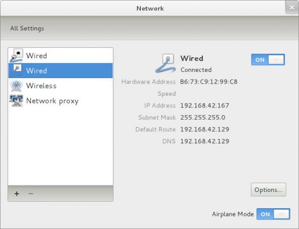
The top-right portion of the panel contains the usual system management icons, including the Network Manager, the interface of which has changed somewhat in Lovelock. The networking menu displays a simplified version of the available networks, each with a representation of a toggle switch to the right (Figure 3).

Simply clicking a network’s entry turns it on or off. The network settings and systems settings windows have also changed (Figures 4 and 5, respectively); the latter was named Control Centre in previous versions of GNOME. The system settings window appears similar to the KDE one, but some important features have been removed from the user interface. One is that you can no longer customise the desktop theme using the built-in tools as easily as you could in previous versions. In fact, the default tools don’t have any option to change the theme at all! Another UI change is that now there are no buttons present to minimise or maximise windows. To do that, either right-click the title bar and select the appropriate option, or use the keyboard to achieve the same effectboth much more cumbersome than the established norm.


The top panel’s default menu has also been replaced by an Activities entry. You can either click on it, or point your mouse to the top-left corner of the screen. This opens up a screen with bookmarked applications on the left and those that are currently running in the middle, along with an Applications tab that lists all installed apps. However, the convenience of having the applications listed in groups (Accessories, Internet, etc.) is gone. The right side of the Activities screen shows the currently available virtual desktops. There is always one more than the number you are using, so you can keep creating as many as you like.
GNOME 3 is new software, and, just as was the case with KDE 4, this first version still has issues that need to be sorted out. For example, Figure 6 shows the Activities screen along with an error notification at the bottom. This particular error is not fatal, but it keeps recurring, and diminishes one’s confidence in the software. Notifications in GNOME 3 are unobtrusive, and can be pulled up at a later time, as shown in Figure 7. The Activities screen also allows you to search for applications and files (Figure 8).


Another deviation from the norm is the user menu in the top-right corner of the screen (Figure 9). The restart and shutdown options are now gone, and only ‘Log Out’ and ‘Suspend’ remain. To restart or power off the computer, either press and hold the Alt key while the menu is open, which replaces the ‘Suspend’ item with an option to power off or restart — or log out and then proceed to shutdown from the login screen.

If you have more than one window open in GNOME 3, to switch between them, you either press Alt+Tab or open the Activities screen. The panel no longer has a task-bar to list open windows.
So it seems that GNOME 3 will take some time getting used to. Let’s see how Natty fares.
Natty and Unity
The developers at Canonical have not adopted GNOME 3 for Natty, although they will for its successor, the Oneiric Ocelot. Ubuntu already had a netbook interface, which was somewhat similar to Natty’s new interface, Unity — Canonical wanted to create a uniform look-and-feel across its desktop and netbook versions.
Also, the folks at Canonical were not entirely in favour of all the proposed changes in GNOME 3. Whatever be the reason, the decision to not use GNOME 3 in Natty has resulted in a much more stable environment than the one in Lovelock. So, what is Unity and what does it bring to the table?
Unity is just a shell running on top of GNOME. In Natty, therefore, you can select the Ubuntu Classic session from the login screen, if you want the default GNOME 2 interface instead of Unity. Figure 10 shows a customised Unity desktop on Natty.

Like GNOME 3, Unity also uses a single top panel, but there is no notification area at the bottom. Notifications appear in the top-right portion of the screen, as in previous versions of Ubuntu. Additionally, the top panel now serves as an integrated menu bar for almost all applications, similar to the way the Mac OSX UI works. This provides maximum vertical screen space (Figure 11). However, the absence of a taskbar even here means that to switch between open windows, you either press Alt+Tab or use the launcher.

The launcher is a bar on the left side of the Unity screen that holds bookmarked applications and some lenses. Lenses are screens that show searchable lists of your applications, files, results on the Web, etc. However, unlike the GNOME 3 Applications list, you can view the categorised lists of your installed applications. Also, the applications lens shows random selections of the apps available for installation from Natty’s configured software repositories, making it a useful place to discover new apps.
When you open a window, the launcher hides itself if the window needs its space, just as in the case of a maximised window. To get the launcher back, either hold your pointer at the left edge of the screen, or press and hold the Super (Windows) key on the keyboard. The latter action also causes the launcher to display numbers and letters on top of its icons. You can press a number or letter to open the corresponding window/application.
Also, right-clicking an icon on the launcher opens a context menu with useful actions. You can remove any application from the launcher, and you can also drag items in the launcher to re-position them. All of this is much more than what the default GNOME 3 panel or Activities screen does.
In the top-left corner of the screen is the icon for the Dash, a feature similar to the applications lens, which allows you to search for or browse installed applications. The shortcut key for the Dash is the OS (Windows) logo key.
As for the rest, since Unity runs atop GNOME, the basic interface is that provided by GNOME itself.
The outer reaches
We now come to the outermost aspect of our giants — the environment they provide for actually getting work (or play) done on the computer. The most famous component of this environment is probably the office suite. Both Lovelock and Natty include version 3.3.2 of LibreOffice, the new fork of the popular OpenOffice.org suite of applications.
LibreOffice is owned and operated by the community, so there is no concern of it being monopolised by any single entity. Also, the new suite has the crucial support of several big companies. It will be best if OpenOffice.org can be merged into LibreOffice, thus liberating it from Oracle, but as of now, most major GNU/Linux distributions are switching over to LibreOffice.
Apart from this, the rest of the software is also pretty standard and up to date. What is not available in the live or installation discs can, of course, be installed from the repositories. The installers are, as usual, radically different in the two distros. The venerable Synaptic Package Manager is available in Natty, just as it should be.
However, the new software manager, Ubuntu Software Centre, has seen some improvements. It now allows for purchasing software directly through its interface (although a bug prevented me from actually going through with a purchase at one go), and it also now shows libraries and other non-GUI software in search results, on demand, apart from providing some recommendations based on your searches and installations.
The standard PackageKit installer in Lovelock, on the other hand, seems pretty bare-bones in comparison. It allows simple configuration of the software sources, but is nowhere near Synaptic in power. However, YUM, the installation back-end on Lovelock, scores an extremely important point over the Debian Apt in Natty — it allows delta packages to be downloaded. A delta is just the code that is different in a new version of a package that is already installed. Downloading deltas instead of entire packages saves huge amounts of time and bandwidth for data transfers during upgrades.
However, yet another factor negatively affecting Lovelock is that Fedora does not have integrated repositories for proprietary software. It depends on the external RPM Fusion repositories, and they may not always follow the latest Fedora release on time. For example, RPM Fusion did not have the proprietary drivers for the Broadcom BCM4312 Wi-Fi chip for the current Lovelock kernel even several days after the Lovelock release (they are available now, though there is no guarantee that they will be available on time in case of a kernel upgrade).
Ubuntu, on the other hand, has always had integrated proprietary software repositories. They are not supported by Canonical, of course, but they do track the latest Ubuntu release correctly and Natty is no exception.
The verdict
Instead of beating about the bush, it is better to admit that, as of now, Natty is much more usable than Lovelock. However, there are some points that must still be taken into consideration. First of all, the future of GNOME is GNOME 3. Even the next version of Ubuntu will have GNOME 3 as its base for Unity. So, whether you like it or not, if you want to stay with GNOME, you will have to consider GNOME 3 sometime or the other.
Thus, you may want to delve into it right away, and report whatever bugs and missing features you encounter, so that the software matures more quickly; after all, free software is dependent not on corporations, but on users. And besides, KDE version 4.6 also has some serious bugs (such as PolicyKit randomly crashing at the end of a session), which have not yet been addressed by the developers.
Also, Fedora is known for its leadership and innovation in the GNU/Linux field. If you want to stay absolutely current on the Free Software front, Fedora is the way to go. Lovelock, for example, has a dynamically configurable firewall, which means that you do not have to stop and restart the firewall to effect some changes to its rules.
You also should keep in mind that if you choose Fedora, you will not just start up to date, but you will also stay up to date. For example, a Fedora release will, as long as it is supported, keep getting the latest versions of all its software, including the kernel and desktop environment, which is not the case with Ubuntu.
The final decision is, of course, up to you. Both Lovelock and Natty are critical releases that pave the way for the future of the GNU/Linux desktop. Whether you are comfortable with handling the latest stuff, with the occasional trip-up, or want the relative safety of a traditional environment, the choice is yours.
Whichever you choose, you will be a participant in one of the most important revolutions in the free software world, instead of being a mere spectator.


GNOME 3 is the reason I am stuck with Fedora 14!