
While strings and pages of data seem cryptic, a plot reveals the entire data flow at a glance. Interpretation suddenly seems much easier. Understanding that maze of numbers requires just a glance. Scientists, mathematicians, engineers and statisticians rely heavily on plots.
While OriginLab, an expensive commercial plotting software, is used extensively among university researchers or those blessed with bulging purses, GNUPlot doesn’t lag behind. It is very popular amongst scientists and student communities. In fact, knowledge and skill in GNUPlot is one of the requirements for some senior research fellowships at the IITs! The fact that GNUPlot can be used along with applications like Octave makes it even more indispensable.
GNUPlot is a portable command-line driven graphing utility for Linux, MS Windows, OSX, and many other platforms. While the source code is copyrighted, it can be freely distributed. GNUPlot supports many types of plots in 2D and 3D, and can draw using lines, points, boxes, contours, vector fields, surfaces, and various associated text, besides Web scripting.
And for those who think that is all there is to it, here are some more attributes of GNUPlot: It supports interactive screen terminals (with mouse and hot-key input), direct output to pen plotters or modern printers, and output to many file formats like EPS, fig, JPEG, LaTeX, metafont, PBM, PDF, PNG, Postscript, SVG, etc. Other features include an interactive terminal based on wxWidgets, and the creation of “mouseable” graphs for Web display using the HTML5 canvas element.
Installation
Users of Ubuntu and other Debian-based distributions will find GNUPlot in the repositories — I’m sure this is true for other popular distributions too. If you’re one of those hard-core types who prefers source tarballs, then get yours from here.
For those with itchy fingers like mine, let’s immediately jump to some examples of using GNUPlot. Open the terminal, and type gnuplot. You should see the following snippet:
nelson@nelson-desktop ~ $ gnuplot

G N U P L O T
Version 4.2 patchlevel 6
last modified Sep 2009
System: Linux 2.6.32-21-generic

Copyright (C) 1986 - 1993, 1998, 2004, 2007 - 2009
Thomas Williams, Colin Kelley and many others

Type `help` to access the on-line reference manual.
The gnuplot FAQ is available from http://www.gnuplot.info/faq/

Send bug reports and suggestions to <http://sourceforge.net/projects/gnuplot>

Terminal type set to 'wxt'
gnuplot>
GNUPlot in action
Example 1
We all know what a sine function looks like. Type in the following at the gnuplot> prompt, and press Enter:
gnuplot> plot sin(x)
You will immediately see the sine plot popping up in a separate window. GNUPlot will auto-scale the axes to include all the data, and take ‘x’ as a variable.
Example 2
Let us plot the function y=cos(x)*x**3. At the GNUPlot prompt, type the following:
gnuplot> plot cos(x)*(x**3)
Though correct, the graph doesn’t seem to reveal the exact nature of the function. Redo it as follows:
gnuplot> set xrange [0:350]
gnuplot> set samples 5000
gnuplot> plot cos(x)*(x**3)
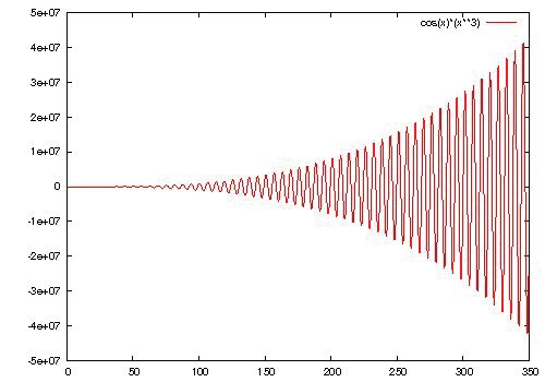
Interpretation:
- Line 1: Sets the x axis range from 0 to 350.
- Line 2: Sets the number of samples to 5000. Without this line, GNUPlot would evaluate the function at a fewer number of points, giving rise to a distorted wave.
- Line 3: Could also be written as gnuplot>replot.
As with all plots, we would like to save our work with all the parameter settings, constant definitions, etc., along with the plot. Here is what you should do:
gnuplot> save "cosfunc.plt"
gnuplot> set terminal postscript eps enhanced color
Terminal type set to 'postscript'
Options are 'eps enhanced defaultplex \
leveldefault color colortext \
dashed dashlength 1.0 linewidth 1.0 butt \
palfuncparam 2000,0.003 \
"Helvetica" 14 '
gnuplot> set output 'cosfunc.eps'
gnuplot> replot
gnuplot>
Interpretation:
- Line 1:
save "cosfunc.plt"will save your work in a file namedcosfunc.plt, which can be edited using an ASCII editor like gedit or kwrite.pltimplies “plot”. - Line 2: Sets the output to Postscript format.
- Line 3: Most research publication work in Indian and foreign journals requires figures in EPS (Postscript). This line does exactly that. These EPS figures will be saved in the current working directory, and can be opened in GIMP and saved in JPG format, or whatever format you require, that GIMP supports.
You can exit GNUPlot by typing the following command:
gnuplot> exit
You can open an existing plt file with:
gnuplot> load 'filename.plt'
Customising ticks, labels and titles
GNUPlot allows the setting of ticks (scale markings on the axes) with the set xtics and set ytics commands. Use this sample syntax to set the xtics:
gnuplot> set xtics <start pt>, <increment>, <end pt>
The format to set labels on the x axis, y axis and z axis (in case of 3D plots) are as follows:
gnuplot> set xlabel 'x-axis'
gnuplot> set ylabel 'y-axis'
gnuplot> set zlabel 'z-axis'
Similarly, for the title of the graph, use the set title command as indicated below:
gnuplot> set title 'my-title'
Example 3
gnuplot> plot sin(x)
gnuplot> set ytics -1,0.1,1
gnuplot> set xtics -10,2,10
gnuplot> set xlabel 'x-axis'
gnuplot> set ylabel 'y-axis'
gnuplot> set title 'SINE-PLOT'
gnuplot> replot
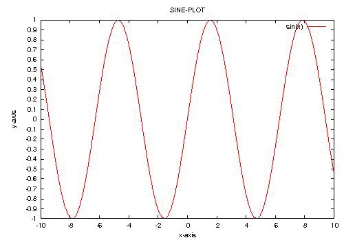
If you would like to change the font-size and/or font colour of your Postscript output, use the following syntax:
set terminal postscript {<mode>} {enhanced | noenhanced}
                  {color | monochrome} {solid | dashed}
                  {<duplexing>}
                  {"<fontname>"} {<fontsize>}
Here:
<mode>is landscape, portrait, eps, or default.soliddraws all plots with solid lines, overriding any dashed patterns.<duplexing>is defaultplex, simplex, or duplex. (“Duplexing” in Postscript is the ability of the printer to print on both sides of the same page — don’t set this if your printer can’t do it.)enhancedactivates the “enhanced Postscript” features (subscripts, superscripts and mixed fonts)."<fontname>"is the name of a valid Postscript font; and<fontsize>is the size of the font in Postscript points.defaultmode sets all options to their defaults: landscape, monochrome, dashed, defaultplex, noenhanced, Helvetica and 14pt.
The default size of a Postscript plot is 25.4 cm (10 inches) wide and 17.8 cm (7 inches) high. You can change the size with the set size width height command.
Plotting a data set with multiple columns
Rarely would you find a data set with only a single column of data. Let us consider a data set with three columns, with a blank space between columns, as shown below (Data Set 1):
A       B         C
1       1      0.120373
2       2      0.898681
3       4      1.568595
4       9      2.049314
5      16      2.123498
Copy the data set into an ASCII editor, hash the first line, and save it in your home directory as data1. To obtain the plot using Columns 1 and 2 and Columns 1 and 3, use the command below:
gnuplot> plot "data1" using 1:2 with lines, "data1" u 1:3 with lines
In case of multiple data sets, you can use the following, with data sets separated by commas:
gnuplot> plot 'dataset1','dataset2','dataset3'
Experimental work always turns up errors — either instrumental, human or otherwise. The quality of work depends on the smallness of errors. In this case, the third column of a data set, such as the “C” column in Data Set 1, will feature the following errors: Here, we have used error bars parallel to the y axis. We could also use error bars in the x direction, with Here, 2D plots are fantastic, but 3D plots look fabulous. You just need to replace Now save the script as The You will see that your plot is also saved in EPS. Use GIMP to convert it into the desired image format. Now, at the GNUPlot prompt, type the following: Remove the What has been covered should take you through most plotting needs. But GNUPlot can do much more. You can have text in colour, plot with cylindrical and spherical coordinates, use animation, plot mathematical functions, do curve-fitting, and a whole lot more. All this makes GNUPlot the desired plotting application. Check out the official project website for more.gnuplot> plot "data1" with yerrorbars
gnuplot> plot "data1" u 1:2 with lines, 'data1' with yerrorbars
xerrorbars.Plotting in Polar/Parametric
t is taken as the variable for curves, and u/v for surfaces. Type in the following:gnuplot> set polar
gnuplot> set grid polar
gnuplot> set samples 5000
gnuplot> plot 1+cos(t)/t,t
gnuplot> set parametric is to be used for parametric equations
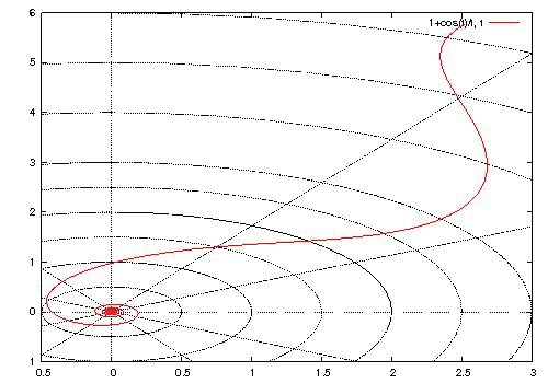
Plotting in 3D
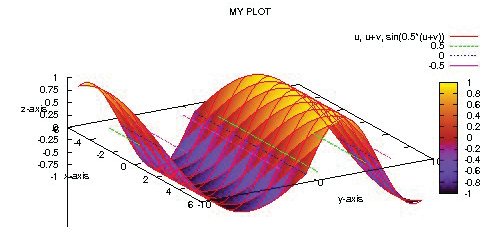
plot with splot to get a 3D plot, in the simplest case. However, getting detailed plots requires much typing at the GNUPlot prompt, and is the biggest letdown. The easier way out would be to type all the commands using an ASCII editor, and load the file at the prompt. Open a text editor and type in the following:set style data lines
set parametric
set view 60, 60, 1, 1
set xlabel 'x-axis'
set ylabel 'y-axis'
set zlabel 'z-axis'
set ztics -1,0.25,1
set title 'MY PLOT'
#set pm3d implicit at s
#set xyplane at 0
#set mapping spherical
splot u,u+v,sin(0.5*(u+v))
set terminal postscript eps enhanced color
set output 'myplot.eps'
replot
myplot.set view <rot_x>, <rot_z>, <scale>, <scale_z> format allows the user to set rotations about the x- and z-axis respectively, as well as the scale of the graph.gnuplot> load 'myplot'
# marks from the above script, one at a time; run the script myplot at the GNUPlot prompt, and observe the output.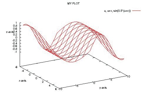
Finally





Sir , u r article on GNUPlot is super-awesome……..
I’ve tried all the instructions u gave( SINCE I TOO HAVE ITCHY FINGERS AS THAT OF YOURS…;) :) ) & they were indeed simple enough( so that students like me could understand all of them !! ) to arouse my curiousity for plotting……..!!!
Thank you for all that info , coz i was always wondering how could i plot graphs in Ubuntu !!!
I have also very excitedly informed all my friends ( & even seniors) @ this GNUPlot………!!