I was initially a KDE user, but for a long time, I’ve been using GNOME on Ubuntu. This is because there has always been some serious bug or the other in KDE, ever since the team overhauled the desktop. I have waited with eager anticipation for a bug-free KDE and a distro that would serve it in a nice package, but have had no luck. Even when KDE became usable again with version 4.3, no distro did it right. But when Fedora released version 14, I had an uncanny feeling that this would be the distro I was waiting for.
Yes, it was!
However, what bowled me over first was not KDE — it was the new Fedora website. Never have I seen such an outstanding presentation of free and open source software, or of an operating system, done so meticulously. Even if FOSS is not your cup of tea, it may succeed in wooing you. The interesting part is that if you are already a FOSS supporter, it will make you smile for all the right reasons, and that’s not something you come across every day.

Anyway, I immediately downloaded the 64-bit KDE spin. There is KDE 4.5.2 with a custom Fedora theme called Laughlin, after the release codename, and it’s beautiful (see Figure 1). The login and splash screens are the most beautiful ever. All hardware worked, including the Broadcom 4312 wireless chip, using the driver from RPM Fusion, although I did have to install b43-tools and rfkill as well. I don’t have any other hardware that requires proprietary drivers. The multimedia codecs provided by RPM Fusion also worked correctly. KPackageKit, the software manager, is now much more usable, and shows package groups on the home screen (see Figure 2), as well as icons for the installed applications (see Figure 3).
- Figure 2: KPackageKit shows software groups
- Figure 3: KPackageKit shows application icons
- Figure 4: Local holidays in the calendar
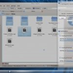
KDE itself has also improved significantly. The calendar shows local holidays (as in Figure 4), while Dolphin, the file manager, has enhanced Nepomuk support for semantic desktop integration (take a look at Figure 5). However, one of the really thoughtful design decisions in Dolphin is the way it handles copying a file into a folder where a file of the same name already exists. It pops up a useful window, showing previews of both files, providing options for overwriting or renaming the file (check out Figure 6).
- Figure 5: Dolphin and Nepomuk integration
- Figure 6: Handling file name conflicts in Dolphin
- Figure 7: Notifications
Also of note is the mechanism for dealing with the status of an ongoing job (such as file copy) and the notification of completed jobs. All such notifications are grouped into a box that pops up above the notification icon area. You can selectively expand, collapse or dismiss notifications (see Figure 7). The Firefox download completion notification also has the Plasma notification look (it may even be integrated — its appearance makes it difficult to tell).
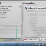
The network manager also shows details (including traffic) of connected network devices, as you can see in Figure 8. As far as the larger applications are concerned, there are three of note here, none of which is included in the KDE spin live CD image — they need to be installed separately. The first is, of course, reKonq, the new KDE Web browser (see Figure 9). It’s fast, and has a few nice features such as pages for favourites, bookmarks, history, etc, but it’s still not mature enough to “Konquer” Firefox. It generally works well, but has problems with a few sites like Gmail, in which parts of the page appear above the page area (but Gmail still works correctly, unlike in Konqueror); and the WordPress post editing system, which did not work for me in WYSIWYG mode.
- Figure 8: Network details in Network Manager
- Figure 9: reKonq Web browser
- Figure 10: Bangarang playing an audio file
Bangarang (see Figure 10) is a new KDE multimedia player. As an application, this one is much more usable than reKonq. It plays everything except video CDs. Since I use video CDs (they are cheaper, and free of illogical encryption), I had to bring back good old SMPlayer, but just for that. For everything else, Bangarang rocks! The Fedora system uses Xine as the Phonon back-end by default, which, complemented by RPM Fusion, is something I have always liked better than GStreamer with its good, bad and ugly (and many other) plugins.
However, where the system really shines is when Bangarang plays video while 3D effects are enabled on the desktop. If taskbar thumbnails are enabled, hovering over the Bangarang taskbar entry displays the actual moving video (Figure 11). This may be the case with other multimedia players too, but I’ve not checked that out.

The last of the three is OpenOffice.org. Fedora has decided to include the pre-release version 3.3.0, but it works well enough. The new white splash screen is nice. The venerable OpenOffice, whose future had become doubtful with Oracle, has recently found a haven in The Document Foundation, which is a collaborative organisation, with various supporting companies, working to maintain a fork of OpenOffice.org called LibreOffice.
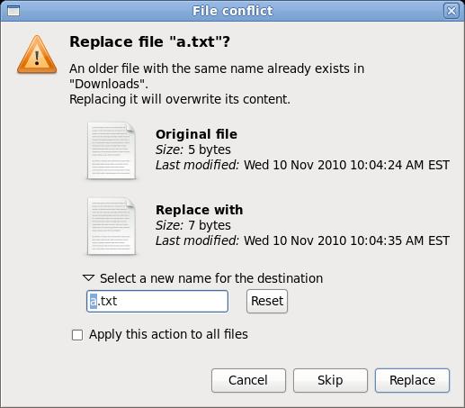
The changes in GNOME are not so radical as the ones in KDE. GNOME in Fedora 14 is at version 2.32, and the default desktop is still pretty much the same as before. The GNOME 2.32 release notes specify a few new features included in the latest version. Chief among these are several updates to Empathy, the instant messaging client, and Evince, the document viewer. Nautilus has gained a couple of improvements. One is a slightly enhanced Wastebasket folder. The other is better handling of conflicting file names during copy and move operations (see Figure 12). It is somewhat like Dolphin’s but, as with the rest of GNOME, doesn’t have as many features.
One of the better decisions the Fedora team has made is replacing Tomboy, the note-taking application, with Gnote — and removing F-Spot, the picture management application, to make way for Shotwell. Both Tomboy and F-Spot are dependent on Mono, an implementation of the Microsoft .NET framework standards. Although open source, Mono is, at best, a doubtful investment, given Microsoft’s fickle moods, and its questionable fidelity to principles. Including Gnote and Shotwell instead, which are based on public code, eliminates the need to include Mono in the default installation, and also gives you peace of mind — something that’s becoming a rarity these days.
On the flip side, the GNOME spin, unlike the KDE one which includes KOffice, has no word processor, spreadsheet or presentation application included by default. Fedora had previously cited lack of space as a factor, but that explanation doesn’t wash with me. For one, it is better to make room on the CD for these applications, instead of lesser-used features. For another, they can simply make it a DVD image. You neither have to limit yourself to 700 MB, nor do you have to pack 4 GB to create a live disc. It is easy to install OpenOffice, but the default configuration of the GNOME spin might give rise to doubts in the minds of new users.
The other factors
Apart from this, the rest is as usual in Fedora-land. Fedora 14 includes Linux 2.6.35, which has nice desktop-oriented improvements. KDE 4.5 is beautiful. For GNOME, we need to wait until version 3 to see how it fares. Adobe killed Flash 10.1 for 64-bit Linux, but its pre-release 10.2 works correctly. KDE’s Network Manager is getting better. Bluetooth still needs improvement in KDE; Kubuntu has included BlueDevil as the Bluetooth tool, but it doesn’t work correctly in Fedora 14. KBluetooth does, if you are careful!
Another problem is that Skype does not work on 64-bit Fedora (it does in Ubuntu, but not here in Fedora); but by the error message, it seems that the problem is caused by Skype itself, or its packaging and not by Fedora. The correct dependencies for running the 32 bit version on a 64 bit system have not been included so the application cannot find the 32 bit libraries it needs and thus fails to start. Anyway, Skype only releases beta versions for GNU/Linux — and even then, they are only tested on
hopelessly outdated versions of the distributions they release for. Jabber and Google Talk/Gmail video chat are better alternatives.
The verdict
Fedora has earned itself a reputation as a lab for enterprise features, but it seems the Fedora developers are now serious about solid, user-friendly desktop software. Fedora 14 also has its share of new enterprise features, such as the OpenSCAP security system, and the Spice virtualisation framework, but the new, user-oriented website and the excellent desktop systems give Fedora both a highly professional look, and the feel of a really good desktop operating system.
One gripe is that Fedora KDE bundles up the KDE applications in generic KDE packages (such as kdemultimedia); it would be much better if they’d been split into individual packages, as with Kubuntu. For example, I don’t need JuK or Dragon Player, but I have to keep them because I need KMix. Another is that although double-tapping the laptop touch-pad works as a double-click in Qt applications, it doesn’t in the case of GTK apps running in KDE; I have to double-click the button for that. Still, what matters is, as I said earlier, the diligence with which the Fedora developers prepare their distribution. Fedora often misses deadlines, but that is thousands of times better than releasing a buggy product. Kubuntu 10.10, for example, also includes KDE 4.5, but both Ubuntu and Kubuntu 10.10 (and, I suspect, all derivatives) freeze randomly on some computers, including mine. There was a mad rush to release on 10/10/10 at 10:10:10 GMT. They met the deadline, but tripped while trying to run.
In version 4, KDE redefined desktop computing. It’s been a long time since I last used it. I don’t know whether Fedora will keep up this dedication to the desktop; I hope it does! As for KDE, well, the oldest major desktop environment for one of the oldest operating systems is now the most modern (at least until GNOME 3 arrives, and who knows what bugs it will bring along), riding one of the most advanced and fastest-growing operating systems. For now, it seems, I’m back home.





I like this article. Meanwhile, what’s the name of the font/typeface used on the GUI especially the one used for the title “Carmina Burana” in Fig.10?