The GIMP version 2.6 was released two years back, and it’s time for us to embrace a new development series of the GIMP. Dubbed as 2.8:2.7, the FOSS editing software is finally getting a much-needed makeover, to make it more profound and exploitable.
The venerable and most powerful open source image editing software, the GIMP, is out with a new development release, and it is brimming with new features. The new release is a milestone in the FOSS graphics editing world. With the Libre Graphics Meeting over, the GIMP developers have laid out a roadmap and deadline for the upcoming stable release. Like other graphics editing software, the GIMP has an odd release number for testing candidates, and an even number for the stable release. Major changes and feature sets are pushed into odd-numbered releases, while the stable releases provide only bug fixes.
Unlike the GIMP 2.6, the upcoming release will focus more on cosmetic changes, rather than on the core of the system. It features the first-ever complete (yet optional) UI redesign, with a single-windowed mode, along with layer grouping, brush rotation and other nifty features. With such major UI changes, the developers are determined to remove the perplexities of the old UI, which were a major barrier to mass adoption. In addition, the GIMP 2.8 will bring deeper GEGL integration, though the release will still lack CMYK and high-bit colour channel support “out of the box”.
The main reason for the makeover was the general lack of usability, which was often considered to be a barrier. With the confusing assortment of windows and the floating toolbar, the cluttered interface of the GIMP 2.6 is too perplexing for newbies and professionals alike. After intensive brainstorming and subjecting the GIMP to major analysis, the developers have attempted to make the interface more usable and intuitive.
Installing
Installation is where things can get nasty. Since packages for distros are not readily available (Ubuntu has a PPA), you may need to compile the GIMP, which can be cumbersome. In this case, make sure you first compile the core dependencies — first BABL, then GEGL (which should be the latest versions). Let’s take a look at what the new release has to offer.
Major new features
Single window mode
The most hyped and awaited feature of the upcoming release, the reworked interface, removes the clutter and provides a lucid interface, which should increase user productivity and might lead to the GIMP snatching some market share from proprietary graphics editing software.
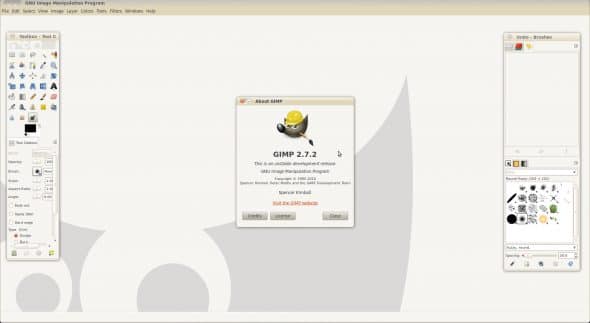
When you start it, version 2.7 defaults to the old floating-window mode. To enable single-window mode, choose the menu option Windows –> Single Window Mode. That snaps dockable dialogues into preset panel positions — the toolbox and tool options to the left, and the layer-box and other dockable dialogue boxes to the right.

The GIMP allows you to drag individual dockable dialogue boxes from one panel to another. For example, you can drag the tool options to the panel containing the layer-box, and hence reduce the width of the toolbox, to give you more working area for the image you are editing. Or you can drag it elsewhere (see Figure 3). This results in a more complex, yet more productive and configurable interface for graphics experts.

There are downsides to the single-window mode, however. When you open multiple images, the second image onwards is displayed at the top left of the editing area in its tab, instead of at the centre, leaving lots of empty space on the right and bottom of the editing area. Of course, you can use the four-headed arrow or the scroll-bars to adjust the position, but it is irritating.
Another problem is that the GIMP fails to “remember” that you’ve selected single-window mode, and again defaults to floating-window mode the next time you start it up. Worse, the floating toolboxes are positioned haphazardly; the docking changes and width changes to panels are “remembered”, but the panels are away from their old default position at the left and right of the screen.
I must note that previously, in version 2.6.x, the behaviour of the GIMP’s UI in the KDE environment was quite peculiar. For some reason, the GIMP utility window wouldn’t stay on top; as a result, KDE users had to go back to the GIMP 2.4 UI. I have yet to test 2.7’s behaviour with KDE; I hope the developers have ironed out the previous issues with Kwin.
Tabbed view
The single-window mode also removes the huge task-bar clutter you suffer in floating-window mode, when working with multiple images. The row of tabs below the menu bar (see Figure 3) is a pleasure to use; it is reminiscent of Paint.Net, and each tab displays a thumbnail of its image. The tab list itself is fixed in place, unlike other GIMP dialogues or panes, and so is the order of tabs (you can’t drag image tabs to change their order).
Layer grouping
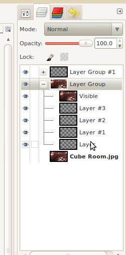
Touted as a major benefit for high-level work flow, and a part of the proprietary Adobe suite, layer grouping is new in this release. With this feature, you can group several layers into a “layer folder” (see Figure 4). This feature is very useful when working on complex images with many layers; it makes things less cluttered, and easier to manage.
On-canvas text editing
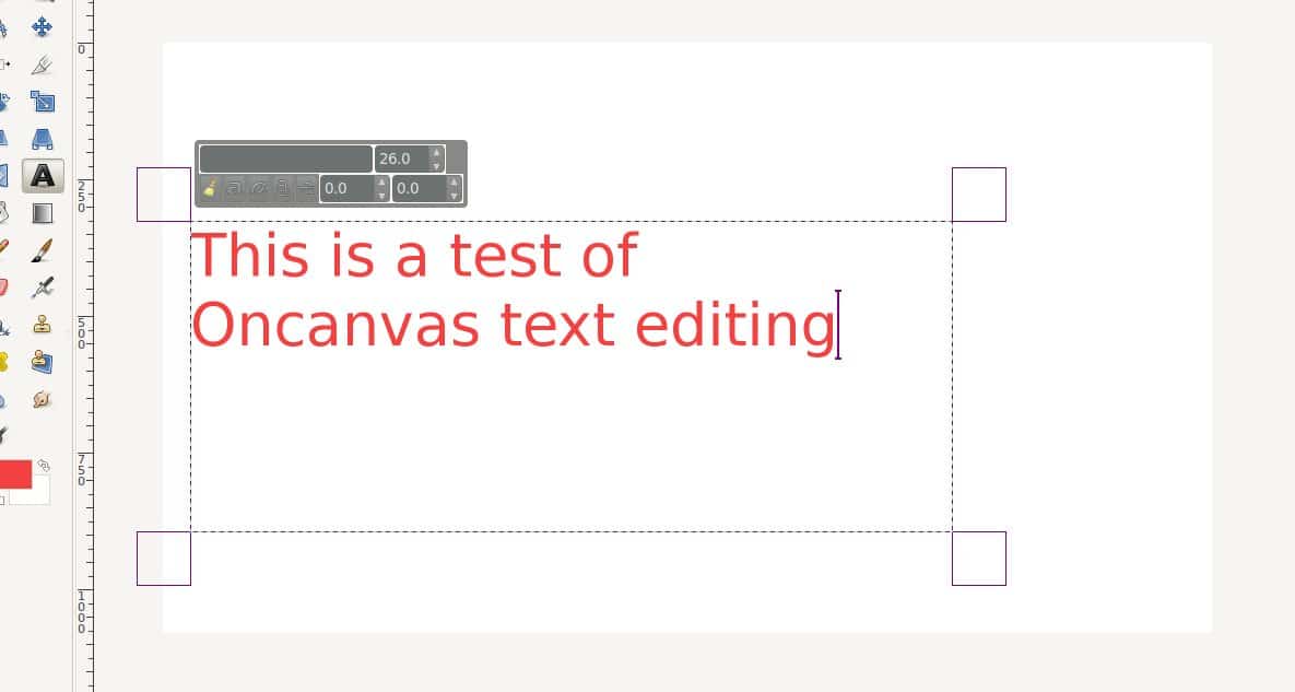
As promised earlier at the announcement of version 2.6, the developers have finally merged this much-hyped feature. Though it still has some sharp edges, working with text on canvas is such fun. Just select the Text tool, drag around an area of the canvas, and start typing — no fussy pop-up dialogue!
Those are the major changes in this release. Apart from these, the developers have added a slew of other nifty new features. Let’s take a look at what will début with the GIMP 2.8.
Other changes
File saving options
From 2.8 onwards, the GIMP will only save images as .xcf (the GIMP’s native format) from the Save or Save As menu option. To save the image to any other image format, there is a new Export option on the File menu. This makes sense, since many other software have similar features.
To make things simpler, there is another option, Overwrite, which quickly overwrites the source image you opened to edit, with the changed image in the GIMP.
Resource tagging and management
Do you find it hard to sort through the plethora of resources at your disposal in the GIMP? Don’t worry. A brand new resource-tagging option lets you tag your brushes, gradients and patterns to ease selection. Type in a tag for a resource, and you can later type that tag in the filter box — and, bingo! The GIMP shows only those resources with that tag. This is a very useful feature for people with large resource collections.
Rotational brushes and sorted layer modes
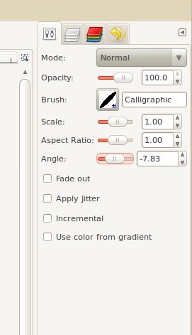
You can now rotate your brushes at any angle that you desire, making it possible to create effects that just weren’t possible in earlier releases. Brush dynamics have also improved (see Figure 6).
Apart from this, the GIMP has segregated the layer modes menu into categories of similar modes (see Figure 7), making things easier for professionals. Of course, you’ll need some time to adjust to the new order, if you are used to the older layout.

GEGL improvements
Version 2.8 will bring tighter GEGL integration; it is likely to be the default rendering framework from 2.10. (This means that you still have to enable GEGL in the GIMP 2.8.) GEGL, or the Generic Graphics Library, is the new image-rendering framework that has been under development for almost a decade, and has finally matured enough for mainstream usage.
With GEGL, the GIMP allows non-destructive image editing, and allows support for higher-colour channels. The main addition of GEGL is the feature that allows processing and composition of layers.
Other improvements
The GIMP has polished certain areas that needed attention. Though these might not be every user’s cup of tea, the changes will enable the GIMP to hold its ground against the other major players in the market. Some of these features are:
- Support for JPEG2000
- Support for 16-bit RAM image export.
- Improved palette export options.
- Calculations possible in the resize window options.
- Extended brush and paint dynamics.
- GPL v3 licensing.
Closing in
With the GIMP 2.7 development release, it’s quite clear that the GIMP’s developers are ready to up the ante and create a rocking release with much-needed features. The long-awaited UI changes are a welcome addition, and will make using the GIMP a pleasing experience. The ‘unfriendly UI’ tag should be a thing of the past now.
The developers have much more extensive plans for the future, but for now, the GIMP 2.8 is shaping up to be an awesome release that will remove many hurdles to its acceptance. The 2.8 second alpha release (2.7.1) reflects most of the upcoming changes, but there is still a lot of work going on. Though there are still missing bits in the release — like the inability to auto-detect a layer when changing the image workspace, and some patchy behaviour in single-window mode — with the second alpha release, I couldn’t have asked for any thing better!
The GIMP 2.8 is going to set a new standard in the open source graphics department, so make sure you give this release a try, if you haven’t tested it yet.
Feature image courtesy: Kate Hiscock. Scaled and reused under the terms of CC-BY 2.0 License.


