Glade is a tool for designing GTK/GTK+ GUIs, and is used quite a bit by developers who work with the GNOME desktop environment. It has been around for a long time. This tutorial uses Glade 3.6.7, the latest stable version at the time of writing, on Fedora 13, as the reference platform. However, it should work with all recent Linux distributions.
Check that you have Glade version 3 installed, with the following command:
$ glade-3 –version
glade3 3.6.7
If you see something like the above output (it doesn’t matter if the minor version number is different, ensure that you have at least 3.6) then you have Glade 3 installed. If you get an error message, then either you don’t have Glade installed, or have an earlier version. Install Glade 3 by running the following command:
$ sudo yum install glade3
Getting started
Our tutorial project will use Glade to design an application with two screens—a ‘user authentication’ screen and an ‘employee information viewer’. In this article, we will simulate some of the functionality of a real project; we won’t actually use a database, since we are only demonstrating how to design the UI, and will write the bare minimum code to get it ‘working’.
Once you fire up Glade, select GtkBuilder for the project file format, and choose to have object names unique within the project. For the GTK+ Catalog option, choose version 2.16.
GTK is different from the older (pre .NET) Windows ‘fixed-position’ layout model for GUIs, where you placed controls (widgets) on a form using absolute positioning and sizing, and then had to write extra code to reposition or resize the controls – in response to events like the user resizing the window, or changing screen resolution. In GTK, controls generally try to occupy as much space as they can in their parent container. If the container is resized, the controls inside it automatically resize themselves as well. However, as a result, when you create a toplevel (an empty window) container, you can place only one control directly inside it. To get around this, you place a container control inside the toplevel window, and add other controls inside the container. You create complex layouts by nesting containers one inside the other, as we will see in this tutorial. This usually entails some planning of what you want to have in your window—though, as you will soon realise, the initial steps are almost the same for many windows.
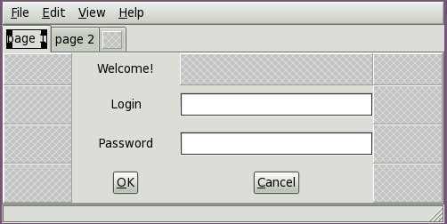
Before we begin, take a look at Figure 1, which is the login screen we intend to create. Notice that we want to have a menu bar, a notebook container control that will hold multiple ‘screens’, and a status bar. Now, let’s start creating the window.
Toplevel window and VBox
In the palette at the left of the Glade window, you should see a section titled ‘Toplevels’. If you hover your mouse pointer above each of the buttons, you will see tool-tips, one of which says, ‘Window’. Click that button, and a toplevel window is shown in the design area.
Since the toplevel window can contain only one control, we must add a container control. There are three containers that are frequently used as the first control in a toplevel window: the HBox, the VBox, and the Table. If you look at the ‘Containers’ section of the Glade palette, you will find those (their tool-tips are ‘Horizontal Box’, ‘Vertical Box’ and ‘Table’, respectively). Each of these has a number of ‘slots’ or ‘cells’ into which you can place controls. When adding (packing) controls into a Horizontal Box/HBox, the widgets are inserted horizontally, from left to right, or right to left (depending on property settings, some of which may not be visible in Glade but can be set in code). In a VBox, the ‘slots’ are stacked vertically, so the controls placed in them appear one below the other. If you look at Figure 1 again, you will realise this is just what we need: a menu bar at the top, a notebook below it, and a status bar below that. We’ll use the Table container later in this tutorial.
Let’s place a VBox in the toplevel window: click the ‘Vertical Box’ button in the ‘Containers’ section, and then click on the toplevel window in the design area. In the pop-up dialogue box, set the number of items for the VBox to 3. The upper left part of your Glade window should now resemble Figure 2.
Naming controls
Some developers insist on giving a meaningful name to each and every control placed in a window. From the practical viewpoint, this can be tedious and time-consuming. We assign a different name to a control only if we intend to access that control in code. For example, if we want to set a property of a control, or retrieve some data from a control (like the text in a text entry), then giving the control a memorable name is a good idea. The code becomes more readable, and both the code and the UI design become easier to maintain.
Since we have only one window in this tutorial Glade project, we have left its name at the default. As far as the VBox is concerned, we do not intend to manipulate it in code—hence, the default name vbox1 is good enough.
Note: To change the Name property, and other properties of a control, you would use the Properties pane, at the bottom right of the Glade window; look under the General tab for the Name property. Look at the ‘Control Properties’ box now, to read about some commonly used properties.
Next, add a menu bar control, a notebook control (both are in the palette’s ‘Containers’ section), and a status bar control (in the ‘Control and Display’ section) to the top, middle and bottom slots in vbox1. You can later experiment with different settings in the Packing, Common and General tabs in the Properties pane, selecting different controls from the object tree above the Properties pane.
Laying out the login screen
Returning to the notebook widget, we will use the first page for our login screen. We need to place several widgets and change properties. You can refer to Figure 1 for an example of the desired layout. The R1C1 notation used in the following instructions indicates which cell of the table to add a control to; for example, R1C2 means, “…the cell where the second column intersects the first row.” Perform the following steps:
1. Add a Table container into the first page of the notebook (we use it to keep the other, contained, controls aligned). In the pop-up dialogue that appears when you add the table, set it to have four rows and four columns.
2. Place a label at R1C2 of the table, and change its Label property to ‘Welcome’.
3. Place a label at R2C2, and change its Label property to ‘Login’.
4. Place a label at R3C2, and change its Label property to ‘Password’.
5. Place a text entry widget at R2C3 and change its Name to ‘login_ent’.
6. Place a text entry widget at R3C3 and change its Name to ‘pw_ent’.
7. Place a button at R4C2. Change its Label to ‘_OK, its Use underline to Yes, and its Name to ‘ok_btn’.
8. Place a button at R4C3. Change its Label to ‘_Cancel’, its Use underline to Yes, and its Name to ‘cancel_btn’.
9. Double-click the notebook’s second page. In the empty area of the page, place a single label widget. Change its Label property to ‘Authentication succeeded! You can now close the window.’ (This is a place-holder label. We will design the ‘employee information viewer’ screen in the second notebook page in a later article in this series, and we will delete this place-holder label at that time.)
10. Double-click the notebook’s first page to make it the active page again.
11. In the Glade object tree pane, find and select the notebook1 widget. In its General properties, toggle the Show Tabs property to No. This will prevent users from clicking the tab for the second page, and accessing the ‘employee information viewer’ screen without first logging in.
12. An important requirement for our login screen is that the pw_ent text entry should not display the text of the password to a casual onlooker. To mask the password as the user types it in, select the text entry, and toggle the Invisible Character Set property (in General properties) to Yes. Glade, by default, provides a dot-like masking character, in the Invisible character property, which will replace each character in this text entry. If you like, you can change this to another character, such as an asterisk (*) or another non-alpha-numeric character of your choice. Avoid using a space or other ‘invisible’ character, though; it can confuse users, who will get no visible feedback in response to their typing in the password entry.
Our login screen design is done; we leave the rest of the cells in the 4×4 table empty. Save the file, in Glade, supplying the name ‘employee-builder.glade’. This file is an XML file in the new GtkBuilder format that is built into newer versions of GTK. After setting up the required signal handlers, we will save this file a final time, and proceed to writing the code that turns our design into a running application window. Before that, let’s get some understanding of the signals.
Events, signals and GTK+ programming
The programming model that GTK+ provides is event-driven, like many other windowing tool kits. That is, the flow of the program execution is controlled by events like user inputs, messages from other programs, or some other kind of external data. For GTK+, almost all events are in the form of messages from the underlying X server. The main loop (Gtk2->main()) loops, waiting for events. When there is an event (say, a mouse click), the main loop wakes up and delivers the event to one or more widgets. When widgets receive events, they emit signals. Signal emission is the process of GTK running all handlers for a specific control object (widget) and the emitted signal. Handler functions (also called callbacks) can be bound to signals using the g_signal_connect() function, or similar ones. The signal-handling callback function can be written to effectuate the desired behaviour of the application in response to the event received. After the handler finishes, control is generally transferred back to the main loop.
It is not mandatory to implement handlers for every signal for every widget. Almost all signals are handled by default handlers. A widget inherits its parent’s default signal handlers. When a signal is emitted by a widget, first the signal ID is looked up, and all normally connected callbacks are invoked before the default handlers. If one signal callback function needs to be executed after the default handler, it must be connected using a different function (g_signal_connect_after()). This process of signal emission is repeated up the widget hierarchy, till the top-level widget is reached, or propagation is stopped by a handler (by returning TRUE).
Event handling is a complex subject. GTK+ uses GDK (the GIMP Drawing Kit) in order to abstract the underlying graphical windowing system. This makes it easier to port GTK+ to various platforms. For example, with Linux, GDK uses the XLib library by X Windowing System, whereas with Microsoft Windows, GDK uses Windows’ own windowing system libraries. In general, a developer need not be concerned about GDK, unless a new widget needs to be designed.
Finally, GTK+ signals and POSIX signals have nothing in common, except the confusing name.
Let’s add a signal handler to the top-level window:
1. Click on the toplevel window (window1)
2. Click the Properties pane and choose the Signals tab.
3. Click on GtkWidget to expand it.
4. Click on delete-event, and click under Handler to reveal the pull-down menu.
5. Choose on_window1_delete_event as the name for the handler.
6. Leave user_data blank; you do not need it.
7. Leave the ‘after’ unchecked. You do not need to make this handler run after the default handler.
8. Save the Glade file.
Repeat this procedure to set up signal handlers for the OK button-click (on_ok_btn_clicked) and the Cancel button-click (on_cancel_btn_clicked). For the destroy event of the toplevel window, you must choose GtkObject instead of GtkWidget.
As we have just seen above, the hierarchy between the GtkWidget and GtkObject classes lets us handle two different signals for the same event (the user clicking the window’s close button).
on_window1_delete_event: This is triggered when the window1 GtkWidget is deleted. The return value from the signal handler we will write controls the propagation of the signal: TRUE means ‘do not propagate the event to higher levels’ and FALSE means ‘the event should be propagated’. If the window has unsaved data, here is where you would prompt the user with a Yes/No/Cancel type of message dialog, asking whether to save the data and exit (Yes button), exit without saving (No button), and abort the closing of the window (Cancel button).
on_window1_destroy: This is triggered when the window1 GtkObject is destroyed. If this was the last open window in the application (which it is for us!), in this handler, we must compulsorily execute code to exit the Gtk2->main() main-loop; otherwise the GUI toplevel window will be destroyed, but the application itself will not exit—it will continue running. To stop the Gtk2 main loop, we call the Gtk2->main_quit() function in this handler.
Writing the glue code
First, we need the Gtk2 Perl module (and its dependencies) installed, in order to use the GUI. You can use this command to install them:
$ sudo yum install perl-Gtk2.x86_64
Note: The LFY CD this month carries the entire Perl script. Take a look at Listing 1 in this CD.
The first step in a Perl GTK program is to load the Gtk2 module, and that is done with:
use Gtk2 qw{ -init };
The next step is to create a Gtk2 Builder object, and load the XML UI definition from the Glade file which we saved earlier:
$builder = Gtk2::Builder->new();
$builder->add_from_file(“./employee-builder.glade”);
Next, we connect the signal handlers we had defined in Glade, to functions defined in our Perl script, with the following command:
$builder->connect_signals(undef);
Our signal-handler functions are deliberately given names identical to the signal handler names we defined in Glade, so that the ‘automatic’ connection of the signal to the handler function can be done with the single line of code shown just above, instead of having to write several lines of code using the g_signal_connect() function to connect each widget’s signal to the handler function for it. The signal-handler functions have the following functionality:
on_window1_delete_event: returns FALSE; as this is a simulation of an application, we don’t have unsaved data to check for, and there’s nothing for us to do with this function.
on_window1_destroy: As mentioned earlier, we must end the Gtk2 main loop, so we simply call the Gtk2->main_quit() function here.
on_cancel_btn_clicked: Prints the function name, and calls Gtk2->main_quit() to signal the main loop to exit.
on_ok_btn_clicked: This function shows how to get the user input from the login and password text entry widgets, using the get_text() function associated with text entry objects. The values are printed to show that the text shown in the password field is not the content of the text entry object’s buffer. In the real world, this code must be replaced by an authentication function.
Run code, run…
Run the script with:
perl ./employee.pl
You can now verify that the code works as expected, and you have a working GTK program window controlled by a Perl script!
In the next article in this series, we will design and write code for the ‘employee information viewer’ screen.
|
Control Properties There are many widget properties that you can change, using Glade. The most important property, from a code perspective, is the Name property, accessible on the General tab of the Properties pane. We have renamed all the widgets that we are going to access from code, providing names that follow our widget-naming convention. For example, the text entry names are login_ent and pw_ent; the buttons are named ok_btn and cancel_btn. You don’t necessarily need to follow this convention, but when doing team development, it’s important that you follow the scheme chosen for the project, or used by the rest of the development team. Under the Common tab, you can change the width and height requests of widgets. You can add tool-tips, and control whether the widget is visible (shown when its container is shown) or not. Further, you can change the Sensitivity setting—whether the widget responds to user input or not. The ‘data’ property of a widget that is displayed to the user varies in name from widget to widget, and has a convention that follows the purpose of the control, and the type of data that is displayed. For example, a text entry widget has a Text property that represents the (editable) text shown to the user. A label control has the Label property, in which you enter the (non-editable) text you want the label to display to the user. Many widgets, by default, fill all the available space in the parent container when they are added. If you find this annoying, you can change this behaviour: select the widget, and in the Properties pane, go to the Packing tab. Modify the Expand and Fill settings that are available for most controls. You can change these properties from code as well. Keyboard accelerators are useful for those using large windows, such as data entry forms; they enable the user to quickly activate controls like text entries or buttons, without having to pick up the mouse and click that control. Generally, these accelerators are alpha-numeric keys combined with the Alt key—for example, Alt+S is a common accelerator for a search button. Generally, any widget with a label can have a keyboard accelerator. To add one, click the widget in the object tree; in the Properties pane’s General tab, go to the Label property. Add an underscore just before the letter you want to use as the accelerator (for example, on a search button, the label would become _Search). Toggle the Use underline property from No to Yes. When the window is running, pressing the respective accelerator will activate the widget for which you have set the accelerator key. Obviously, avoid assigning the same accelerator key to two controls on the same window! |


