A working man’s place
Well, at the end of the day, with all these great features, you still need applications to survive. KDE 4.2, with its accompanying applications, doesn’t disappoint here either. Whether it’s a personal information manager, Internet apps, image and document viewers, media players, desktop administration tools, or other assorted utilities, it’s got you more or less covered everywhere. And once the ambitious KOffice 2 goes stable (currently the CD includes the beta version), KDE4 could become an all-in-one desktop powerhouse.
Although, we from the free software world have grown too used to OpenOffice.org for an office suite, KOffice 2 indeed offers a pretty useful alternative, which consumes a lot less memory compared to the former, besides introducing a pretty innovative user interface and set of features. The same is true if you compare Konqueror as a Web browser with Firefox. However, both KOffice and Konqueror have some catching up to do before they can pose a threat to the dominance of OpenOffice.org and Firefox, respectively.
In fact, now that KDE has got a default file manager called Dolphin, I hope the Konqueror developers concentrate more on its Web page rendering capabilities to make it compatible with the websites around the globe. One good option is to dump the KHTML engine for Webkit. Although Webkit is available as an optional rendering engine, the pages still appear ad hoc—which leads me to wonder what the issue might be, because I hear Google Chrome uses the same engine.
Anyway, for now, since we have OpenOffice.org and Firefox to take care of our requirements, let’s look at some of the other programs that help us in our day-to-day work.
Dolphin
The most important tool is obviously the file manager. This is what you essentially use to browse the gigabytes of data stored in your hard drive, which you can’t do without. Dolphin concentrates on taking care of exactly this, unlike Konqueror in KDE3, which sort of posed as an all-in-one tool for multiple purposes.
The Dolphin interface is simple, with no frills at all. Okay, that information pane on the right looks slightly weird, you say? Well, it’s there to display information about the file you select. But, if you want to get rid of it, simply hit F11 and it’s gone. To tell you the truth, I don’t like it either, and would rather have tool tips provide me the information when I hover my mouse over a file. That’s doable too; you can configure all this from the Configure Dolphin option under the Settings menu.
A new addition in this release is the zoom slider at the bottom right corner of Dolphin—you can use it to increase the size of icons in the file manager. However, if you remember Dolphin from KDE 4.1, it used to display the free disk space in the same location, which is a nice way to keep an eye on your disk activities. What made it disappear this time? You got me there! But, again, you can enable it to appear beside the zoom slider from the Configure Dolphin option.
And here’s two handy shortcuts for you, just in case you aren’t aware of them already: if you don’t like the breadcrumbs-based navigation bar, press Ctrl+L and you get the traditional input field to enter a location. If you want to filter a file from a directory listing hundreds of files, press Ctrl+I to get the filter input box at the bottom of the window. And if you want these features permanently available, visit Configure Dolphin again.
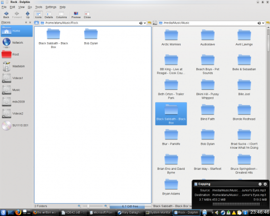
Dolphin does offer some advanced features too. One of my favourites is the ‘Split’ view option to divide the window into two parts—activate by F3 or View→Split. This option, as shown in Figure 8, comes in very handy when you want to copy/move files between two locations. Simply drag and drop the file/folder from one side to the other. By the way, the copying dialogue box has a nice notification window now, that pops out of the system tray, which even gives you the option to pause a transfer—much better than a separate floating window, I’d say. This dialogue box is not specific to Dolphin, but ubiquitous for copy/move/download/upload activities across all KDE apps.
Another good addition is the preview option in the toolbar. Now, I don’t need previews for regular files, but only in a directory of images. When I go inside the images folder, I hit preview and use the zoom slider to increase the size of the thumbnails; Dolphin remembers this setting. So, next time I launch Dolphin, although the rest of the folders appear as they were, inside the Images folder, the preview option is still active, and the thumbnail sizes are still bigger. Neat, eh?
Other assorted apps
Some of the other KDE-specific tools I have to depend on heavily for my daily grind are personal information manager Kontact, Gwenview image viewer and Okular document viewer. All of them are full-fledged apps with pretty advanced capabilities, and deserve a few pages to cover the features they each offer.
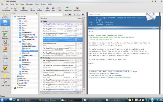
Kontact is something I depend a lot on at work. Apart from the Kmail client and an address book, it gives me an RSS feed reader, a to-do list, a calendar, time tracker, and something called pop-up notes. I absolutely love the addition of the ‘Fancy with Clickable Status’ theme in Kmail, which finally made me switch to a vertical message preview pane using a three-column layout in my wide screen laptop (Figure 9).
My image viewing needs are fulfilled by Gwenview, which offers me some handy image editing features, apart from working as a powerful image viewer. Okular, on the other hand, takes care of displaying a range of document formats. For your digital camera requirements, there’s Digikam, although the Qt4 version is still in its beta stage.
Kget is available for normal downloads. The interface is very simple to use, while it also lets me unleash a lot of advanced features when I need them. It even supports torrents and metlinks for downloads. Although, for torrents, I like sticking to KTorrent, which is a full blown torrent client with some fantastic features.
KDE 4.2 comes with JuK for an audio player and music collection manager, which does what it’s supposed to do, pretty well. However, most of us are too used to Amarok anyway, which has also finally released its Qt4-based stable v2.0, with some intuitive features. Dragon Player is the default media player in the KDE4 series, which is more like its GNOME counterpart Totem, that does its job with no frills attached. Those who need more functionality anyway have the MPlayer-based SMPlayer, which I recommend that you check out just in case you haven’t already.
Besides these, there’re lots of other tools in the accompanying KDE 4.2 live CD; it’s just that I don’t have enough space to write about them here. Explore for yourself—there are the educational tools, the highlight being the Google Earth alternative, Marble, and various other utility programs.
Oh wait, before I end: don’t forget to check out the much-improved System Monitor application. The highlight of this release is the System Load tab. The interface has finally been made similar to its GNOME counterpart, which always had a much better UI.
Bottom line
Well, KDE 4.2 is not perfect! It still tends to crash on me occasionally for no obvious reason, but things are getting there. And even if it’s still not as feature complete as KDE 3.5.10, with this release things have indeed gotten a LOT better. So, c’mon, don’t be so uptight and give it a go! Or, do you really want to wait another six months for version 4.3? Well?















it's good …