While your system boots the live CD (built on top of an openSUSE 11.1 base), you will be looking at that same old dull green boot screen of openSUSE. Wondering why I am picking on openSUSE’s default theme again this month? Well, that’s because the KDE 4.2 Live CD, which is bundled with this issue of LFY, is based on it. Thankfully, once the desktop loads up, you are greeted by the default look and feel of the official desktop release. That’s the desktop shell dubbed Plasma by the way, whose job it is to let you organise your desktop pretty much the way you want it.
Oxygen: Breathe in, breathe out!
Yes, that default look and feel that KDE 4.2 comes with is thanks to something called Oxygen—the theme, the window borders and those beautiful icons. The noticeable change this time round is the desktop panel, which is now a shade of blue—much prettier, I must add.
The panel
The panel has the usual stuff—the KDE (Kickoff) menu, the Show desktop utility, the pager (or the workspace switcher), the task manager, device notifier and system tray, followed by the clock. I don’t remember if that’s the exact order of things, by default, but that’s how I like it. If you’re on a laptop, the panel should also have the battery monitor next to the system tray.
Apart from a new icon for the device notifier, the utility that has attracted a significant amount of attention from developers is the system tray—the thing that generally holds the KMix (sound control), Klipper (clipboard), and perhaps a software update notifier too. The tray now looks like, well…a tray, due to it being confined by a boundary. Also, you can right click on its edge to get a hold of the System Tray Settings menu, from where you can select icons of the running apps you want to be auto hidden. After you’ve made your selections, the size of the system tray will get shortened, and the left side of the tray will display an arrow pointing left, indicating you can expand it in that direction. This option comes in handy if you run a lot of apps that place a control icon inside the system tray, thus expanding the tray to occupy the precious panel space.
The task manager has also got a bit of a facelift—it can now again group applications based on program names, and placing the tasks on multiple rows is also possible just like in KDE3. All this can be configured from the Task Manager Settings menu by right clicking on the panel. Although, I have no complaints about how grouping works, when you organise tasks in rows, the default teaming makes it look a bit odd—as if someone has shrunk the tasks forcefully (Figure 1). However, I’m sure this would be addressed in a bug fix release soon, as it looks like a theme issue. Also, by default, while tasks are sorted in alphabetical order (and not in the order programs are launched) I’ve enabled it to let me sort stuff manually. This enables me to drag and reorganise my programs as I wish.

In addition to all this, more options have been added to the general settings of the overall panel. Things like how to increase the height, position and screen-edge can be much more easily achieved now, unlike in KDE 4.1, where it was much harder to guess how to go about things.
Coming back to those who’re on the move, right click on the Battery Monitor widget (should be somewhere near your clock), and you’ll see configurable options galore. This is thanks to the integration of the PowerDevil utility, another addition in this release. It offers various pre-configured ‘Power Profiles’—viz. performance, powersave, aggressive powersave, presentation, etc.—and lets you fine tune all the profiles as per your liking. Overall, although it’s pretty easy to use and understand the options, KDE4 seems to drain out a lot of battery power compared to KDE3 and GNOME.
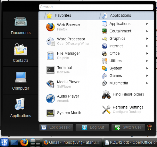
As for the default KDE4 menu, Kickoff, it hasn’t got any visually noticeable feature additions, apart from the border colour, which is now black, to gel with the rest of the Oxygen theme.
Workspace
As for the other part of the desktop, which is the main workspace, things have again been refined a lot with respect to the widgets, and their numbers have also increased considerably. Figure 2 shows what my personal desktop screen looks like, while Figure 3 shows my work laptop. As you can see on my personal desktop, I have the Folder View widget, a Calvin and Hobbs comic strip, plus a few pictures of my family members.
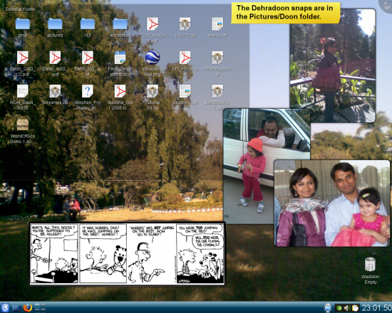
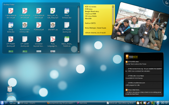
The Folder View widget, as you know, was introduced in KDE 4.1. You configure it to point towards the contents of the folder you access frequently, right on your desktop—so there’s no need to use the file manager to hunt down that folder every time you need something; however deep inside the filesystem it is located, you can see its contents right on your desktop. You can also have multiple Folder Views, say ~/Documents and ~/Pictures folders, for easy access.
Traditionally, the contents of the ~/Desktop folder are displayed as icons on your desktop. Well, by default, the Folder View widget displays the contents of this folder. In fact, if you like, in KDE 4.2 you can even make your desktop imitate the traditional versions, with icons and files all over the place. You can set it by accessing the Appearance Settings option by right clicking on your desktop and then changing your desktop activity type from ‘Desktop’ to ‘Folder View’. But I don’t think it’s a good idea, especially if you are someone like me who keeps downloading random stuff from the Web, and storing it on the ~/Desktop folder, turning the desktop into a huge pool of icons. That’s why I would rather use Folder View as a widget than use it as my desktop. The reason being that I can set its size to what I want and use the rest of the desktop to put other useful widgets, without worrying about my ~/Desktop folder becoming a junkyard of trash downloads from all over the Web.
This brings me to the other useful widgets I use. The Calvin and Hobbs is courtesy the Comic Strip widget, and it works provided you’re connected to the Internet. When you launch it, you first need to set it up. You can pull comic streams from a wide range of streams hosted at KDE-Files.org—so whether you’re into Garfield, Dilbert, or anybody else, you are free to choose from a list that’s more than a handful. This is a healthy addition considering v4.1.x only provided me with an option of a few.
The pictures are courtesy the Picture Frame widget. Here, you can simply drag and drop pictures and the widget adjusts its size according to the dimensions (landscape or portrait) of the source image. Don’t worry, the widget doesn’t depend on the resolution of the source image—it’s intelligent enough to give you a good-sized picture frame, and you are free to increase or decrease it as per your taste. This is a very useful addition for me, as earlier I used to remix an image with lots of elements (and faces) to create wallpaper. Now, I can simply select an image of some scenery for a wall paper, while pictures of people go into frames. :-)
For my work desktop, I like to track a few news sites and the RSSNow widget lets me do exactly that. Each feed automatically scrolls horizontally to show me the current news—and of course, it gives me the option to manually skim through them. When I chance upon something interesting, I click, and the default browser loads the Web page with the complete story.
Another handy widget is Pastebin. If you hang out in IRC channels, I don’t need to explain what pastebins are. You probably point your browser to a pastebin website, upload the information and then obtain the URL to share with others. Instead, the widget connects to pastebin.ca for you, so all you need to do is drag and drop text or images here, and it gives you the URL that you can post in the IRC channel you’re logged in to. Makes life a lot easier, right?
Other widgets that you may find handy are the age-old binary clock, Blue Marble (a 3D model of the earth that’s rendered thanks to the Marble application—a Google Earth-like tool), Calculator, Dictionary, Eyes, Fifteen Puzzle, LCD Weather Station (to keep an eye on the current weather of your city), Luna (to check the current phase of the moon), Twitter Microblogging client, World Clock, various system monitors (to monitor your hard disk, CPU temperature, network traffic and other hardware information), besides a lot more that don’t really seem interesting enough to me. I also hope some of these widgets get the attention of the artists teams to make them look more appealing, like the system monitors that take up too much screen space and look too dull.
Before ending my rant on the widgets, allow me to draw your attention to the Lancelot Launcher menu in Figure 4. Although, technically it’s more or less similar to Kickoff, I like the way things are organised here, besides the fact that it looks more appealing. After customising a few of its settings, I’ve finally switched to Lancelot as my default launcher menu. Although, I hardly use even this: which brings me to…
KRunner
This is the ‘Run’ command that you activate by pressing Alt+F2 from the keyboard. Although it’s been available for a year now, things have been more aesthetically refined in this release. You can make it work in either of two modes—command-based like we’ve been used to since ages, or now even task-based. By default, you can key in the commands to launch an application—as soon as you start typing, it starts filtering from the names of the applications available. For example, take a look at Figure 5—as soon as I type ‘Kon’, it filters from all the commands for apps that contain the letters ‘kon’. I can now either key in a few more letters to fine-tune the filtering further, or use Tab to select the program I need to launch.

You can also use KRunner for a lot of other purposes, viz., as a calculator, to find documents, search by tags, or even visit website URLs you directly key in. This extended functionality is courtesy several plug-ins that power its back-end. A few examples are spell checking, browser history, recent documents, etc. You can check out the full listing of plug-ins by accessing its configuration dialogue. In fact, this is where you can switch from command-based to task-based mode by activating it from the ‘User Interface’ tab. As you can see in Figure 6, now you can find applications by their task, rather than command—for example, I typed ‘write’ and it shows me all the applications that can help me write something. However, since I’m too used to the command-based mode, I found the task-oriented method kind of difficult to use.

Talking about the command mode, thanks to the back-end calculator plug-in, I can now see the outcome of simple math problems from KRunner itself, without launching the calculator application separately. For example, type ‘2134*134=’, excluding the single quotes. Did you see ‘285554’ right away? Pretty cool, eh?
Overall, KRunner is not just a regular Run dialog any more—it’s turning out to be a pretty powerful application in itself.
Kwin
Kwin is basically the window manager—something that acts as a container for the apps we run on our desktop. Even in KDE 4.1, we saw some pretty cool compositing and desktop effects features added to Kwin. This release has added even more plug-ins for effects, and the ones that were already available, have been fine tuned—refer to Figure 7 for an improved Alt+Tab effect, when too many windows are open; note the horizontal viewer at the top. You can activate it from the ‘Desktop’ settings in the Personal Settings app (the replacement for KControl from the KDE3 branch).
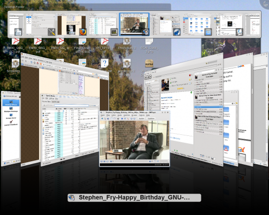
I won’t go on and on about the desktop effects it offers; you should try it out yourself to experience its niceties. Maybe you’ll find a lot less polish with respect to some features that Compiz Fusion also offers, but things aren’t that bad either. In fact, looking at the features made available during the last six months, I won’t be surprised if it catches up with Compiz by the time KDE 4.3 comes out.
As for me, although I usually keep these effects disabled as I find them distracting, I don’t mind playing around with them when I need to kill time, or show off in front of those Winduhs users. And for that purpose, I’d rather prefer a native window manager to take care of the effects rather than using a third-party tool, which most of the time asks me to log out and log back in to activate/disable the effects. Although, I’ve got to admit, these effects work much better on Intel’s graphics, rather than the proprietary drivers that ATI and Nvidia depend on—mostly due to bugs in the drivers.

















it's good …