


This article is a tutorial on plotting graphs with LaTeX. It contains a number of examples that will be of immense use to readers who wish to try it out. It also has a comprehensive list of references, which will be of further use.
The LaTeX package for plotting is pgfplot. Its present in all full distributions of LaTeX, and permits the creation of consistent graphics with the typographic settings of the document, writing the instructions directly in the text source and ensuring the highest quality typical of LaTeX. In other words, pgfplots is a package that plots by coding. Further on in this article, an example of a flowchart will be shown. All the examples presented here are as standalone plots and are made with ProTeXt 3.1.5. Because the complete code is too long for a printed article, interested readers will find it freely available on https://github.com/astonfe/latex.
Data management
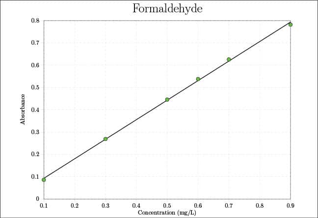
The first important thing to be aware of is how to use the data. Generally speaking, there are two main situations a short data table and a long data table. The former is useful to put the table directly into the script, while in the case of the latter, its preferable to use an external file. For a short table, I use the coordinates of each point, as shown in the following code:
coordinates {
(0.1,0.086)
(...,... )
(0.9,0.782)};
This data has been taken from Reference 1 given at the end of the article. Another way to use a short table is to use table, as shown in the following example:
table {
X Y Z
0.324 0.213 0.463
... ... ...
0.150 0.700 0.150
};
A third short table option is given by pgfplotstableread:
\pgfplotstableread[row sep=\\,col sep=&]{
M & Palermo & Milan \\
1 & 71.6 & 58.7 \\
.. & ... & ... \\
12 & 80.0 & 61.7 \\
}\datarain
This meteorological data has been published in References 2 and 3. If the table is a bit longer, I can continue to use pgfplotstableread, but in another way, as shown below:
\pgfplotstableread{absorbance.txt}{\dataabs}
in which absorbance.txt is a simple text file with a structure comprising rows and columns. In this example, usepackage{pgfplotstable} must be added in the preamble (see the next section). Probably, the simplest way is to put the data file, for example pressure.txt, directly after addplot, without any other command:
\addplot [p1] table[x=Date,y=DAP]{pressure.txt};
This last example will be better explained in the next section.
File structure
A generic LaTeX file has the following well-known structure:
\documentclass{...}
...
\begin{document}
...
\end{document}
in which the preamble is the part between documentclass and begin{document}. The following example is a bit more detailed:
\documentclass[border=0.5cm]{standalone}
\usepackage[svgnames]{xcolour}
\usepackage{pgfplots}
\usetikzlibrary{pgfplots.dateplot}
\pgfplotsset{width=16cm,height=12cm}
\begin{document}
\begin{tikzpicture}
\begin{axis}[
date coordinates in=x,
grid=major,
grid style={dashed,gray!30},
xtick align=outside,
ytick align=outside,
xtick pos=left,
ytick pos=left,
xticklabel=\month.\year,
xticklabel style={rotate=90,anchor=near xticklabel},
ylabel={Pressure (mmHg)},
title={Blood pressure},
title style={font=\huge},
legend cell align=left,
p1/.style={draw=DodgerBlue,line width=1pt,mark=*,mark options={fill=white}},
p2/.style={draw=Salmon,line width=1pt,mark=*,mark options={fill=white}}
]
\addplot [p1] table[x=Date,y=DAP]{pressure.txt};
\addplot [p2] table[x=Date,y=SAP]{pressure.txt};
\legend{DAP,SAP}
\end{axis}
\end{tikzpicture}
\end{document}
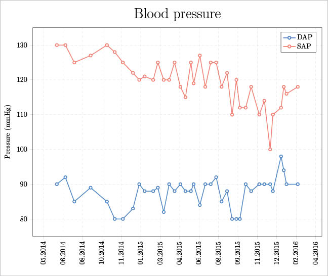
The preamble contains the packages, the libraries and some settings to build the plot typically, these are the width, height and, eventually, the definition of a custom colour map. In this example, the xcolor package is used to have svgnames for the colours for example, DodgerBlue, Salmon, etc (see Reference 4, pages 38-39). Usually, the preamble also contains the data table if its used with pgfplotstableread. The part between begin{axis} and end{axis} is about the plot options for example, the grid, ticks, labels, title and legend. In this part, addplot is also present. Its used to add each data series to the plot. Each data series has its own style options as specified with p1 and p2. The file pressure.txt contains a simulation of medical data about the measure of the diastolic (DAP) and systolic (SAP) arterial pressures during a certain period of time. It has the following structure:
Date DAP SAP
2014-06-12 90 130
2014-07-04 92 130
2014-07-27 85 125
... ... ...
The final result is shown in Figure 1.
2D plot examples
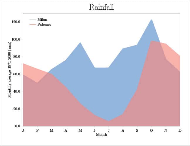
Using the above mentioned meteorological data, an area plot can be easily built. In the axis section, the following options are used:
p1/.style={draw=DodgerBlue,draw opacity=0.6,line width=3pt,fill=DodgerBlue,fill opacity=0.6,mark=none},
p2/.style={draw=Salmon,draw opacity=0.6,line width=3pt,fill=Salmon,fill opacity=0.6,mark=none}
And then each data series is plotted, as follows:
\addplot [p1] table[x=M,y=Milan]{\datarain}\closedcycle;
\addplot [p2] table[x=M,y=Palermo]{\datarain}\closedcycle;
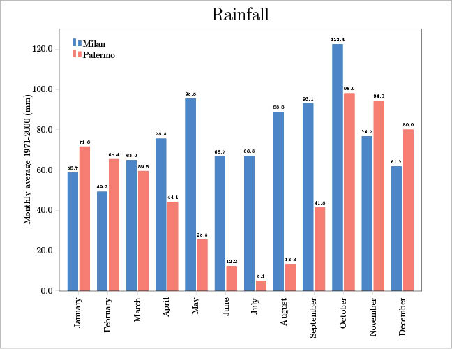
The option closedcycle defines a closed surface for each series. This is the main difference between an area plot and a bar plot. The same table could also be plotted as a bar plot. In the preamble, the following lines are added to have the height of each bar written on the plot considering the first decimal figure, even if its a zero.
\pgfkeys{
/pgf/number format/precision=1,
/pgf/number format/fixed zerofill=true}
The axis section contains, among the other options, the following code. The first three lines are to write on the plot the height of each bar and the last two to select the colour of each bar type.
nodes near coords,
nodes near coords align={vertical},
every node near coord/.append style={font=\tiny},
...
p1/.style={draw=DodgerBlue,fill=DodgerBlue},
p2/.style={draw=Salmon,fill=Salmon}
Last of all, each series is plotted, as shown below:
\addplot [p1] table[x=M,y=Milan]{\datarain};
\addplot [p2] table[x=M,y=Palermo]{\datarain};
On the same plot, its possible to add two (or more) data series with different plot types. For example, I can plot the above mentioned coordinates table as points only, as follows:
\addplot[only marks,mark=*,mark size=3pt,mark options={fill=green}]
coordinates {...};
And then add another series as a line only, as shown below:
\addplot[line width=1pt]
coordinates {
(0.1,0.0927143)
(0.9,0.7937429)};
The final results are shown in Figures 2, 3 and 4.
Smoothing: an example of interacting with Scilab
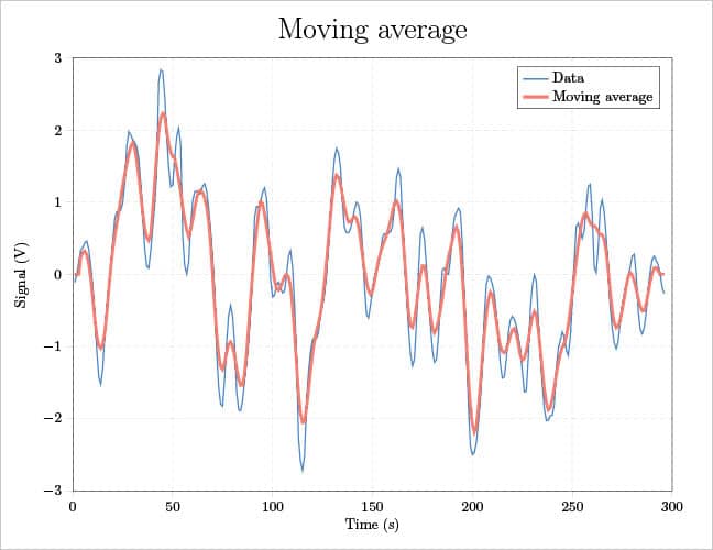
If some calculations are necessary before plotting the data, Scilab (http://www.scilab.org) can be used. In the following script for Scilab, a moving average smoothing is calculated. The block length is equal to 2*m+1. A three-column text file called smoothing.txt is exported; the first column is an index from 1 to the data length, the second is the data values, and the third is the calculated moving average. The LaTeX engine is then called by the function unix_g and the script smoothing.tex produces the final plot (see Figure 5).
clear; sheets=readxls(uigetfile(*.xls)); data=sheets(1).value; m=3; [nr,nc]=size(data); ma=zeros(1:nr); for i=1+m:nr-m for j=-m:m ma(i)=ma(i)+data(i+j); end ma(i)=ma(i)/(2*m+1); end n=1:1:nr; q=cat(2,n,data,ma); write_csv(q,smoothing.txt, ,.); unix_g(pdflatex smoothing.tex);
Since in smoothing.txt the column headers are not present, in smoothing.tex each column is selected by its own index:
\addplot [p1] table[x index={0},y index={1}]{smoothing.txt};
\addplot [p2] table[x index={0},y index={2}]{smoothing.txt};
3D plot examples
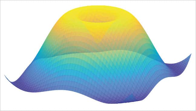
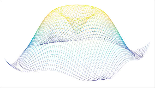
The first thing I would like to talk about is how to create a custom colour map. Simply add the following code to pgfplotsset in the preamble:
colormap={parula}{rgb=(...,...,...)}
The complete RGB data for the parula and the viridis colour maps can be found in Reference 5. This technique is also useful to create a custom colour map for Scilab. In the following example, a 3D algebraic function is plotted and coloured with the parula colour map. For Scilab, also see Reference 6.
clear;
parula=[0.2081,0.1663,0.5292
... ,... ,...
0.9763,0.9831,0.0538];
[nr,nc]=size(parula);
n=nr-1;
k=0:1:n;
cmap=interp1(k/n,parula,linspace(0,1,n));
deff(z=f(x,y),z=sin(sqrt(x.^2+y.^2)));
x=-4:0.25:4;
y=-4:0.25:4;
xset(colourmap,cmap);
fplot3d1(x,y,f,alpha=80,theta=30);
s=gca();
s.box=off;
s.axes_visible=off;
xtitle("","","","");
The LaTeX code for the same function is a bit different, as seen below:
\documentclass[border=0.5cm]{standalone}
\usepackage{pgfplots}
\pgfplotsset{width=16cm,height=12cm,
colourmap={parula}{
rgb=(0.2081,0.1663,0.5292)
rgb=(... ,... ,... )
rgb=(0.9763,0.9831,0.0538)
}
}
\begin{document}
\begin{tikzpicture}
\begin{axis}[hide axis]
\addplot3[
surf,
domain=-230:230,
samples=50,
opacity=0.8,
shader=flat,
line width=0.1pt
]
{sin(sqrt(x^2+y^2))};
\end{axis}
\end{tikzpicture}
\end{document}
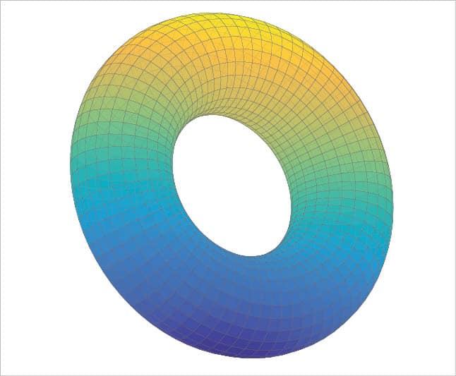
An alternative is to replace surf with mesh. The final plots are shown in Figures 6 and 7. If the surface is parametric, for example, a torus (Figure 8), the three equations can be written in an easy way putting them between ( and ):
({cos(x)},
{(2.5+sin(x))*cos(y)},
{(2.5+sin(x))*sin(y)});
Plotting a 3D function, algebraic or parametric, requires the customisation of some keys for example, domain (x range, or x, y if domain y is not specified), domain y (y range), draw (lines colour), line width (lines width), opacity (alpha value, from 0 – totally transparent – to 1 – totally opaque -), samples (which manages the number of sampled points on x – its default value is 25 -, or x, y if samples y is not specified), samples y (manages the number of sampled points on y), shader (lines shade), and z buffer (if equal to sort, the segments more distant from the observation point are first plotted).
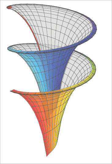
I think that a better way to plot a parametric function is shown in Reference 7 or Reference 14 (page 109), in which the package pst-solides3d is used. This is the only example discussed here for which its necessary to run with XeLaTeX. The final plot in Figure 9 shows the Dinis surface (from Ulisse Dini, http://en.wikipedia.org/wiki/Ulisse_Dini). Some important options are: viewpoint (notation with spherical coordinates), decran (a particular distance, see Reference 14, pages 14-15), base (dimensions of the grid), and ngrid (the number of grid lines).
\documentclass[border=0.5cm]{standalone}
\usepackage{pst-solides3d}
\begin{document}
\begin{pspicture}(-1,-2)(1,2)
\psset{viewpoint=20 70 20 rtp2xyz,Decran=20}
\defFunction[algebraic]{lily}(u,v)
{cos(u)*sin(v)}
{sin(u)*sin(v)}
{cos(v)+ln(tan(v/2))+0.15*u}
\psSolid[
object=surfaceparametree,
function=lily,
base=0 12.56 0.13 2,
ngrid=60 0.1,
linewidth=0.1pt,
incolor=gray!30,
hue=0 1,
opacity=0.8,
]
\end{pspicture}
\end{document}
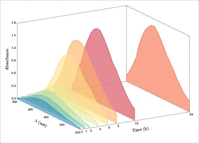
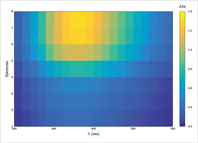
The last example for 3D plotting is about the representation of some spectroscopic data. In particular, I will consider an absorbance spectrum measured by points from 350 nm to 550 nm with steps of 10 nm, at 8 different times (0, 1, 2, 4, 6, 8, 12, 24 hours). So I have a table 21 rows x 8 columns. The table is present in the preamble as pgfplotstableread, the first column is the wavelength and the columns from two to nine are the measured absorbance values. In the preamble I have also added eight different definecolors, one for each spectrum, and eight different pgfplotscreateplotcyclelist to define some options for each spectrum. The syntax is as follows:
\definecolor{col1}{HTML}{F46D43}
...
\definecolor{col8}{HTML}{3288BD}
\pgfplotscreateplotcyclelist{mycol}{%
{draw=col1,line width=1pt,fill=col1,fill opacity=0.6},
...
{draw=col8,line width=1pt,fill=col8,fill opacity=0.6}%
}
Each spectrum is then plotted by a loop, as follows:
\pgfplotsinvokeforeach{24,12,8,6,4,2,1,0}{
\addplot3 table[x=nm,y expr=#1,z=abs#1]{\dataabs};
}
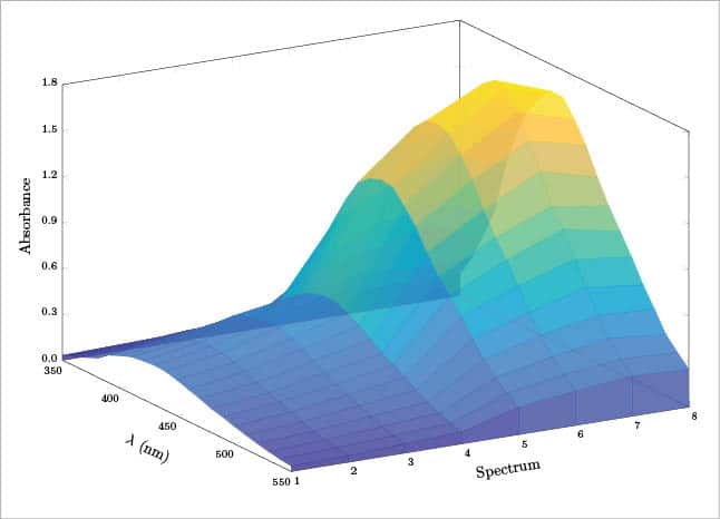
The result is eight different areas plotted in a 3D space, as shown in Figure 10. For aesthetic reasons, I have added one more row with a z=0 value at 350 nm and at 550 nm. Another option is to plot each spectrum in a simple sequence, not considering the time. In this case, each measured point is specified by its coordinates (x,y,z) and the result is a surface (see Figure 11).
\addplot3[
surf,
z buffer=sort,
opacity=0.8,
shader=flat,
line width=0.1pt
]
coordinates{
(350,1,0.000)(350,2,0.000)(350,3,0.000) ...
...
... (550,6,0.000)(550,7,0.000)(550,8,0.000)
};
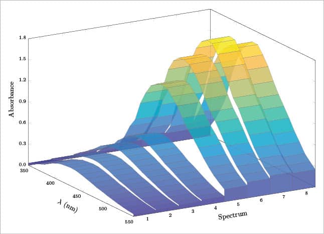
Another possibility is to give each spectrum a certain thickness by adding one more y value and then plotting from the last (n=8 or 24 h) to the first (n=1 or 0 h). The resulting plot is a series of ribbons (Figure 12). The contour plot is not directly supported (a Gnuplot installation is required), but its possible to obtain a pseudo contour plot using view={0}{90} (the syntax is view={azimuth}{elevation}) in the axis definition; see Figure 13). For a 3D bar plot, it is possible, for example, to follow the answer proposed by the user LMT-PhD in reference [8]; see also https://github.com/astonfe/latex/blob/master/absorbance/absorbance_bar.tex. In this case, the data are ordered according to the following table, in which the first row under the headers contains the maximum value of each column:
X Y Z
21 8 1.758

1 8 0.143
1 7 0.138
...
2 8 0.280
2 7 0.270
...
21 8 0.247
21 7 0.263
...
21 1 0.035
Other examples
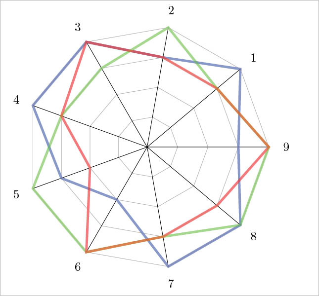
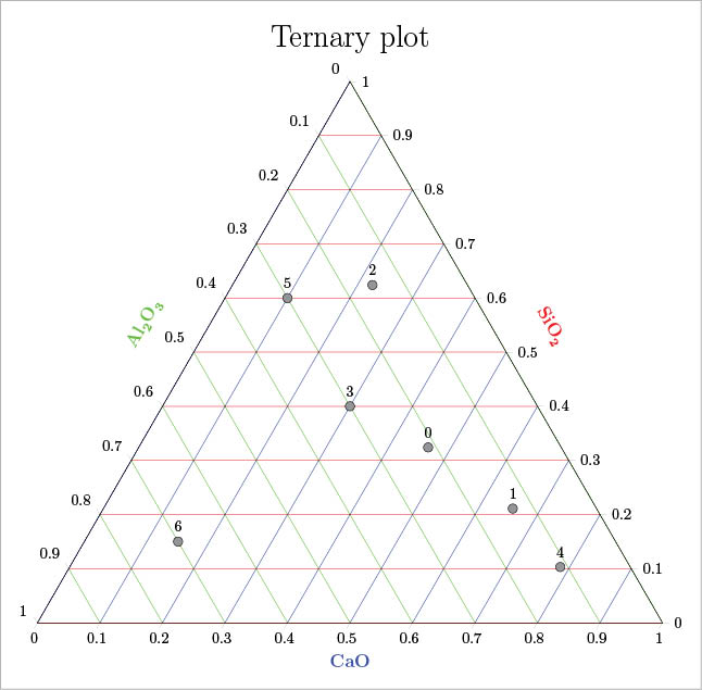
The last two examples are about the radar (or spider) and ternary plots. For the first type, an interesting way is to follow Reference 9. Figure 14 shows an example based on that reference. The radar plot has a certain importance for some applications, an example of which can be seen in Reference 10 (pages 12-13 and 21). A ternary plot (Figure 15) can be done by adding the usepgfplotslibrary{ternary} in the preamble. An example of this is shown below:
\begin{ternaryaxis}[
ternary limits relative=false,
clip=false,
disabledatascaling,
...
]
\addplot3[
mark=*,mark size=3pt,only marks,draw=black,fill=gray,
nodes near coords=\coordindex,
every node near coord/.append style={yshift=3pt}
]
table {
X Y Z
0.324 0.213 0.463
... ... ...
0.150 0.700 0.150
};
\end{ternaryaxis}
An easy technique for numbering each point is to use coordindex. See Reference 13, pages 487-498, in which more complex examples are reported.
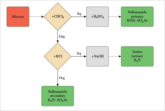
Flowchart
This section is dedicated to creating a basic example of a flowchart with the package tikz. Even in this case, LaTeX can produce a great output. In the preamble, the packages xcolour, mhchem (because some chemical formulae will be used) and tikz are called. Then each chart component (block, decision a type of diamond shaped block, and line) is defined using tikzstyle for example, geometry, fill colour, text, etc. In the tikzpicture section, each block or decision (both called node) is positioned with respect to the others and the text content is written. Last, every node is connected with a path (a line), and on each path its also possible to add some text. Its pretty easy and only takes a little patience. Probably, the best explanation is to view a practical example (Figure 16):
\documentclass[border=0.5cm]{standalone}
\usepackage[svgnames]{xcolor}
\usepackage[version=3]{mhchem}
\usepackage{tikz}
\usetikzlibrary{shapes,arrows}
\tikzstyle{block1}=[rectangle,draw,fill=Tomato,text width=2cm,minimum height=2cm,rounded corners]
...
\tikzstyle{line}=[draw,-triangle 45]
\begin{document}
\begin{tikzpicture}[text centered,node distance=4cm,auto]
\node [block1] (1) {Mixture};
\node [decision,right of=1] (2) {+\ce{CHCl3}};
...
\path [line] (1)--(2);
\path [line] (2)--(3);
...
\path [line] (2)--node {Aq} (3);
\path [line] (2)--node {Org} (5);
...
\end{tikzpicture}
\end{document}
Only some introductory examples are presented here. More of them can be found in References 11 and 12, and a large collection in the manuals for the packages pgfplots and pst-solides3d (References 13 and 14). About tikz, an introduction can be found in Reference 15 and a large manual in Reference 16.


Good amount of information regarding Scilab plotting with LaTex