


Viewing statistics in motion charts can be great fun. This article describes how googleVis software can be used to view motion charts. The author gives the reader an interesting example of data picked up from the Bombay Stock Exchange and how it can be viewed as a motion chart.
Viewing statistics can be an exciting experience. If you are surprised, look at one of the motion chart presentations by Hans Rosling, at his TED talk https://www.youtube.com/watch?v=RUwS1uAdUcI. The software behind the presentation of motion charts was acquired by Google and integrated into the Google Charts API.
Normally, I would have experimented with the Python API. However, I came across the R package googleVis on GitHub and decided to experiment with that instead. It provides a motivation to experiment with R.
R is a statistical tool, which assumes considerable significance in the context of making sense of Big Data.
Installing googleVis
You need to install R and then the googleVis package under R. For example, on Fedora, use the following commands:
$ sudo dnf install R $ sudo R >install.packages(googleVis)
You may be prompted to select a repository from which to install R packages. Once the installation is complete, you can test it with just two commands, as follows:
$ R > suppressPackageStartupMessages(library(googleVis)) > plot(gvisMotionChart(Fruits, Fruit, Year, options=list(width=600, height=400))) starting httpd help server ... done
You will get a 600×400 (width x height) motion chart in the browser and can play around with various bubbles moving with time. You can find videos of googleVis charts on YouTube in case you are interested.
Getting started with R
In case you are not already familiar with R, at this point, try a sample session in An Introduction to R which is included in the R distribution. You can access the built-in help including the introduction as follows:
> help.start()
starting httpd help server ... done
This will bring up HTML documentation. You can navigate to Appendix A: A sample session in An Introduction to R.
Exploring googleVis
Now, lets get back to understanding and exploring the googleVis package.
Fruits is a data frame included in the distribution of the googleVis package. The command data() will list all the data frames available. However, we are currently interested in the googleVis package only. So, find out the data frames available in googleVis, load Fruits and print its contents as follows:
> data(package=googleVis) Data sets in package googleVis: Andrew Hurricane Andrew: googleVis example data set Cairo Daily temperature data for Cairo CityPopularity CityPopularity: googleVis example data set Exports Exports: googleVis example data set Fruits Fruits: googleVis example data set . > data(Fruits) > Fruits Fruit Year Location Sales Expenses Profit Date 1 Apples 2008 West 98 78 20 2008-12-31 2 Apples 2009 West 111 79 32 2009-12-31 ... 9 Bananas 2010 East 81 71 10 2010-12-31
You can learn more about googleVis in the R interpreter, with the following:
- help(googleVis) which will give a brief description of the package and guide you to further information about it
- demo(googleVis) which will guide you through examples of charts included in the package, including gvisBubbleChart and gvisMotionChart
- vignettes(googleVis) which will give you an introduction to the package
Experimenting with stock market indices
The next step is to use your own data. An easy and interesting resource is to download historical indices data from the BSE (Bombay Stock Exchange) site. You can save the data as CSV files. The daily data will look something like what follows:
Date Open High Low Close
1-January-2016 26101.5 26197.27 26008.2 26160.9
4-January-2016 26116.52 26116.52 25596.57 25623.35
5-January-2016 25744.7 25766.76 25513.75 25580.34
You can merge and organise the data from the various CSV files in a spreadsheet so that it is suitable for importing in R. The YMD date format is very convenient as there is no ambiguity. You may want to add a column that shows the difference between the high and low values as an indicator of volatility. Suppose you want to look at the Sensex, MidCap, SmallCap and IT indices, the properly organised data will look like what follows:
Date        Index      Open       High      Low      Close     Hi-Lo
2016-02-29  Sensex    23238.5    23343.   22 22494.61 23002    848.61
2016-02-29  Midcap     9584.31   9651.77   9389.35    9575.1    262.42
2016-02-29  Smallcap   9567.63   9594.03   9399.43   9548.33    194.6
2016-02-29  IT        10488.4    10507.62  10044.59  10229.49   463.03
Save this sheet in CSV format as BSE-indices.csv. This file can be easily imported as a data set in R, though the date field needs to be explicitly identified.
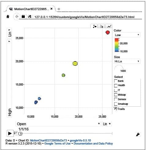
> D=read.csv(BSE-indices.csv, header=TRUE,colClasses=c (Date=Date)) > M <- gvisMotionChart(D,idvar=Index,timevar=Date, sizevar=Hi.Lo) > plot(M)
Notice that the Hi-Lo becomes Hi.Lo in R. This value is used as the default value for the size of the bubble in the above chart. The chart will open in a browser window and needs Flash Player. Figure 1 shows the initial image.
The Open column is used as the x-axis and the next column, High, is used as the y-axis. However, the columns used for the x and y axes can be changed in the chart. The colours for various indices can also be changed. If you click on the Play option, the values and bubble sizes will change with time.
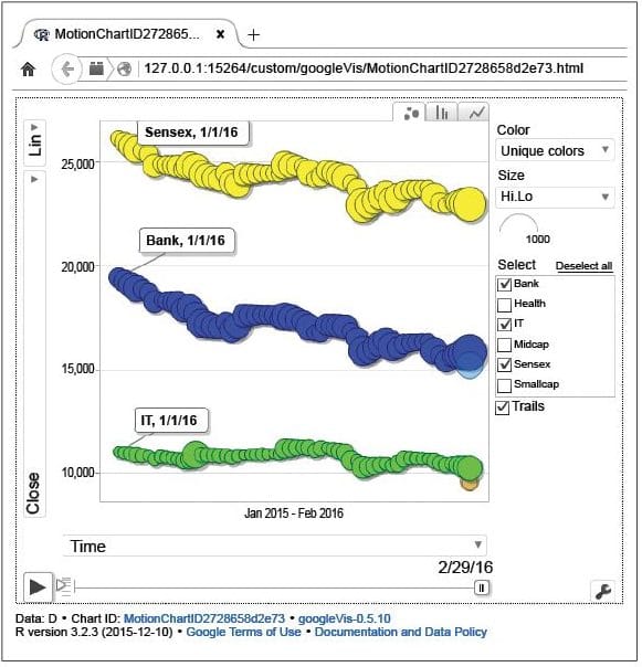
Change the x-axis column to Date, the y-axis column to Closing and colours to Unique. Select Bank, IT and Sensex indices for showing the trails. You can see the results in Figure 2.
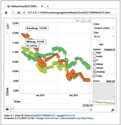
You may notice that the values of some of the indices are too close to each other to be viewed effectively. The chart has the option to select an area and zoom in, as you can see in Figure 3.
The range of data sets available in the public domain is increasing, some of which you may explore on https://www.google.com/publicdata/. The data made available by various government departments in India is available through https://data.gov.in/. Visualisation tools like the one discussed above help you make sense of it all.


